Join us at FabCon Vienna from September 15-18, 2025
The ultimate Fabric, Power BI, SQL, and AI community-led learning event. Save €200 with code FABCOMM.
Get registered- Power BI forums
- Get Help with Power BI
- Desktop
- Service
- Report Server
- Power Query
- Mobile Apps
- Developer
- DAX Commands and Tips
- Custom Visuals Development Discussion
- Health and Life Sciences
- Power BI Spanish forums
- Translated Spanish Desktop
- Training and Consulting
- Instructor Led Training
- Dashboard in a Day for Women, by Women
- Galleries
- Data Stories Gallery
- Themes Gallery
- Contests Gallery
- Quick Measures Gallery
- Notebook Gallery
- Translytical Task Flow Gallery
- TMDL Gallery
- R Script Showcase
- Webinars and Video Gallery
- Ideas
- Custom Visuals Ideas (read-only)
- Issues
- Issues
- Events
- Upcoming Events
Compete to become Power BI Data Viz World Champion! First round ends August 18th. Get started.
- Power BI forums
- Forums
- Get Help with Power BI
- Desktop
- Re: How to create visual with Overall Percentage f...
- Subscribe to RSS Feed
- Mark Topic as New
- Mark Topic as Read
- Float this Topic for Current User
- Bookmark
- Subscribe
- Printer Friendly Page
- Mark as New
- Bookmark
- Subscribe
- Mute
- Subscribe to RSS Feed
- Permalink
- Report Inappropriate Content
How to create visual with Overall Percentage for combined group of items?
As shown in the picture (1), this is my data source (excel)
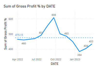
and as shown in the picture (2), I would like to create Line Chart to see what's my gross profit % for the overall business and selected item group.
Problem: the percentage are adding up which causes 400, 500 which makes no sense. If I select to view each item, of course there is no problem, but I beleive there are some certain ways to view gross profit % for the overall business or selected item group.
Looking forward and Thanks
- Mark as New
- Bookmark
- Subscribe
- Mute
- Subscribe to RSS Feed
- Permalink
- Report Inappropriate Content
Hi @Nay_Myo_Zaw !
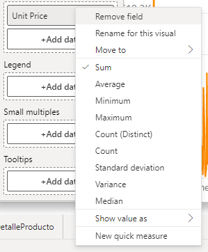
When you drop your column in your chart and its a number, by default Power BI usually summarizes it. You need to change the behaviour of this by selecting the type of aggregation you want for your column.
If you right click on the field of your visual you can select this
Hope this helps!
- Mark as New
- Bookmark
- Subscribe
- Mute
- Subscribe to RSS Feed
- Permalink
- Report Inappropriate Content
Yes, I tried. But none of the aggregation doesn't really make sense because what I really need is (sum of gross profit of all items) divided by (sum of sales amount of all items) to get the overall business gross profit %.
The options are just average, median etc. of the gross profit %, which doesn't really make sense.
- Mark as New
- Bookmark
- Subscribe
- Mute
- Subscribe to RSS Feed
- Permalink
- Report Inappropriate Content
Have you tried creating a measure like this?
Gross Profit % =
DIVIDE(
    SUM( Gross Profit ),
    SUM( sales Amount )
)


