FabCon is coming to Atlanta
Join us at FabCon Atlanta from March 16 - 20, 2026, for the ultimate Fabric, Power BI, AI and SQL community-led event. Save $200 with code FABCOMM.
Register now!- Power BI forums
- Get Help with Power BI
- Desktop
- Service
- Report Server
- Power Query
- Mobile Apps
- Developer
- DAX Commands and Tips
- Custom Visuals Development Discussion
- Health and Life Sciences
- Power BI Spanish forums
- Translated Spanish Desktop
- Training and Consulting
- Instructor Led Training
- Dashboard in a Day for Women, by Women
- Galleries
- Data Stories Gallery
- Themes Gallery
- Contests Gallery
- QuickViz Gallery
- Quick Measures Gallery
- Visual Calculations Gallery
- Notebook Gallery
- Translytical Task Flow Gallery
- TMDL Gallery
- R Script Showcase
- Webinars and Video Gallery
- Ideas
- Custom Visuals Ideas (read-only)
- Issues
- Issues
- Events
- Upcoming Events
The Power BI Data Visualization World Championships is back! Get ahead of the game and start preparing now! Learn more
- Power BI forums
- Forums
- Get Help with Power BI
- Desktop
- Re: How to create multi-level sankey diagram. Sank...
- Subscribe to RSS Feed
- Mark Topic as New
- Mark Topic as Read
- Float this Topic for Current User
- Bookmark
- Subscribe
- Printer Friendly Page
- Mark as New
- Bookmark
- Subscribe
- Mute
- Subscribe to RSS Feed
- Permalink
- Report Inappropriate Content
How to create multi-level sankey diagram. Sankey visual 3.0.3
I have tried to follow a few posts and videos on this but can't figure this out for the life of me. Data structure is very straight forward, however I want to have 3 sets of pillars. Can't figure this out.. Do i need to set up particular measures/formulas?
I want there to be.
Pillar 1: Non-Australia Sources: Flow of volume from non-australian countries to australia
Middle Pillar 2: Australia destinations: Flow of volume from non-australian countries to Australia.
Pilalr 3 (on right): Non-Australia destinations: Flow of volume from australia to non-australia countries.
I'm using the custom visual Sankey 3.0.3 on PBI.
Data example:
| Source | Destination | Volume |
| USA | Australia | 50 |
| Canada | Australia | 100 |
| Australia | New Zealand | 30 |
| Australia | Fiji | 80 |
Solved! Go to Solution.
- Mark as New
- Bookmark
- Subscribe
- Mute
- Subscribe to RSS Feed
- Permalink
- Report Inappropriate Content
Hi, @Chris_1996
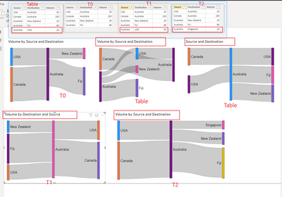
I attribute it to the design of the chart itself. When there is a loop in the data flow, the design of the chart makes the above display result. Although it looks a bit confusing, it clearly shows the loop flow of the data.
Okay, let's talk about making the chart look what we want.
According to my research, when the weight field is not put in the chart, the chart looks great.
When there is no loop in the data flow, the graph looks exactly what we want. For example, changing the flow from Australia to the USA to Australia to Singapore breaks the circular flow of the data.
When the inflow and outflow of data are equal, we can also get a look similar to what we want. Although there is a little trick here, it is to put the destination field in the source bucket and the source field in the destination bucket. I'm not sure why, but it works.
The above is a possible effective solution to get the desired chart. Hope it helps you.
Please refer to the attachment below for details
Best Regards,
Community Support Team _ Zeon Zheng
If this post helps, then please consider Accept it as the solution to help the other members find it more quickly.
- Mark as New
- Bookmark
- Subscribe
- Mute
- Subscribe to RSS Feed
- Permalink
- Report Inappropriate Content
Hi @Chris_1996
Power BI custom visuals, such as Sankey diagrams, can be customized to meet specific needs. Various Sankey diagram custom visuals are available, and I have found the one by ChartExpo to be particularly useful. Their support team has been responsive and has provided solutions in updated releases, addressing features like sorting of nodes and links, cross-highlighting, cross-filtering, and conditional formatting.
Follow the playlist to explore how to videos:
https://www.youtube.com/playlist?list=PLG5ONdnoR4TKBL9woafVVwO1VGtZFVz_b
Explore the Sankey Diagram for Power BI Demo here
https://app.powerbi.com/view?r=eyJrIjoiOTEzZTdjZGUtNzE5MS00ODk2LWJkOTAtNTI3ZjMwNWI1MTdhIiwidCI6IjYyZ...
Thanks,
Talib
- Mark as New
- Bookmark
- Subscribe
- Mute
- Subscribe to RSS Feed
- Permalink
- Report Inappropriate Content
I think your Sankey diagram issue will be resolve by this visual.
- Mark as New
- Bookmark
- Subscribe
- Mute
- Subscribe to RSS Feed
- Permalink
- Report Inappropriate Content
it's not free anyway. you need to pay for every user.
i believe now it's better use updated version of charticulator
____________
⭐️ Fabric Group Channel
⭐️ Microsoft Fabric Community
Please join the Power BI UX/UI User Group if you need help with dashboard design and usability
Join to Data Governance User Group
Join to DENEB and Power BI Enthusiasts User Group
Join to Data Fabric Best Practices User Group
Subscribe to my medium blog
- Mark as New
- Bookmark
- Subscribe
- Mute
- Subscribe to RSS Feed
- Permalink
- Report Inappropriate Content
Hi so i've got the diagram i want. but it want to show the Values and the source / destination name. The data is in the tool tip. but is there really no way to show the number? I can't be the only person who wants a number in the component bars or in the flows? I need to show these sankey's in Powepoint and don't want to have to manually write in the values. please help
- Mark as New
- Bookmark
- Subscribe
- Mute
- Subscribe to RSS Feed
- Permalink
- Report Inappropriate Content
@Anonymous Unfortunately, I'm running into the same problem!
So far found a way to do it via charticulator OR Deneb.
I created Idea for it:
https://community.fabric.microsoft.com/t5/Custom-Visuals-Ideas/Sankey-diagram/idi-p/3440502#M1193
You can vote for it.
____________
⭐️ Fabric Group Channel
⭐️ Microsoft Fabric Community
Please join the Power BI UX/UI User Group if you need help with dashboard design and usability
Join to Data Governance User Group
Join to DENEB and Power BI Enthusiasts User Group
Join to Data Fabric Best Practices User Group
Subscribe to my medium blog
- Mark as New
- Bookmark
- Subscribe
- Mute
- Subscribe to RSS Feed
- Permalink
- Report Inappropriate Content
@Chris_1996 @v-angzheng-msft @AllisonKennedy
Try again please. Developers updated the component now!
____________
⭐️ Fabric Group Channel
⭐️ Microsoft Fabric Community
Please join the Power BI UX/UI User Group if you need help with dashboard design and usability
Join to Data Governance User Group
Join to DENEB and Power BI Enthusiasts User Group
Join to Data Fabric Best Practices User Group
Subscribe to my medium blog
- Mark as New
- Bookmark
- Subscribe
- Mute
- Subscribe to RSS Feed
- Permalink
- Report Inappropriate Content
@technolog Yes, I saw that there's now an option toggle to determine how to handle looping. 🙂
Please @mention me in your reply if you want a response.
Copying DAX from this post? Click here for a hack to quickly replace it with your own table names
Has this post solved your problem? Please Accept as Solution so that others can find it quickly and to let the community know your problem has been solved.
If you found this post helpful, please give Kudos C
I work as a Microsoft trainer and consultant, specialising in Power BI and Power Query.
www.excelwithallison.com
- Mark as New
- Bookmark
- Subscribe
- Mute
- Subscribe to RSS Feed
- Permalink
- Report Inappropriate Content
Hi, @Chris_1996
I attribute it to the design of the chart itself. When there is a loop in the data flow, the design of the chart makes the above display result. Although it looks a bit confusing, it clearly shows the loop flow of the data.
Okay, let's talk about making the chart look what we want.
According to my research, when the weight field is not put in the chart, the chart looks great.
When there is no loop in the data flow, the graph looks exactly what we want. For example, changing the flow from Australia to the USA to Australia to Singapore breaks the circular flow of the data.
When the inflow and outflow of data are equal, we can also get a look similar to what we want. Although there is a little trick here, it is to put the destination field in the source bucket and the source field in the destination bucket. I'm not sure why, but it works.
The above is a possible effective solution to get the desired chart. Hope it helps you.
Please refer to the attachment below for details
Best Regards,
Community Support Team _ Zeon Zheng
If this post helps, then please consider Accept it as the solution to help the other members find it more quickly.
- Mark as New
- Bookmark
- Subscribe
- Mute
- Subscribe to RSS Feed
- Permalink
- Report Inappropriate Content
Thanks - I will give this a go.
As a work around prior to this, I added a fullstop to the duplicate country in the destination column, that way it didn't recognize that it was the same input/output. But I will give what you have shown a go as it would be preferrable not to have the fullstop.
ie.
| Source | Destination |
| Australia | USA. |
| USA | Australia |
- Mark as New
- Bookmark
- Subscribe
- Mute
- Subscribe to RSS Feed
- Permalink
- Report Inappropriate Content
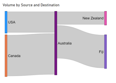
@Chris_1996 I'm not sure what you're looking for - this has the three pillars, with Australia in the middle. Can you draw what you want if this isn't it?
https://excelwithallison.blogspot.com/2021/07/custom-visual-review-sankey.html
Please @mention me in your reply if you want a response.
Copying DAX from this post? Click here for a hack to quickly replace it with your own table names
Has this post solved your problem? Please Accept as Solution so that others can find it quickly and to let the community know your problem has been solved.
If you found this post helpful, please give Kudos C
I work as a Microsoft trainer and consultant, specialising in Power BI and Power Query.
www.excelwithallison.com
- Mark as New
- Bookmark
- Subscribe
- Mute
- Subscribe to RSS Feed
- Permalink
- Report Inappropriate Content
Ok so this is exactly what i'm after. I think I realised why I wasn't able to get the visual to do what yours was showing and still would be great if you know a fix to this.
So this is the chart as per yours above:
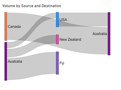
But i have instances where the source becomes the destination. ie. if we expand the original table so it looks like so: where i have added in a line that has volume going back from australia to usa. I want this line to be the same as the above chart, coming from australia in the middle row.. but it throws the visual into dissaray..
| USA | Australia | 50 |
| Canada | Australia | 100 |
| Australia | New Zealand | 30 |
| Australia | Fiji | 80 |
| Australia | USA | 20 |
This is the same visual as above, but with no filter applied on destination = USA.. Australia is no longer in the middle of the chart as i am after, and the chart is quite confusing..
Helpful resources

Power BI Dataviz World Championships
The Power BI Data Visualization World Championships is back! Get ahead of the game and start preparing now!

| User | Count |
|---|---|
| 41 | |
| 38 | |
| 36 | |
| 31 | |
| 28 |
| User | Count |
|---|---|
| 128 | |
| 88 | |
| 79 | |
| 68 | |
| 63 |


