Fabric Data Days starts November 4th!
Advance your Data & AI career with 50 days of live learning, dataviz contests, hands-on challenges, study groups & certifications and more!
Get registered- Power BI forums
- Get Help with Power BI
- Desktop
- Service
- Report Server
- Power Query
- Mobile Apps
- Developer
- DAX Commands and Tips
- Custom Visuals Development Discussion
- Health and Life Sciences
- Power BI Spanish forums
- Translated Spanish Desktop
- Training and Consulting
- Instructor Led Training
- Dashboard in a Day for Women, by Women
- Galleries
- Data Stories Gallery
- Themes Gallery
- Contests Gallery
- Quick Measures Gallery
- Visual Calculations Gallery
- Notebook Gallery
- Translytical Task Flow Gallery
- TMDL Gallery
- R Script Showcase
- Webinars and Video Gallery
- Ideas
- Custom Visuals Ideas (read-only)
- Issues
- Issues
- Events
- Upcoming Events
Get Fabric Certified for FREE during Fabric Data Days. Don't miss your chance! Learn more
- Power BI forums
- Forums
- Get Help with Power BI
- Desktop
- How to combine two histograms with different x-axi...
- Subscribe to RSS Feed
- Mark Topic as New
- Mark Topic as Read
- Float this Topic for Current User
- Bookmark
- Subscribe
- Printer Friendly Page
- Mark as New
- Bookmark
- Subscribe
- Mute
- Subscribe to RSS Feed
- Permalink
- Report Inappropriate Content
How to combine two histograms with different x-axis time fields into one stacked column chart ?
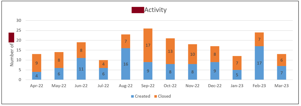
One histogram report aggregated by incident created month-year, and another report aggregated by incident completed month-year, how can I put these two reports into one stacked column chart in PowerBi?
I want to create a visual like this:
Thank you for your help!
Solved! Go to Solution.
- Mark as New
- Bookmark
- Subscribe
- Mute
- Subscribe to RSS Feed
- Permalink
- Report Inappropriate Content
Hi @TG-516
To get a stacked column with both statuses you need to calculate 2 measures :
1. For "created"
2. For "Closed"
and put these 2 measures on the Y-axis:
Link to my sample file with a similar scenario
If this post helps, then please consider Accepting it as the solution to help the other members find it more quickly
Rita Fainshtein | Microsoft MVP
https://www.linkedin.com/in/rita-fainshtein/
Blog : https://www.madeiradata.com/profile/ritaf/profile
- Mark as New
- Bookmark
- Subscribe
- Mute
- Subscribe to RSS Feed
- Permalink
- Report Inappropriate Content
Thank you! This helps a lot.
- Mark as New
- Bookmark
- Subscribe
- Mute
- Subscribe to RSS Feed
- Permalink
- Report Inappropriate Content
Happy to help 🙂
Rita Fainshtein | Microsoft MVP
https://www.linkedin.com/in/rita-fainshtein/
Blog : https://www.madeiradata.com/profile/ritaf/profile
Helpful resources

Fabric Data Days
Advance your Data & AI career with 50 days of live learning, contests, hands-on challenges, study groups & certifications and more!

Power BI Monthly Update - October 2025
Check out the October 2025 Power BI update to learn about new features.

| User | Count |
|---|---|
| 82 | |
| 48 | |
| 36 | |
| 31 | |
| 29 |


