FabCon is coming to Atlanta
Join us at FabCon Atlanta from March 16 - 20, 2026, for the ultimate Fabric, Power BI, AI and SQL community-led event. Save $200 with code FABCOMM.
Register now!- Power BI forums
- Get Help with Power BI
- Desktop
- Service
- Report Server
- Power Query
- Mobile Apps
- Developer
- DAX Commands and Tips
- Custom Visuals Development Discussion
- Health and Life Sciences
- Power BI Spanish forums
- Translated Spanish Desktop
- Training and Consulting
- Instructor Led Training
- Dashboard in a Day for Women, by Women
- Galleries
- Data Stories Gallery
- Themes Gallery
- Contests Gallery
- QuickViz Gallery
- Quick Measures Gallery
- Visual Calculations Gallery
- Notebook Gallery
- Translytical Task Flow Gallery
- TMDL Gallery
- R Script Showcase
- Webinars and Video Gallery
- Ideas
- Custom Visuals Ideas (read-only)
- Issues
- Issues
- Events
- Upcoming Events
The Power BI Data Visualization World Championships is back! Get ahead of the game and start preparing now! Learn more
- Power BI forums
- Forums
- Get Help with Power BI
- Desktop
- Re: How to change Formatting with icons to specifi...
- Subscribe to RSS Feed
- Mark Topic as New
- Mark Topic as Read
- Float this Topic for Current User
- Bookmark
- Subscribe
- Printer Friendly Page
- Mark as New
- Bookmark
- Subscribe
- Mute
- Subscribe to RSS Feed
- Permalink
- Report Inappropriate Content
How to change Formatting with icons to specific
HI,
I have a chart that shows Branded vs UnBranded. The Rate on the right is conditionally formatted. ALthough, i dont want it to look at all the rates and give me the colors, I want it to look at the Branded vs UnBranded and color icons based on those two outputs and not all lines. Here is what i have in PBI.

Is should be
Branded | Project Name | Rate | UP ARROW
Unbranded | Project Name | Rate | DOWN ARROW
Branded | Project Name | Rate | DOWN ARROW
Unbranded | Project Name | Rate | UP ARROW
Branded | Project Name | Rate | UP ARROW
Unbranded | Project Name | Rate | DOWN ARROW
- Mark as New
- Bookmark
- Subscribe
- Mute
- Subscribe to RSS Feed
- Permalink
- Report Inappropriate Content
I can be dynamic if you create a good measure.
If you do not show your data and explain exactly clearly what you want nobody here can help you write te specific measure. The DAX is depending on the model.
- Mark as New
- Bookmark
- Subscribe
- Mute
- Subscribe to RSS Feed
- Permalink
- Report Inappropriate Content
@Kornholio1313 , Go to cell element in format visual of the table visual and select the column on which the conditional formatting is set. Then in icons go conditional format and change the style from shapes to arrows. The option of arrows are from all 8 directions to 3[Up Down right]. Change the conditions accordingly and can also remove any arrow as per convinience.
Thank You, if solves the issue mark as solution.
- Mark as New
- Bookmark
- Subscribe
- Mute
- Subscribe to RSS Feed
- Permalink
- Report Inappropriate Content
This is ok, but it has to be dynamic, not set. Meaning Branded Rate could be 40% one timeframe and 65% the next same goes for UnBranded. The idea is to show, no matter the number, who won in green. So, if Branded Engagment Rate is =65% and UnBranded is =45%, then Branded rate is colored GREEN and UnBranded is RED. These rates will change when the dates are changed, so the next time UnBranded could =65% and Branded 45%, therefore UnBranded Engagement Rate would be in GREEN
- Mark as New
- Bookmark
- Subscribe
- Mute
- Subscribe to RSS Feed
- Permalink
- Report Inappropriate Content
Then there is a need to create a measure that decides who won and then use that measure in conditional formatting. For Ex. make a measure that marks win and loss and then using that measure that in condtional formatting marking that win is green and loss is red.
- Mark as New
- Bookmark
- Subscribe
- Mute
- Subscribe to RSS Feed
- Permalink
- Report Inappropriate Content
hi @ChiragGarg2512 , tht would be nice, but this is dynamic, so the winning % could be any number when you change the date timeframe, it could be 55%, 55.4%, 56.5%, etc. so i cant just hardcode a winning %. Any other ideas?
- Mark as New
- Bookmark
- Subscribe
- Mute
- Subscribe to RSS Feed
- Permalink
- Report Inappropriate Content
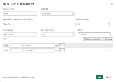
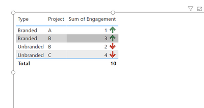
I am not sure when you want the arrow to go up or down but you could do it like above
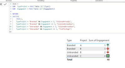
if your logic is to complex for this option. You could also create a measure and use it as a field value in conditional formatting. Something like this
More info: Power BI Icon Names for Conditional Formatting Using DAX - RADACAD
- Mark as New
- Bookmark
- Subscribe
- Mute
- Subscribe to RSS Feed
- Permalink
- Report Inappropriate Content
This did not acomplish what i needed to do, has to be dynamic, thanks. I am going to go back to using Tableau now
Helpful resources

Power BI Monthly Update - November 2025
Check out the November 2025 Power BI update to learn about new features.

Fabric Data Days
Advance your Data & AI career with 50 days of live learning, contests, hands-on challenges, study groups & certifications and more!


