Fabric Data Days starts November 4th!
Advance your Data & AI career with 50 days of live learning, dataviz contests, hands-on challenges, study groups & certifications and more!
Get registered- Power BI forums
- Get Help with Power BI
- Desktop
- Service
- Report Server
- Power Query
- Mobile Apps
- Developer
- DAX Commands and Tips
- Custom Visuals Development Discussion
- Health and Life Sciences
- Power BI Spanish forums
- Translated Spanish Desktop
- Training and Consulting
- Instructor Led Training
- Dashboard in a Day for Women, by Women
- Galleries
- Data Stories Gallery
- Themes Gallery
- Contests Gallery
- QuickViz Gallery
- Quick Measures Gallery
- Visual Calculations Gallery
- Notebook Gallery
- Translytical Task Flow Gallery
- TMDL Gallery
- R Script Showcase
- Webinars and Video Gallery
- Ideas
- Custom Visuals Ideas (read-only)
- Issues
- Issues
- Events
- Upcoming Events
Get Fabric Certified for FREE during Fabric Data Days. Don't miss your chance! Request now
- Power BI forums
- Forums
- Get Help with Power BI
- Desktop
- Re: How to calculate variance ?
- Subscribe to RSS Feed
- Mark Topic as New
- Mark Topic as Read
- Float this Topic for Current User
- Bookmark
- Subscribe
- Printer Friendly Page
- Mark as New
- Bookmark
- Subscribe
- Mute
- Subscribe to RSS Feed
- Permalink
- Report Inappropriate Content
How to calculate variance ?
Hello,
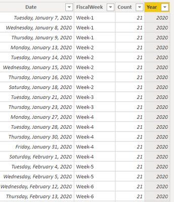
I have table that looks like this:
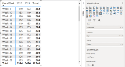
I created matrix like this:
What i really need is matrics that has Variances which is 2021-2020 and also %YoY which would be Variance/2020.
So something like this:
| FiscalWeek | 2020 | 2021 | Variance | %YoY |
| Week-1 | 119 | 133 | 14 | 12% |
| Week-2 | 133 | 133 | 0 | 0% |
| Week-3 | 112 | 126 | 14 | 13% |
| Week-4 | 133 | 119 | -14 | -11% |
| Week-5 | 112 | 112 | 0 | 0% |
| Week-6 | 133 | 140 | 7 | 5% |
| Week-7 | 126 | 112 | -14 | -11% |
| Week-8 | 119 | 126 | 7 | 6% |
| Week-9 | 126 | 126 | 0 | 0% |
| Week-10 | 133 | 119 | -14 | -11% |
| Week-11 | 126 | 140 | 14 | 11% |
| Week-12 | 112 | 126 | 14 | 13% |
| Week-13 | 119 | 133 | 14 | 12% |
| Week-14 | 119 | 105 | -14 | -12% |
| Week-15 | 105 | 133 | 28 | 27% |
| Week-16 | 119 | 112 | -7 | -6% |
| Week-17 | 112 | 112 | 0 | 0% |
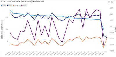
And ultimatelly i need to be able to grab data from 2020, 2021 and %YoY and plot it on the line chart.
Can this be done?
- Mark as New
- Bookmark
- Subscribe
- Mute
- Subscribe to RSS Feed
- Permalink
- Report Inappropriate Content
Hi, @Anonymous
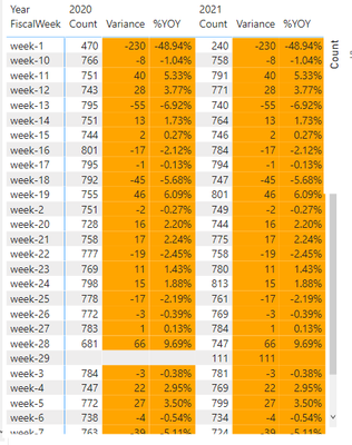
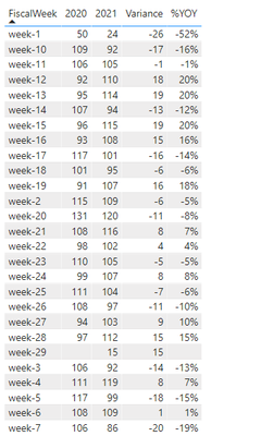
If you keep your data structure, then you can't get the above matrix effect, unless you pivot the year column, and then use a table to achieve such a visual effect.
Matrix:
Pivot the year column and use a table visual.
Please refer to the attachment below for details
Hope this helps.
Best Regards,
Community Support Team _ Zeon Zheng
If this post helps, then please consider Accept it as the solution to help the other members find it more quickly.
Helpful resources

Power BI Monthly Update - November 2025
Check out the November 2025 Power BI update to learn about new features.

Fabric Data Days
Advance your Data & AI career with 50 days of live learning, contests, hands-on challenges, study groups & certifications and more!

| User | Count |
|---|---|
| 99 | |
| 76 | |
| 56 | |
| 51 | |
| 46 |
