Party with Power BI’s own Guy in a Cube
Power BI is turning 10! Tune in for a special live episode on July 24 with behind-the-scenes stories, product evolution highlights, and a sneak peek at what’s in store for the future.
Save the date- Power BI forums
- Get Help with Power BI
- Desktop
- Service
- Report Server
- Power Query
- Mobile Apps
- Developer
- DAX Commands and Tips
- Custom Visuals Development Discussion
- Health and Life Sciences
- Power BI Spanish forums
- Translated Spanish Desktop
- Training and Consulting
- Instructor Led Training
- Dashboard in a Day for Women, by Women
- Galleries
- Data Stories Gallery
- Themes Gallery
- Contests Gallery
- Quick Measures Gallery
- Notebook Gallery
- Translytical Task Flow Gallery
- TMDL Gallery
- R Script Showcase
- Webinars and Video Gallery
- Ideas
- Custom Visuals Ideas (read-only)
- Issues
- Issues
- Events
- Upcoming Events
Enhance your career with this limited time 50% discount on Fabric and Power BI exams. Ends August 31st. Request your voucher.
- Power BI forums
- Forums
- Get Help with Power BI
- Desktop
- Re: How to apply conditional formatting on data le...
- Subscribe to RSS Feed
- Mark Topic as New
- Mark Topic as Read
- Float this Topic for Current User
- Bookmark
- Subscribe
- Printer Friendly Page
- Mark as New
- Bookmark
- Subscribe
- Mute
- Subscribe to RSS Feed
- Permalink
- Report Inappropriate Content
How to apply conditional formatting on data level in clustered bar chart ?
Hello Team,
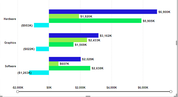
I'm encountering an issue where I've utilized a clustered bar chart to represent some data. I need assistance with a specific requirement: for negative values in the chart, I want the bars to be displayed in red color. Can someone provide guidance on how to achieve this? Your help would be greatly appreciated. I have included a visual representation for reference.
Solved! Go to Solution.
- Mark as New
- Bookmark
- Subscribe
- Mute
- Subscribe to RSS Feed
- Permalink
- Report Inappropriate Content
Hi @jay3vedi ,
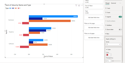
According to your description and the example screenshot provided, you are using a clustered bar chart. And in this example screenshot you have categorized these. As you can see on the chart, the negative numbers are in the same category, and if you want to change the color, go to -> Format ->Bars->Appply setting to targrt type->Change color to red
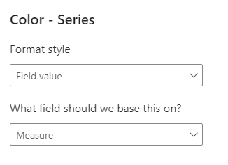
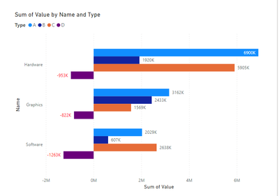
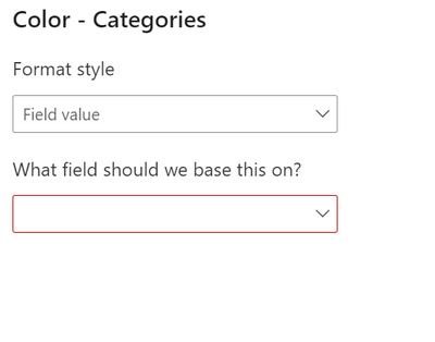
But from your description then you are trying to turn all the negative bars red. This is not possible because your category determines the color of your series of bars. But you can achieve the effect you want by changing the color of the data lable. First create a measure, then go to Format -> Data labels ->value ->apply measure to conditional formatting
Fianl output
Best regards,
Albert He
If this post helps, then please consider Accept it as the solution to help the other members find it more quickly
- Mark as New
- Bookmark
- Subscribe
- Mute
- Subscribe to RSS Feed
- Permalink
- Report Inappropriate Content
Hi @jay3vedi
Refer this video below
https://www.youtube.com/watch?v=MItQGef79Lc
I hope this resolves your issue!
- Mark as New
- Bookmark
- Subscribe
- Mute
- Subscribe to RSS Feed
- Permalink
- Report Inappropriate Content
Hi @jay3vedi
Or you can try with measure
Color= if(sum(sales)<0, "red")
use this color measure in conditional formatting of column color
select filed value and measure color under setting of column color.
Helpful resources
| User | Count |
|---|---|
| 74 | |
| 73 | |
| 39 | |
| 25 | |
| 24 |
| User | Count |
|---|---|
| 96 | |
| 93 | |
| 51 | |
| 43 | |
| 42 |
