Party with Power BI’s own Guy in a Cube
Power BI is turning 10! Tune in for a special live episode on July 24 with behind-the-scenes stories, product evolution highlights, and a sneak peek at what’s in store for the future.
Save the date- Power BI forums
- Get Help with Power BI
- Desktop
- Service
- Report Server
- Power Query
- Mobile Apps
- Developer
- DAX Commands and Tips
- Custom Visuals Development Discussion
- Health and Life Sciences
- Power BI Spanish forums
- Translated Spanish Desktop
- Training and Consulting
- Instructor Led Training
- Dashboard in a Day for Women, by Women
- Galleries
- Webinars and Video Gallery
- Data Stories Gallery
- Themes Gallery
- Contests Gallery
- Quick Measures Gallery
- Notebook Gallery
- Translytical Task Flow Gallery
- R Script Showcase
- Ideas
- Custom Visuals Ideas (read-only)
- Issues
- Issues
- Events
- Upcoming Events
Enhance your career with this limited time 50% discount on Fabric and Power BI exams. Ends August 31st. Request your voucher.
- Power BI forums
- Forums
- Get Help with Power BI
- Desktop
- Re: How to add color in my matrix?
- Subscribe to RSS Feed
- Mark Topic as New
- Mark Topic as Read
- Float this Topic for Current User
- Bookmark
- Subscribe
- Printer Friendly Page
- Mark as New
- Bookmark
- Subscribe
- Mute
- Subscribe to RSS Feed
- Permalink
- Report Inappropriate Content
How to add color in my matrix?
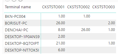
Now I have a matrix that contains the valuable information. I want to add color to the value for making it easy to present.
If the value is greater than 15, I want to show that critical as a red color.
If the value is between 7-14, I want to show that medium as a yellow color.
If the value is less than 6, I want to show that low as a green color.
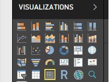
Now I use the matrix visualization in which in the yellow box.
So, I would like to ask somebody that can help me solve the problem.
Best regard.
Solved! Go to Solution.
- Mark as New
- Bookmark
- Subscribe
- Mute
- Subscribe to RSS Feed
- Permalink
- Report Inappropriate Content
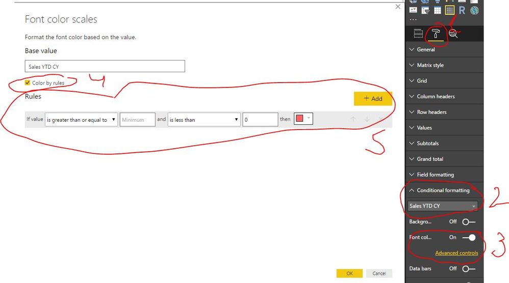
This is how you do that (see picture attached):
1. Select Format pane
2. Select Conditional Formatting and choose column for which you would like to apply conditional formatting
3. Select Font Color scales and press Advanced Control
4. Select Color by rules
5. Define your conditional formatting logic
Helpful resources

Power BI Monthly Update - July 2025
Check out the July 2025 Power BI update to learn about new features.

Join our Fabric User Panel
This is your chance to engage directly with the engineering team behind Fabric and Power BI. Share your experiences and shape the future.

| User | Count |
|---|---|
| 72 | |
| 70 | |
| 37 | |
| 29 | |
| 26 |
| User | Count |
|---|---|
| 91 | |
| 49 | |
| 44 | |
| 38 | |
| 37 |


