Fabric Data Days starts November 4th!
Advance your Data & AI career with 50 days of live learning, dataviz contests, hands-on challenges, study groups & certifications and more!
Get registered- Power BI forums
- Get Help with Power BI
- Desktop
- Service
- Report Server
- Power Query
- Mobile Apps
- Developer
- DAX Commands and Tips
- Custom Visuals Development Discussion
- Health and Life Sciences
- Power BI Spanish forums
- Translated Spanish Desktop
- Training and Consulting
- Instructor Led Training
- Dashboard in a Day for Women, by Women
- Galleries
- Data Stories Gallery
- Themes Gallery
- Contests Gallery
- Quick Measures Gallery
- Visual Calculations Gallery
- Notebook Gallery
- Translytical Task Flow Gallery
- TMDL Gallery
- R Script Showcase
- Webinars and Video Gallery
- Ideas
- Custom Visuals Ideas (read-only)
- Issues
- Issues
- Events
- Upcoming Events
Get Fabric Certified for FREE during Fabric Data Days. Don't miss your chance! Learn more
- Power BI forums
- Forums
- Get Help with Power BI
- Desktop
- Re: How to add a dynamic average line on same axis...
- Subscribe to RSS Feed
- Mark Topic as New
- Mark Topic as Read
- Float this Topic for Current User
- Bookmark
- Subscribe
- Printer Friendly Page
- Mark as New
- Bookmark
- Subscribe
- Mute
- Subscribe to RSS Feed
- Permalink
- Report Inappropriate Content
How to add a dynamic average line on same axis in Power BI Line Chart?
Hello,
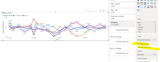
I have a line chart with revenue by region (4 regions). I need to add a dynamic average line (not from the power bi trend line) for all regions to the same axis. So I tried adding it, but I could not add it. It used to be easy, all you have to do is drag it to the value field, but now we have the Y axis and secondary Y axis. I could not add it.
Is there an easy way I can add this? Please help me out. Any help will be highly appreciated.
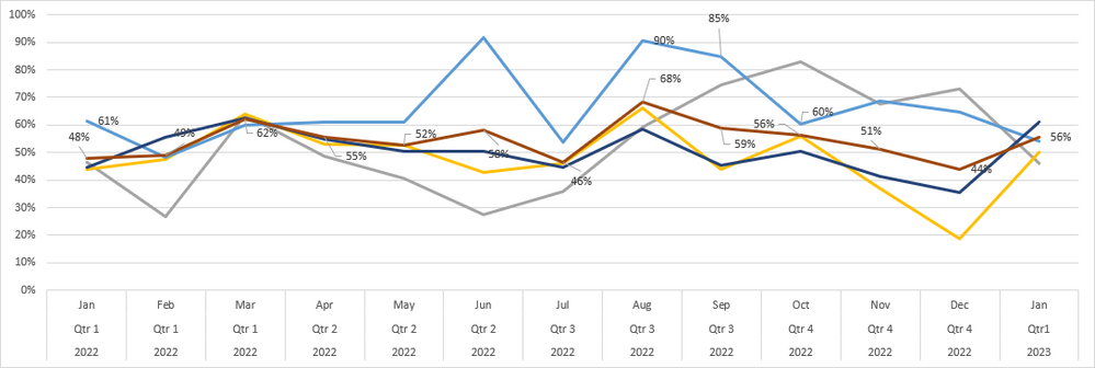
The output result I want is below. (Red line is my average line) I don't want a dual axis.
This is what I got so far.
Sample file
https://drive.google.com/file/d/1PnFHbpYGvZ9DiBjlEJp38r3XhrI2NmGd/view?usp=share_link
Data
Thank you so much
- Mark as New
- Bookmark
- Subscribe
- Mute
- Subscribe to RSS Feed
- Permalink
- Report Inappropriate Content
@rajulshah
Thank you so much for your response. I want all lines including the average in one line chart and on one axis.
I just try to do what you say, but it won't allow measures to add it to the Y axis tho. This is where I am having a hard time. Can you please tell me why is that? Just trying to get into a 1 chart.
Again, thank you
- Mark as New
- Bookmark
- Subscribe
- Mute
- Subscribe to RSS Feed
- Permalink
- Report Inappropriate Content
@Tony88 ,
It's the reason as mentioned here:
"Please know that you can either plot the legends and one measure in Primary Y-axis OR you can have your measures in both Primary and Secondary Y-axis."
You can have either of two approaches.
- Mark as New
- Bookmark
- Subscribe
- Mute
- Subscribe to RSS Feed
- Permalink
- Report Inappropriate Content
@Tony88 please mark the solution as accepted to help fellow Power BI Users.
Thanks.
- Mark as New
- Bookmark
- Subscribe
- Mute
- Subscribe to RSS Feed
- Permalink
- Report Inappropriate Content
@rajulshah
I was able to do this wit this DaX. So I can not accept your answer. I will post it later. Thank you so much for your input
- Mark as New
- Bookmark
- Subscribe
- Mute
- Subscribe to RSS Feed
- Permalink
- Report Inappropriate Content
Any chance you're still willing to share your DAX solution?
Thanks!
- Mark as New
- Bookmark
- Subscribe
- Mute
- Subscribe to RSS Feed
- Permalink
- Report Inappropriate Content
@Tony88 ,
Please know that you can either plot the legends and one measure in Primary Y-axis OR you can have your measures in both Primary and Secondary Y-axis.
OR
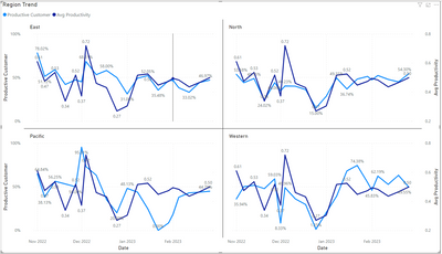
You can plot the below graph:
Please let me know if this didn't help.
Helpful resources

Fabric Data Days
Advance your Data & AI career with 50 days of live learning, contests, hands-on challenges, study groups & certifications and more!

Power BI Monthly Update - October 2025
Check out the October 2025 Power BI update to learn about new features.

| User | Count |
|---|---|
| 87 | |
| 49 | |
| 36 | |
| 31 | |
| 30 |


