Become a Certified Power BI Data Analyst!
Join us for an expert-led overview of the tools and concepts you'll need to pass exam PL-300. The first session starts on June 11th. See you there!
Get registered- Power BI forums
- Get Help with Power BI
- Desktop
- Service
- Report Server
- Power Query
- Mobile Apps
- Developer
- DAX Commands and Tips
- Custom Visuals Development Discussion
- Health and Life Sciences
- Power BI Spanish forums
- Translated Spanish Desktop
- Training and Consulting
- Instructor Led Training
- Dashboard in a Day for Women, by Women
- Galleries
- Webinars and Video Gallery
- Data Stories Gallery
- Themes Gallery
- Contests Gallery
- Quick Measures Gallery
- Notebook Gallery
- Translytical Task Flow Gallery
- R Script Showcase
- Ideas
- Custom Visuals Ideas (read-only)
- Issues
- Issues
- Events
- Upcoming Events
Power BI is turning 10! Let’s celebrate together with dataviz contests, interactive sessions, and giveaways. Register now.
- Power BI forums
- Forums
- Get Help with Power BI
- Desktop
- Re: How do I format the chart that appears when I ...
- Subscribe to RSS Feed
- Mark Topic as New
- Mark Topic as Read
- Float this Topic for Current User
- Bookmark
- Subscribe
- Printer Friendly Page
- Mark as New
- Bookmark
- Subscribe
- Mute
- Subscribe to RSS Feed
- Permalink
- Report Inappropriate Content
How do I format the chart that appears when I filter the data
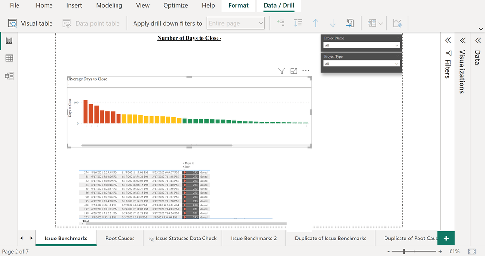
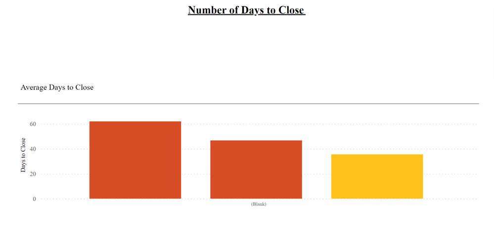
I have a drop down that filters a chart. The chart displays great when it displays for all projects. If I pick one of the projects from the filter, it displays the bars much larger.
Is there a way to make the bars that displays for only one project appear smaller? Are there settings, where the area destinated for the chart be resized?
- Mark as New
- Bookmark
- Subscribe
- Mute
- Subscribe to RSS Feed
- Permalink
- Report Inappropriate Content
@Strongbuck you can control Y-Axis by measure, check this link Customize X-axis and Y-axis properties - Power BI | Microsoft Learn
Follow us on LinkedIn and to our YouTube channel
I would ❤ Kudos if my solution helped. If you can spend time posting the question, you can also make effort to give Kudos to whoever helped to solve your problem. It is a token of appreciation!
Subscribe to the @PowerBIHowTo YT channel for an upcoming video on List and Record functions in Power Query!!
Learn Power BI and Fabric - subscribe to our YT channel - Click here: @PowerBIHowTo
If my solution proved useful, I'd be delighted to receive Kudos. When you put effort into asking a question, it's equally thoughtful to acknowledge and give Kudos to the individual who helped you solve the problem. It's a small gesture that shows appreciation and encouragement! ❤
Did I answer your question? Mark my post as a solution. Proud to be a Super User! Appreciate your Kudos 🙂
Feel free to email me with any of your BI needs.
- Mark as New
- Bookmark
- Subscribe
- Mute
- Subscribe to RSS Feed
- Permalink
- Report Inappropriate Content
I reviewed all of the options for my chart. No where did I see where I could resize the chart that displays when I filter or an option to set a Max size for the bars that appear.
The initial chart displays as depicted below. The second image is how it displays after I select a filter. The bars that display are too large. The transition between chart 1 and the drilldown is not smooth at all.
- Mark as New
- Bookmark
- Subscribe
- Mute
- Subscribe to RSS Feed
- Permalink
- Report Inappropriate Content
I see that there is a "minimum category width". I need a "maximum category width" option. Does this exists? It would be even better, if I could control the length of the entire chart.
Helpful resources

Join our Fabric User Panel
This is your chance to engage directly with the engineering team behind Fabric and Power BI. Share your experiences and shape the future.

Power BI Monthly Update - June 2025
Check out the June 2025 Power BI update to learn about new features.

| User | Count |
|---|---|
| 84 | |
| 75 | |
| 68 | |
| 41 | |
| 35 |
| User | Count |
|---|---|
| 102 | |
| 56 | |
| 52 | |
| 46 | |
| 40 |


