Join us at FabCon Vienna from September 15-18, 2025
The ultimate Fabric, Power BI, SQL, and AI community-led learning event. Save €200 with code FABCOMM.
Get registered- Power BI forums
- Get Help with Power BI
- Desktop
- Service
- Report Server
- Power Query
- Mobile Apps
- Developer
- DAX Commands and Tips
- Custom Visuals Development Discussion
- Health and Life Sciences
- Power BI Spanish forums
- Translated Spanish Desktop
- Training and Consulting
- Instructor Led Training
- Dashboard in a Day for Women, by Women
- Galleries
- Data Stories Gallery
- Themes Gallery
- Contests Gallery
- Quick Measures Gallery
- Notebook Gallery
- Translytical Task Flow Gallery
- TMDL Gallery
- R Script Showcase
- Webinars and Video Gallery
- Ideas
- Custom Visuals Ideas (read-only)
- Issues
- Issues
- Events
- Upcoming Events
Enhance your career with this limited time 50% discount on Fabric and Power BI exams. Ends August 31st. Request your voucher.
- Power BI forums
- Forums
- Get Help with Power BI
- Desktop
- Re: How can I add a Summary Total in the chart?
- Subscribe to RSS Feed
- Mark Topic as New
- Mark Topic as Read
- Float this Topic for Current User
- Bookmark
- Subscribe
- Printer Friendly Page
- Mark as New
- Bookmark
- Subscribe
- Mute
- Subscribe to RSS Feed
- Permalink
- Report Inappropriate Content
How can I add a Summary Total in the chart?
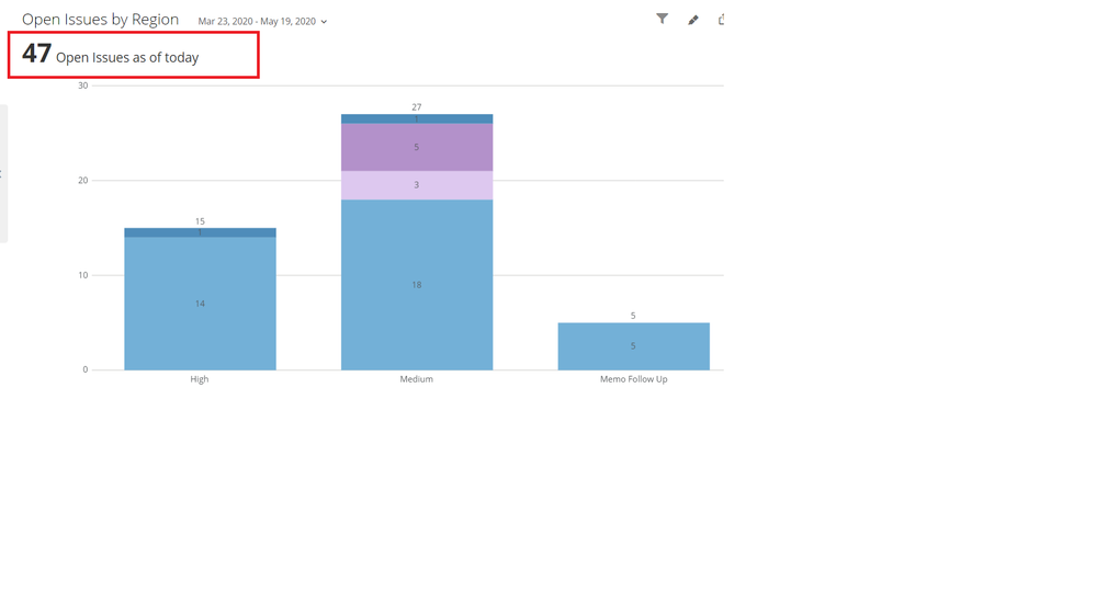
All the charts we use have a Summary total that shows how many items are displayed in all the bars.
How can I achieve this in Power BI? I have searched everywhere but found nothing.
Solved! Go to Solution.
- Mark as New
- Bookmark
- Subscribe
- Mute
- Subscribe to RSS Feed
- Permalink
- Report Inappropriate Content
@GabrielDC I think there is way around to achive this output. You can use another small visual which is Card visual. This card visual can be used to show the total and you can then place in over your main chart. This way you will be able to view the updated total from the bar chart on to the Card visual.
Did I answer your question? Mark my post as a solution!
Appreciate your Kudos
Proud to be a Super User!
Follow me on linkedin
- Mark as New
- Bookmark
- Subscribe
- Mute
- Subscribe to RSS Feed
- Permalink
- Report Inappropriate Content
Hi @GabrielDC ... This is not possible in power Bi but i did the same thing. These are the Steps:
1. Create the measure:
2. Paste on the card and it will look like
 summary Total
Thanks
- Mark as New
- Bookmark
- Subscribe
- Mute
- Subscribe to RSS Feed
- Permalink
- Report Inappropriate Content
@GabrielDC I think there is way around to achive this output. You can use another small visual which is Card visual. This card visual can be used to show the total and you can then place in over your main chart. This way you will be able to view the updated total from the bar chart on to the Card visual.
Did I answer your question? Mark my post as a solution!
Appreciate your Kudos
Proud to be a Super User!
Follow me on linkedin
- Mark as New
- Bookmark
- Subscribe
- Mute
- Subscribe to RSS Feed
- Permalink
- Report Inappropriate Content
Hi, thanks for this, I tried this however when you maximize the chart in the screen the visual card disappears, is there a way to group them together?
- Mark as New
- Bookmark
- Subscribe
- Mute
- Subscribe to RSS Feed
- Permalink
- Report Inappropriate Content
Hi,
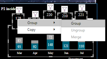
If you select all the Kpi's and right click on selected Kpi's it will give you option of Grouping.
Hope You will get this !!
Thanks
- Mark as New
- Bookmark
- Subscribe
- Mute
- Subscribe to RSS Feed
- Permalink
- Report Inappropriate Content
@GabrielDCYes there is an option to group items. Please select your chart and the visual showing total then under the Format menu you will get option to group them together. I hope it helps. Further, there is no need to create a seperate measure.
Did I answer your question? Mark my post as a solution!
Appreciate your Kudos
Proud to be a Super User!
Follow me on linkedin
- Mark as New
- Bookmark
- Subscribe
- Mute
- Subscribe to RSS Feed
- Permalink
- Report Inappropriate Content
Can you just add a card visual with the same measure as in the chart and put it over the corner of your chart?
If this works for you, please mark it as solution. Kudos are appreciated too. Please let me know if not.
Regards,
Pat
Did I answer your question? Mark my post as a solution! Kudos are also appreciated!
To learn more about Power BI, follow me on Twitter or subscribe on YouTube.
@mahoneypa HoosierBI on YouTube
Helpful resources
| User | Count |
|---|---|
| 78 | |
| 74 | |
| 43 | |
| 32 | |
| 28 |
| User | Count |
|---|---|
| 104 | |
| 93 | |
| 51 | |
| 51 | |
| 46 |


