FabCon is coming to Atlanta
Join us at FabCon Atlanta from March 16 - 20, 2026, for the ultimate Fabric, Power BI, AI and SQL community-led event. Save $200 with code FABCOMM.
Register now!- Power BI forums
- Get Help with Power BI
- Desktop
- Service
- Report Server
- Power Query
- Mobile Apps
- Developer
- DAX Commands and Tips
- Custom Visuals Development Discussion
- Health and Life Sciences
- Power BI Spanish forums
- Translated Spanish Desktop
- Training and Consulting
- Instructor Led Training
- Dashboard in a Day for Women, by Women
- Galleries
- Data Stories Gallery
- Themes Gallery
- Contests Gallery
- QuickViz Gallery
- Quick Measures Gallery
- Visual Calculations Gallery
- Notebook Gallery
- Translytical Task Flow Gallery
- TMDL Gallery
- R Script Showcase
- Webinars and Video Gallery
- Ideas
- Custom Visuals Ideas (read-only)
- Issues
- Issues
- Events
- Upcoming Events
The Power BI Data Visualization World Championships is back! Get ahead of the game and start preparing now! Learn more
- Power BI forums
- Forums
- Get Help with Power BI
- Desktop
- Re: How To create Distribution Chart(Bell chart) i...
- Subscribe to RSS Feed
- Mark Topic as New
- Mark Topic as Read
- Float this Topic for Current User
- Bookmark
- Subscribe
- Printer Friendly Page
- Mark as New
- Bookmark
- Subscribe
- Mute
- Subscribe to RSS Feed
- Permalink
- Report Inappropriate Content
How To create Distribution Chart(Bell chart) in Power BI
Hi ,
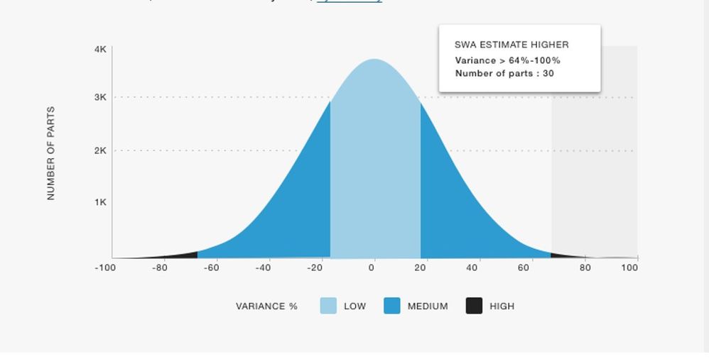
I'm Tableau Developer and very new to Power BI and got new request from my team to build a Distribution Chart(Bell Chart) in Power BI.
I have 2 Columns
1. Risk Score : I have created New Column(color legend) as (if risk score is LOw(>0<40) , Medium(>41<70), High(>71<100) by risk Score)
2. Number of Part Number: i have taken count
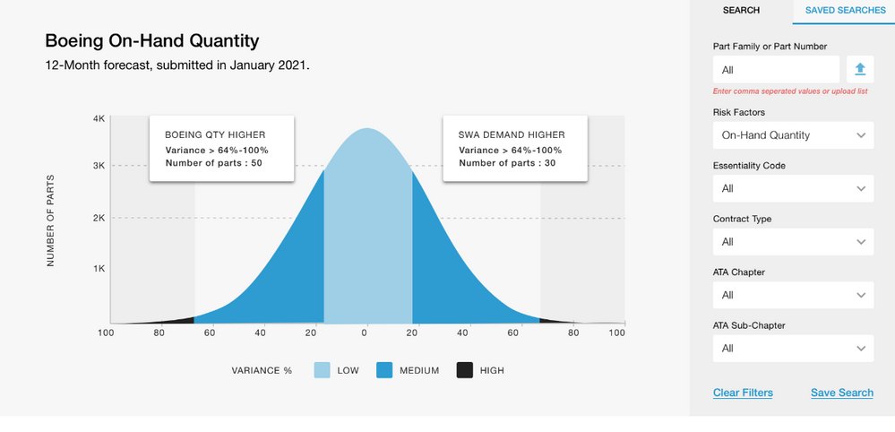
Kindly help me to build a below chart in power BI
Solved! Go to Solution.
- Mark as New
- Bookmark
- Subscribe
- Mute
- Subscribe to RSS Feed
- Permalink
- Report Inappropriate Content
Hi @Anonymous
For the color legend, you could split the line into 3 lines. Create measures for 3 Risk score separately and put all of them into Values. Then format them with different colors and turn on shade area.
f(x) High = IF('Normal Distribution'[X]<FLOOR([x-2],1)||'Normal Distribution'[X]>FLOOR([x+2],1),[f(x)],BLANK())
f(x) Medium = IF(('Normal Distribution'[X]>FLOOR([x-2],1)&&'Normal Distribution'[X]<FLOOR([x-1],1))||('Normal Distribution'[X]>FLOOR([x+1],1)&&'Normal Distribution'[X]<FLOOR([x+2],1)),[f(x)],BLANK())
f(x) Low = IF('Normal Distribution'[X]>FLOOR([x-1],1)&&'Normal Distribution'[X]<FLOOR([x+1],1),[f(x)],BLANK())
For the count of Part number shown in Y axis, I don't know how to deal with it. Sorry.
Regards,
Community Support Team _ Jing
If this post helps, please Accept it as the solution to help other members find it.
- Mark as New
- Bookmark
- Subscribe
- Mute
- Subscribe to RSS Feed
- Permalink
- Report Inappropriate Content
Hi @Anonymous
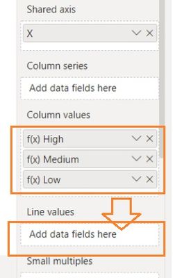
All of f(x) High / Medium / Low measures should be placed in the Line values rather than Column values. You can remove the original f(x) measure from Line values to check the result. They should connect then. Let me know if it works or not.
Regards,
Jing
- Mark as New
- Bookmark
- Subscribe
- Mute
- Subscribe to RSS Feed
- Permalink
- Report Inappropriate Content
- Mark as New
- Bookmark
- Subscribe
- Mute
- Subscribe to RSS Feed
- Permalink
- Report Inappropriate Content
Hi @Anonymous
Seems close, we need to do some formattings further.
- Under X axis, change Type from Continuous to Categorical.
- Right click on the X field in Shared axis and select Show items with no data option.
- On the chart, click ... and select Sort by X and Sort ascending.
And in the formulas, change all > and < signs to >= and <= to connect the boundry values.
Jing
- Mark as New
- Bookmark
- Subscribe
- Mute
- Subscribe to RSS Feed
- Permalink
- Report Inappropriate Content
Use the NORM.DIST() DAX function across your data and plot it in a line chart. NORM.DIST function (DAX) - DAX | Microsoft Docs
Normal Distribution (Gauss Curve) in Power BI (Part I) - YouTube
- Mark as New
- Bookmark
- Subscribe
- Mute
- Subscribe to RSS Feed
- Permalink
- Report Inappropriate Content
Hi Ibendlin,
Thank you for quick response.
I have gone through the youtube videos and came up with below chart, but i would like to show in
Y axis as count of Part number & color legend as low, medium and high.
Kindly help me to build it as above sample chart.
For your reference :
- Mark as New
- Bookmark
- Subscribe
- Mute
- Subscribe to RSS Feed
- Permalink
- Report Inappropriate Content
Hi @Anonymous
For the color legend, you could split the line into 3 lines. Create measures for 3 Risk score separately and put all of them into Values. Then format them with different colors and turn on shade area.
f(x) High = IF('Normal Distribution'[X]<FLOOR([x-2],1)||'Normal Distribution'[X]>FLOOR([x+2],1),[f(x)],BLANK())
f(x) Medium = IF(('Normal Distribution'[X]>FLOOR([x-2],1)&&'Normal Distribution'[X]<FLOOR([x-1],1))||('Normal Distribution'[X]>FLOOR([x+1],1)&&'Normal Distribution'[X]<FLOOR([x+2],1)),[f(x)],BLANK())
f(x) Low = IF('Normal Distribution'[X]>FLOOR([x-1],1)&&'Normal Distribution'[X]<FLOOR([x+1],1),[f(x)],BLANK())
For the count of Part number shown in Y axis, I don't know how to deal with it. Sorry.
Regards,
Community Support Team _ Jing
If this post helps, please Accept it as the solution to help other members find it.
- Mark as New
- Bookmark
- Subscribe
- Mute
- Subscribe to RSS Feed
- Permalink
- Report Inappropriate Content
Hello all,
Please help me to create Beel curve in Power BI as mentioned below in the attached screenshot for an example. The data which needs to be shown is 3 different standard deviation of the trend in 4 different ways:
These are 3 different years standard deviation data which is shown for example. I need to create something similar.
- Mark as New
- Bookmark
- Subscribe
- Mute
- Subscribe to RSS Feed
- Permalink
- Report Inappropriate Content
Please provide sample data that covers your issue or question completely, in a usable format (not as a screenshot).
Do not include sensitive information. Do not include anything that is unrelated to the issue or question.
Please show the expected outcome based on the sample data you provided.
Need help uploading data? https://community.fabric.microsoft.com/t5/Community-Blog/How-to-provide-sample-data-in-the-Power-BI-...
Want faster answers? https://community.fabric.microsoft.com/t5/Desktop/How-to-Get-Your-Question-Answered-Quickly/m-p/1447...
- Mark as New
- Bookmark
- Subscribe
- Mute
- Subscribe to RSS Feed
- Permalink
- Report Inappropriate Content
Hi Jing,
Thank you for your reply.
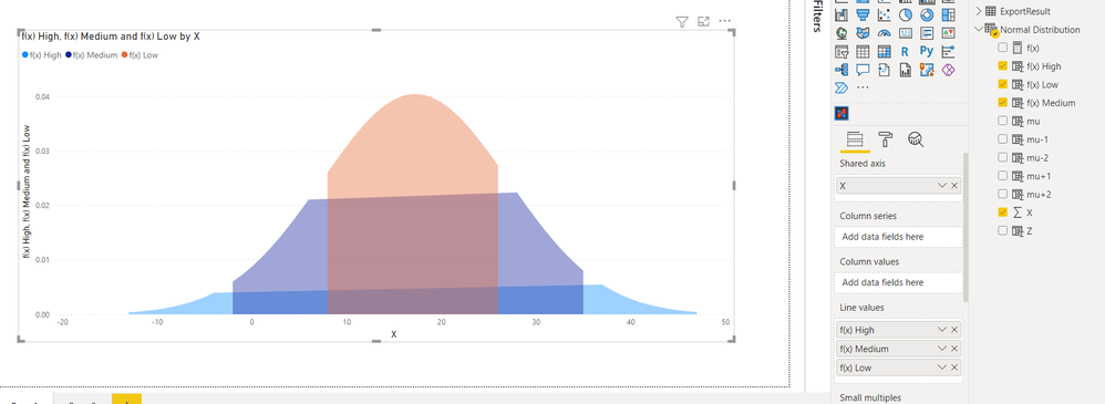
I just applied f(x) High formula, I'm getting below result.
Please do let me know if it is possible to connect.
- Mark as New
- Bookmark
- Subscribe
- Mute
- Subscribe to RSS Feed
- Permalink
- Report Inappropriate Content
Hi @Anonymous
All of f(x) High / Medium / Low measures should be placed in the Line values rather than Column values. You can remove the original f(x) measure from Line values to check the result. They should connect then. Let me know if it works or not.
Regards,
Jing
- Mark as New
- Bookmark
- Subscribe
- Mute
- Subscribe to RSS Feed
- Permalink
- Report Inappropriate Content
Hi Jing,
When i applied your formula i got this result.
- Mark as New
- Bookmark
- Subscribe
- Mute
- Subscribe to RSS Feed
- Permalink
- Report Inappropriate Content
Hi @Anonymous
You should move them to Line values area below.
Jing
- Mark as New
- Bookmark
- Subscribe
- Mute
- Subscribe to RSS Feed
- Permalink
- Report Inappropriate Content
Hi Jing,
Is this correct?
- Mark as New
- Bookmark
- Subscribe
- Mute
- Subscribe to RSS Feed
- Permalink
- Report Inappropriate Content
Hi @Anonymous
Seems close, we need to do some formattings further.
- Under X axis, change Type from Continuous to Categorical.
- Right click on the X field in Shared axis and select Show items with no data option.
- On the chart, click ... and select Sort by X and Sort ascending.
And in the formulas, change all > and < signs to >= and <= to connect the boundry values.
Jing
- Mark as New
- Bookmark
- Subscribe
- Mute
- Subscribe to RSS Feed
- Permalink
- Report Inappropriate Content
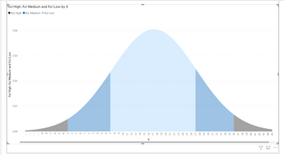
Hi Jing,
you are awesome 🙂 fnally i got the view but is there any way to do the same chart with Variance % & Count of Parts as shown below.
- Mark as New
- Bookmark
- Subscribe
- Mute
- Subscribe to RSS Feed
- Permalink
- Report Inappropriate Content
You can consider creating measures to get the Variance % & Count of Parts, and put them in multi-row card visuals.
Power BI Data Visualization Best Practices Part 6: Multi-Row Cards (instructorbrandon.com)
Helpful resources

Power BI Dataviz World Championships
The Power BI Data Visualization World Championships is back! Get ahead of the game and start preparing now!

| User | Count |
|---|---|
| 38 | |
| 36 | |
| 33 | |
| 33 | |
| 29 |
| User | Count |
|---|---|
| 134 | |
| 96 | |
| 78 | |
| 67 | |
| 65 |
