- Power BI forums
- Get Help with Power BI
- Desktop
- Service
- Report Server
- Power Query
- Mobile Apps
- Developer
- DAX Commands and Tips
- Custom Visuals Development Discussion
- Health and Life Sciences
- Power BI Spanish forums
- Translated Spanish Desktop
- Training and Consulting
- Instructor Led Training
- Dashboard in a Day for Women, by Women
- Galleries
- Data Stories Gallery
- Themes Gallery
- Contests Gallery
- QuickViz Gallery
- Quick Measures Gallery
- Visual Calculations Gallery
- Notebook Gallery
- Translytical Task Flow Gallery
- TMDL Gallery
- R Script Showcase
- Webinars and Video Gallery
- Ideas
- Custom Visuals Ideas (read-only)
- Issues
- Issues
- Events
- Upcoming Events
Join the FabCon + SQLCon recap series. Up next: Power BI, Real-Time Intelligence, IQ and AI, and Data Factory take center stage. All sessions are available on-demand after the live show. Register now
- Power BI forums
- Forums
- Get Help with Power BI
- Desktop
- How To Count with Two Categories
- Subscribe to RSS Feed
- Mark Topic as New
- Mark Topic as Read
- Float this Topic for Current User
- Bookmark
- Subscribe
- Printer Friendly Page
- Mark as New
- Bookmark
- Subscribe
- Mute
- Subscribe to RSS Feed
- Permalink
- Report Inappropriate Content
How To Count with Two Categories
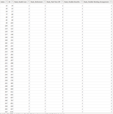
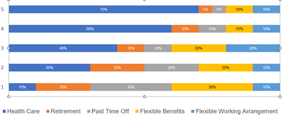
Hi! I wanted to show in report a graph which will present each benefit (health care, pto, retirement, etc.) percentage of rank. Each ID have different answers from 1 to 5 for each benefit.
Wanted to show in the report something like the one below. Like for health care 70% answered 5, etc. etc.
Can anyone help me please 😞
Thank you!
Solved! Go to Solution.
- Mark as New
- Bookmark
- Subscribe
- Mute
- Subscribe to RSS Feed
- Permalink
- Report Inappropriate Content
Hi @Anonymous ,
Please find a solution attached. You will need to unpivot your data to normalise it and this should allow you to get the desired chart.
Hope this helps.
Did I help you today? Please accept my solution and hit the Kudos button.
- Mark as New
- Bookmark
- Subscribe
- Mute
- Subscribe to RSS Feed
- Permalink
- Report Inappropriate Content
- Mark as New
- Bookmark
- Subscribe
- Mute
- Subscribe to RSS Feed
- Permalink
- Report Inappropriate Content
Helpful resources

Power BI Monthly Update - April 2026
Check out the April 2026 Power BI update to learn about new features.

New to Fabric Survey
If you have recently started exploring Fabric, we'd love to hear how it's going. Your feedback can help with product improvements.

Power BI DataViz World Championships - June 2026
A new Power BI DataViz World Championship is coming this June! Don't miss out on submitting your entry.

| User | Count |
|---|---|
| 42 | |
| 37 | |
| 35 | |
| 22 | |
| 15 |
| User | Count |
|---|---|
| 67 | |
| 58 | |
| 29 | |
| 27 | |
| 25 |


