FabCon is coming to Atlanta
Join us at FabCon Atlanta from March 16 - 20, 2026, for the ultimate Fabric, Power BI, AI and SQL community-led event. Save $200 with code FABCOMM.
Register now!- Power BI forums
- Get Help with Power BI
- Desktop
- Service
- Report Server
- Power Query
- Mobile Apps
- Developer
- DAX Commands and Tips
- Custom Visuals Development Discussion
- Health and Life Sciences
- Power BI Spanish forums
- Translated Spanish Desktop
- Training and Consulting
- Instructor Led Training
- Dashboard in a Day for Women, by Women
- Galleries
- Data Stories Gallery
- Themes Gallery
- Contests Gallery
- QuickViz Gallery
- Quick Measures Gallery
- Visual Calculations Gallery
- Notebook Gallery
- Translytical Task Flow Gallery
- TMDL Gallery
- R Script Showcase
- Webinars and Video Gallery
- Ideas
- Custom Visuals Ideas (read-only)
- Issues
- Issues
- Events
- Upcoming Events
The Power BI Data Visualization World Championships is back! Get ahead of the game and start preparing now! Learn more
- Power BI forums
- Forums
- Get Help with Power BI
- Desktop
- Histogram in Power BI
- Subscribe to RSS Feed
- Mark Topic as New
- Mark Topic as Read
- Float this Topic for Current User
- Bookmark
- Subscribe
- Printer Friendly Page
- Mark as New
- Bookmark
- Subscribe
- Mute
- Subscribe to RSS Feed
- Permalink
- Report Inappropriate Content
Histogram in Power BI
I need to create a histogram using Power BI but it appears there is no histogram visualization to choose from. Everytime I try to find resources online I find tutorials explaining how to import a Microsoft visualization for a histogram, but I cannot find this particular one - it just isn't available. I get two other options, both of which do not seem to work and I can't find any resources on how to use them. Does anyone know how to create a pretty basic histogram in Power BI desktop?
Solved! Go to Solution.
- Mark as New
- Bookmark
- Subscribe
- Mute
- Subscribe to RSS Feed
- Permalink
- Report Inappropriate Content
Hi @csaethre19
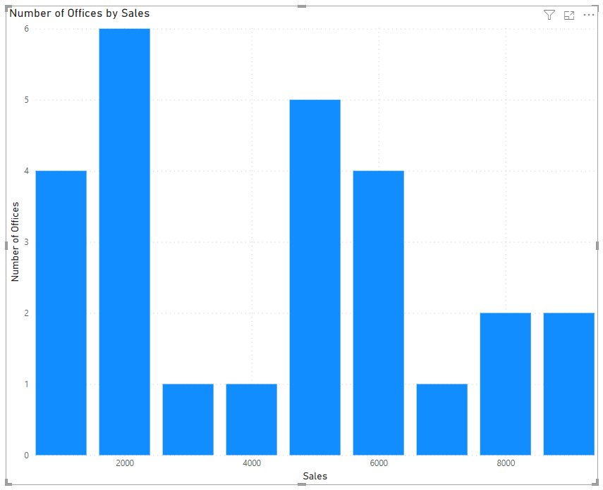
If you want to use the in-built Clustered Column visual, you can create your own bins.
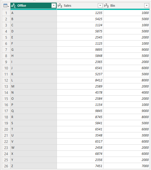
In my example file I've used this data, and added a column for the Bin. Each bin respresents $1000 more in sales.
Then plot the Bin on the x-axis and the Count of Bin on the y-axis (I've renamed the axes)
Your approach would be similar with your data.
Regards
Phil
Did I answer your question? Then please mark my post as the solution.
If I helped you, click on the Thumbs Up to give Kudos.
Blog :: YouTube Channel :: Connect on Linkedin
Proud to be a Super User!
- Mark as New
- Bookmark
- Subscribe
- Mute
- Subscribe to RSS Feed
- Permalink
- Report Inappropriate Content
Hello,
I am facing issues to get the next. I have a table with WOT per Maintenance Name and Creation date and I have the Task Duration. I would like to create a Histogram with the distribution of data to be the next :
IF(Duration < AvgDuration * 0.25, "0-25% of the Average",
IF(Duration < AvgDuration * 0.5, "25-50% of the Average",
IF(Duration < AvgDuration * 0.75, "50-75% of the Average",
IF(Duration < AvgDuration * 1.25, "75-125% of the Average",
IF(Duration < AvgDuration * 1.75, "125%-175% of the Average",
"175%- of the Average"
In order to display the number of WOT that are in each range. Could you give me some support on this? I can't find a way.
Please find the table as a database. I would also be able to filter the Histofra by Maintenance Type or Created date. Thanks for your support
| Number | State WOT | Work Start | Maintenance Type | Created On | Closed At | Work End | Task Duration (hours) |
| WOT0579630 | 3 | 22/01/2025 16:04 | calibration | 22/01/2025 16:02 | 22/01/2025 16:09 | 22/01/2025 16:09 | 0,09 |
| WOT0571105 | 3 | 02/01/2025 11:22 | audit | 02/01/2025 10:53 | 02/01/2025 11:22 | 02/01/2025 11:22 | 0,01 |
| WOT0584768 | 3 | 03/02/2025 18:16 | audit | 03/02/2025 10:57 | 03/02/2025 18:17 | 03/02/2025 18:17 | 0 |
| WOT0571098 | 3 | 02/01/2025 11:25 | audit | 02/01/2025 10:45 | 02/01/2025 11:25 | 02/01/2025 11:25 | 0 |
| WOT0578982 | 3 | 21/01/2025 12:01 | audit | 21/01/2025 11:55 | 21/01/2025 12:34 | 21/01/2025 12:34 | 0,55 |
| WOT0584767 | 3 | 03/02/2025 18:12 | audit | 03/02/2025 10:57 | 03/02/2025 18:15 | 03/02/2025 18:15 | 0,06 |
| WOT0583244 | 3 | 30/01/2025 12:11 | audit | 30/01/2025 12:07 | 30/01/2025 12:32 | 30/01/2025 12:32 | 0,36 |
| WOT0571091 | 3 | 02/01/2025 11:27 | audit | 02/01/2025 10:36 | 02/01/2025 11:27 | 02/01/2025 11:27 | 0,01 |
| WOT0580405 | 3 | 24/01/2025 11:36 | audit | 24/01/2025 11:34 | 24/01/2025 11:53 | 24/01/2025 11:53 | 0,28 |
| WOT0580406 | 3 | 24/01/2025 11:53 | audit | 24/01/2025 11:34 | 24/01/2025 11:54 | 24/01/2025 11:54 | 0,01 |
| WOT0583235 | 3 | 30/01/2025 11:46 | audit | 30/01/2025 11:45 | 30/01/2025 11:46 | 30/01/2025 11:46 | 0,01 |
| WOT0584135 | 3 | 02/02/2025 6:16 | audit | 02/02/2025 6:13 | 02/02/2025 8:12 | 02/02/2025 8:12 | 1,93 |
| WOT0572021 | 3 | 05/01/2025 19:06 | audit | 05/01/2025 18:10 | 05/01/2025 22:25 | 05/01/2025 22:25 | 3,33 |
| WOT0581705 | 3 | 27/01/2025 15:28 | audit | 27/01/2025 15:27 | 27/01/2025 18:46 | 27/01/2025 18:46 | 3,3 |
| WOT0574611 | 3 | 10/01/2025 18:31 | audit | 10/01/2025 18:28 | 10/01/2025 21:04 | 10/01/2025 21:04 | 2,56 |
| WOT0583806 | 3 | 31/01/2025 17:44 | audit | 31/01/2025 16:22 | 31/01/2025 19:34 | 31/01/2025 19:34 | 1,83 |
| WOT0585010 | 3 | 03/02/2025 15:06 | audit | 03/02/2025 15:05 | 03/02/2025 18:31 | 03/02/2025 18:31 | 3,41 |
| WOT0571816 | 3 | 04/01/2025 10:53 | audit | 04/01/2025 9:11 | 04/01/2025 13:18 | 04/01/2025 13:18 | 2,42 |
| WOT0580517 | 3 | 24/01/2025 15:52 | audit | 24/01/2025 15:50 | 24/01/2025 18:06 | 24/01/2025 18:06 | 2,23 |
| WOT0581978 | 3 | 28/01/2025 6:19 | calibration | 28/01/2025 6:18 | 28/01/2025 6:19 | 28/01/2025 6:19 | 0 |
| WOT0581973 | 3 | 28/01/2025 6:15 | calibration | 28/01/2025 6:14 | 28/01/2025 6:15 | 28/01/2025 6:15 | 0,01 |
| WOT0581894 | 3 | 28/01/2025 3:18 | calibration | 28/01/2025 3:18 | 28/01/2025 3:19 | 28/01/2025 3:19 | 0,01 |
| WOT0581897 | 3 | 28/01/2025 3:26 | calibration | 28/01/2025 3:25 | 28/01/2025 3:26 | 28/01/2025 3:26 | 0 |
| WOT0582019 | 3 | 28/01/2025 6:50 | calibration | 28/01/2025 6:49 | 28/01/2025 6:50 | 28/01/2025 6:50 | 0 |
| WOT0581992 | 3 | 28/01/2025 6:27 | calibration | 28/01/2025 6:26 | 28/01/2025 6:27 | 28/01/2025 6:27 | 0,01 |
| WOT0581899 | 3 | 28/01/2025 3:29 | calibration | 28/01/2025 3:28 | 28/01/2025 3:29 | 28/01/2025 3:29 | 0 |
| WOT0584512 | 3 | 03/02/2025 4:07 | calibration | 03/02/2025 4:07 | 03/02/2025 4:08 | 03/02/2025 4:08 | 0 |
| WOT0584506 | 3 | 03/02/2025 4:02 | calibration | 03/02/2025 4:01 | 03/02/2025 4:02 | 03/02/2025 4:02 | 0 |
| WOT0582014 | 3 | 28/01/2025 6:44 | calibration | 28/01/2025 6:43 | 28/01/2025 6:44 | 28/01/2025 6:44 | 0 |
| WOT0582005 | 3 | 28/01/2025 6:38 | calibration | 28/01/2025 6:38 | 28/01/2025 6:38 | 28/01/2025 6:38 | 0 |
| WOT0582033 | 3 | 28/01/2025 7:05 | calibration | 28/01/2025 7:03 | 28/01/2025 7:05 | 28/01/2025 7:05 | 0 |
| WOT0582018 | 3 | 28/01/2025 6:47 | calibration | 28/01/2025 6:46 | 28/01/2025 6:48 | 28/01/2025 6:48 | 0 |
| WOT0581981 | 3 | 28/01/2025 6:21 | calibration | 28/01/2025 6:20 | 28/01/2025 6:21 | 28/01/2025 6:21 | 0 |
| WOT0582026 | 3 | 28/01/2025 6:59 | calibration | 28/01/2025 6:58 | 28/01/2025 7:00 | 28/01/2025 7:00 | 0 |
| WOT0584514 | 3 | 03/02/2025 4:10 | calibration | 03/02/2025 4:09 | 03/02/2025 4:10 | 03/02/2025 4:10 | 0 |
| WOT0581971 | 3 | 28/01/2025 6:13 | calibration | 28/01/2025 6:12 | 28/01/2025 6:13 | 28/01/2025 6:13 | 0 |
| WOT0581908 | 3 | 28/01/2025 3:44 | calibration | 28/01/2025 3:43 | 28/01/2025 3:44 | 28/01/2025 3:44 | 0 |
| WOT0585140 | 3 | 04/02/2025 2:34 | calibration | 04/02/2025 2:33 | 04/02/2025 2:34 | 04/02/2025 2:34 | 0 |
| WOT0584513 | 3 | 03/02/2025 4:09 | calibration | 03/02/2025 4:08 | 03/02/2025 4:09 | 03/02/2025 4:09 | 0 |
| WOT0584509 | 3 | 03/02/2025 4:05 | calibration | 03/02/2025 4:04 | 03/02/2025 4:05 | 03/02/2025 4:05 | 0 |
| WOT0581903 | 3 | 28/01/2025 3:33 | calibration | 28/01/2025 3:32 | 28/01/2025 3:34 | 28/01/2025 3:34 | 0 |
- Mark as New
- Bookmark
- Subscribe
- Mute
- Subscribe to RSS Feed
- Permalink
- Report Inappropriate Content
My hack is that I reduce the spacing between the columns to make it look like a histogram.
Format Visual -> Visual Tab -> Columns -> Layout -> Spacing between columns [0 or 1 %]
- Mark as New
- Bookmark
- Subscribe
- Mute
- Subscribe to RSS Feed
- Permalink
- Report Inappropriate Content
Hi @csaethre19
If you want to use the in-built Clustered Column visual, you can create your own bins.
In my example file I've used this data, and added a column for the Bin. Each bin respresents $1000 more in sales.
Then plot the Bin on the x-axis and the Count of Bin on the y-axis (I've renamed the axes)
Your approach would be similar with your data.
Regards
Phil
Did I answer your question? Then please mark my post as the solution.
If I helped you, click on the Thumbs Up to give Kudos.
Blog :: YouTube Channel :: Connect on Linkedin
Proud to be a Super User!
- Mark as New
- Bookmark
- Subscribe
- Mute
- Subscribe to RSS Feed
- Permalink
- Report Inappropriate Content
I will try this out! Thank you
- Mark as New
- Bookmark
- Subscribe
- Mute
- Subscribe to RSS Feed
- Permalink
- Report Inappropriate Content
Hi @csaethre19
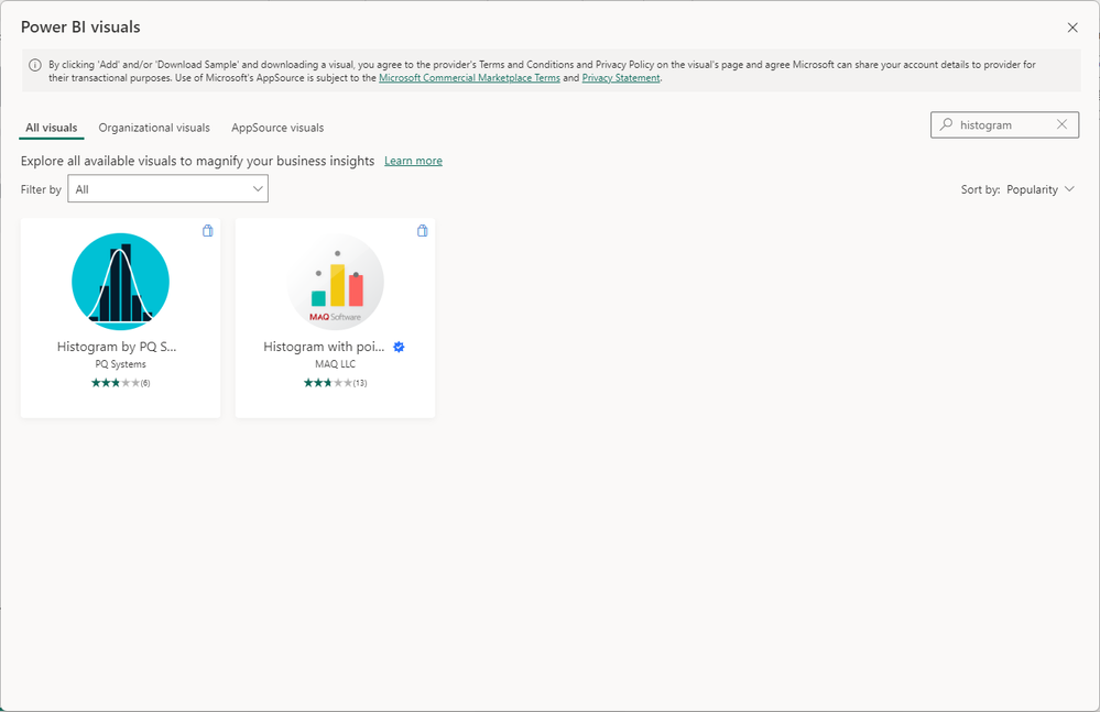
If I go to More Visuals -> From AppSource and then search for Histogram, I get 2 results. You don't?
Regards
Phil
Did I answer your question? Then please mark my post as the solution.
If I helped you, click on the Thumbs Up to give Kudos.
Blog :: YouTube Channel :: Connect on Linkedin
Proud to be a Super User!
- Mark as New
- Bookmark
- Subscribe
- Mute
- Subscribe to RSS Feed
- Permalink
- Report Inappropriate Content
I get those same two results. I just don't understand how to use them and any tutorial I find online mentions a histogram that is built by Microsoft and looks much easier to use.
Helpful resources

Power BI Dataviz World Championships
The Power BI Data Visualization World Championships is back! Get ahead of the game and start preparing now!

| User | Count |
|---|---|
| 38 | |
| 38 | |
| 37 | |
| 28 | |
| 28 |
| User | Count |
|---|---|
| 124 | |
| 89 | |
| 73 | |
| 66 | |
| 65 |


