Party with Power BI’s own Guy in a Cube
Power BI is turning 10! Tune in for a special live episode on July 24 with behind-the-scenes stories, product evolution highlights, and a sneak peek at what’s in store for the future.
Save the date- Power BI forums
- Get Help with Power BI
- Desktop
- Service
- Report Server
- Power Query
- Mobile Apps
- Developer
- DAX Commands and Tips
- Custom Visuals Development Discussion
- Health and Life Sciences
- Power BI Spanish forums
- Translated Spanish Desktop
- Training and Consulting
- Instructor Led Training
- Dashboard in a Day for Women, by Women
- Galleries
- Data Stories Gallery
- Themes Gallery
- Contests Gallery
- Quick Measures Gallery
- Notebook Gallery
- Translytical Task Flow Gallery
- TMDL Gallery
- R Script Showcase
- Webinars and Video Gallery
- Ideas
- Custom Visuals Ideas (read-only)
- Issues
- Issues
- Events
- Upcoming Events
Enhance your career with this limited time 50% discount on Fabric and Power BI exams. Ends August 31st. Request your voucher.
- Power BI forums
- Forums
- Get Help with Power BI
- Desktop
- Re: Histogram in Power BI
- Subscribe to RSS Feed
- Mark Topic as New
- Mark Topic as Read
- Float this Topic for Current User
- Bookmark
- Subscribe
- Printer Friendly Page
- Mark as New
- Bookmark
- Subscribe
- Mute
- Subscribe to RSS Feed
- Permalink
- Report Inappropriate Content
Histogram in Power BI
I need to create a histogram using Power BI but it appears there is no histogram visualization to choose from. Everytime I try to find resources online I find tutorials explaining how to import a Microsoft visualization for a histogram, but I cannot find this particular one - it just isn't available. I get two other options, both of which do not seem to work and I can't find any resources on how to use them. Does anyone know how to create a pretty basic histogram in Power BI desktop?
Solved! Go to Solution.
- Mark as New
- Bookmark
- Subscribe
- Mute
- Subscribe to RSS Feed
- Permalink
- Report Inappropriate Content
Hi @csaethre19
If you want to use the in-built Clustered Column visual, you can create your own bins.
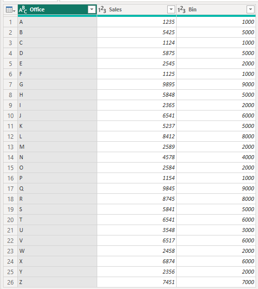
In my example file I've used this data, and added a column for the Bin. Each bin respresents $1000 more in sales.
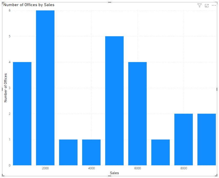
Then plot the Bin on the x-axis and the Count of Bin on the y-axis (I've renamed the axes)
Your approach would be similar with your data.
Regards
Phil
Did I answer your question? Then please mark my post as the solution.
If I helped you, click on the Thumbs Up to give Kudos.
Blog :: YouTube Channel :: Connect on Linkedin
Proud to be a Super User!
- Mark as New
- Bookmark
- Subscribe
- Mute
- Subscribe to RSS Feed
- Permalink
- Report Inappropriate Content
Hello,
I am facing issues to get the next. I have a table with WOT per Maintenance Name and Creation date and I have the Task Duration. I would like to create a Histogram with the distribution of data to be the next :
IF(Duration < AvgDuration * 0.25, "0-25% of the Average",
IF(Duration < AvgDuration * 0.5, "25-50% of the Average",
IF(Duration < AvgDuration * 0.75, "50-75% of the Average",
IF(Duration < AvgDuration * 1.25, "75-125% of the Average",
IF(Duration < AvgDuration * 1.75, "125%-175% of the Average",
"175%- of the Average"
In order to display the number of WOT that are in each range. Could you give me some support on this? I can't find a way.
Please find the table as a database. I would also be able to filter the Histofra by Maintenance Type or Created date. Thanks for your support
| Number | State WOT | Work Start | Maintenance Type | Created On | Closed At | Work End | Task Duration (hours) |
| WOT0579630 | 3 | 22/01/2025 16:04 | calibration | 22/01/2025 16:02 | 22/01/2025 16:09 | 22/01/2025 16:09 | 0,09 |
| WOT0571105 | 3 | 02/01/2025 11:22 | audit | 02/01/2025 10:53 | 02/01/2025 11:22 | 02/01/2025 11:22 | 0,01 |
| WOT0584768 | 3 | 03/02/2025 18:16 | audit | 03/02/2025 10:57 | 03/02/2025 18:17 | 03/02/2025 18:17 | 0 |
| WOT0571098 | 3 | 02/01/2025 11:25 | audit | 02/01/2025 10:45 | 02/01/2025 11:25 | 02/01/2025 11:25 | 0 |
| WOT0578982 | 3 | 21/01/2025 12:01 | audit | 21/01/2025 11:55 | 21/01/2025 12:34 | 21/01/2025 12:34 | 0,55 |
| WOT0584767 | 3 | 03/02/2025 18:12 | audit | 03/02/2025 10:57 | 03/02/2025 18:15 | 03/02/2025 18:15 | 0,06 |
| WOT0583244 | 3 | 30/01/2025 12:11 | audit | 30/01/2025 12:07 | 30/01/2025 12:32 | 30/01/2025 12:32 | 0,36 |
| WOT0571091 | 3 | 02/01/2025 11:27 | audit | 02/01/2025 10:36 | 02/01/2025 11:27 | 02/01/2025 11:27 | 0,01 |
| WOT0580405 | 3 | 24/01/2025 11:36 | audit | 24/01/2025 11:34 | 24/01/2025 11:53 | 24/01/2025 11:53 | 0,28 |
| WOT0580406 | 3 | 24/01/2025 11:53 | audit | 24/01/2025 11:34 | 24/01/2025 11:54 | 24/01/2025 11:54 | 0,01 |
| WOT0583235 | 3 | 30/01/2025 11:46 | audit | 30/01/2025 11:45 | 30/01/2025 11:46 | 30/01/2025 11:46 | 0,01 |
| WOT0584135 | 3 | 02/02/2025 6:16 | audit | 02/02/2025 6:13 | 02/02/2025 8:12 | 02/02/2025 8:12 | 1,93 |
| WOT0572021 | 3 | 05/01/2025 19:06 | audit | 05/01/2025 18:10 | 05/01/2025 22:25 | 05/01/2025 22:25 | 3,33 |
| WOT0581705 | 3 | 27/01/2025 15:28 | audit | 27/01/2025 15:27 | 27/01/2025 18:46 | 27/01/2025 18:46 | 3,3 |
| WOT0574611 | 3 | 10/01/2025 18:31 | audit | 10/01/2025 18:28 | 10/01/2025 21:04 | 10/01/2025 21:04 | 2,56 |
| WOT0583806 | 3 | 31/01/2025 17:44 | audit | 31/01/2025 16:22 | 31/01/2025 19:34 | 31/01/2025 19:34 | 1,83 |
| WOT0585010 | 3 | 03/02/2025 15:06 | audit | 03/02/2025 15:05 | 03/02/2025 18:31 | 03/02/2025 18:31 | 3,41 |
| WOT0571816 | 3 | 04/01/2025 10:53 | audit | 04/01/2025 9:11 | 04/01/2025 13:18 | 04/01/2025 13:18 | 2,42 |
| WOT0580517 | 3 | 24/01/2025 15:52 | audit | 24/01/2025 15:50 | 24/01/2025 18:06 | 24/01/2025 18:06 | 2,23 |
| WOT0581978 | 3 | 28/01/2025 6:19 | calibration | 28/01/2025 6:18 | 28/01/2025 6:19 | 28/01/2025 6:19 | 0 |
| WOT0581973 | 3 | 28/01/2025 6:15 | calibration | 28/01/2025 6:14 | 28/01/2025 6:15 | 28/01/2025 6:15 | 0,01 |
| WOT0581894 | 3 | 28/01/2025 3:18 | calibration | 28/01/2025 3:18 | 28/01/2025 3:19 | 28/01/2025 3:19 | 0,01 |
| WOT0581897 | 3 | 28/01/2025 3:26 | calibration | 28/01/2025 3:25 | 28/01/2025 3:26 | 28/01/2025 3:26 | 0 |
| WOT0582019 | 3 | 28/01/2025 6:50 | calibration | 28/01/2025 6:49 | 28/01/2025 6:50 | 28/01/2025 6:50 | 0 |
| WOT0581992 | 3 | 28/01/2025 6:27 | calibration | 28/01/2025 6:26 | 28/01/2025 6:27 | 28/01/2025 6:27 | 0,01 |
| WOT0581899 | 3 | 28/01/2025 3:29 | calibration | 28/01/2025 3:28 | 28/01/2025 3:29 | 28/01/2025 3:29 | 0 |
| WOT0584512 | 3 | 03/02/2025 4:07 | calibration | 03/02/2025 4:07 | 03/02/2025 4:08 | 03/02/2025 4:08 | 0 |
| WOT0584506 | 3 | 03/02/2025 4:02 | calibration | 03/02/2025 4:01 | 03/02/2025 4:02 | 03/02/2025 4:02 | 0 |
| WOT0582014 | 3 | 28/01/2025 6:44 | calibration | 28/01/2025 6:43 | 28/01/2025 6:44 | 28/01/2025 6:44 | 0 |
| WOT0582005 | 3 | 28/01/2025 6:38 | calibration | 28/01/2025 6:38 | 28/01/2025 6:38 | 28/01/2025 6:38 | 0 |
| WOT0582033 | 3 | 28/01/2025 7:05 | calibration | 28/01/2025 7:03 | 28/01/2025 7:05 | 28/01/2025 7:05 | 0 |
| WOT0582018 | 3 | 28/01/2025 6:47 | calibration | 28/01/2025 6:46 | 28/01/2025 6:48 | 28/01/2025 6:48 | 0 |
| WOT0581981 | 3 | 28/01/2025 6:21 | calibration | 28/01/2025 6:20 | 28/01/2025 6:21 | 28/01/2025 6:21 | 0 |
| WOT0582026 | 3 | 28/01/2025 6:59 | calibration | 28/01/2025 6:58 | 28/01/2025 7:00 | 28/01/2025 7:00 | 0 |
| WOT0584514 | 3 | 03/02/2025 4:10 | calibration | 03/02/2025 4:09 | 03/02/2025 4:10 | 03/02/2025 4:10 | 0 |
| WOT0581971 | 3 | 28/01/2025 6:13 | calibration | 28/01/2025 6:12 | 28/01/2025 6:13 | 28/01/2025 6:13 | 0 |
| WOT0581908 | 3 | 28/01/2025 3:44 | calibration | 28/01/2025 3:43 | 28/01/2025 3:44 | 28/01/2025 3:44 | 0 |
| WOT0585140 | 3 | 04/02/2025 2:34 | calibration | 04/02/2025 2:33 | 04/02/2025 2:34 | 04/02/2025 2:34 | 0 |
| WOT0584513 | 3 | 03/02/2025 4:09 | calibration | 03/02/2025 4:08 | 03/02/2025 4:09 | 03/02/2025 4:09 | 0 |
| WOT0584509 | 3 | 03/02/2025 4:05 | calibration | 03/02/2025 4:04 | 03/02/2025 4:05 | 03/02/2025 4:05 | 0 |
| WOT0581903 | 3 | 28/01/2025 3:33 | calibration | 28/01/2025 3:32 | 28/01/2025 3:34 | 28/01/2025 3:34 | 0 |
- Mark as New
- Bookmark
- Subscribe
- Mute
- Subscribe to RSS Feed
- Permalink
- Report Inappropriate Content
My hack is that I reduce the spacing between the columns to make it look like a histogram.
Format Visual -> Visual Tab -> Columns -> Layout -> Spacing between columns [0 or 1 %]
- Mark as New
- Bookmark
- Subscribe
- Mute
- Subscribe to RSS Feed
- Permalink
- Report Inappropriate Content
Hi @csaethre19
If you want to use the in-built Clustered Column visual, you can create your own bins.
In my example file I've used this data, and added a column for the Bin. Each bin respresents $1000 more in sales.
Then plot the Bin on the x-axis and the Count of Bin on the y-axis (I've renamed the axes)
Your approach would be similar with your data.
Regards
Phil
Did I answer your question? Then please mark my post as the solution.
If I helped you, click on the Thumbs Up to give Kudos.
Blog :: YouTube Channel :: Connect on Linkedin
Proud to be a Super User!
- Mark as New
- Bookmark
- Subscribe
- Mute
- Subscribe to RSS Feed
- Permalink
- Report Inappropriate Content
I will try this out! Thank you
- Mark as New
- Bookmark
- Subscribe
- Mute
- Subscribe to RSS Feed
- Permalink
- Report Inappropriate Content
Hi @csaethre19
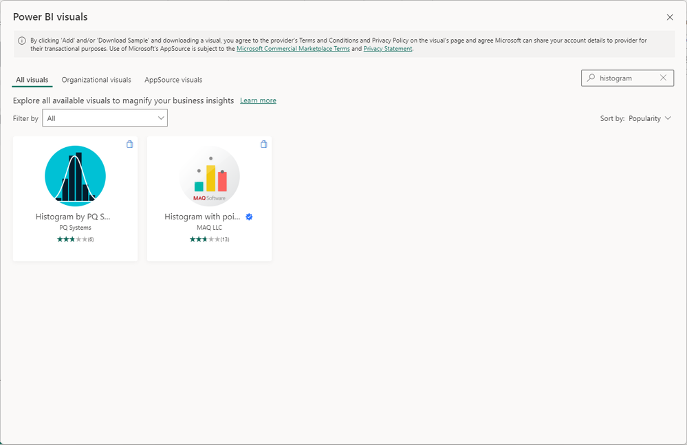
If I go to More Visuals -> From AppSource and then search for Histogram, I get 2 results. You don't?
Regards
Phil
Did I answer your question? Then please mark my post as the solution.
If I helped you, click on the Thumbs Up to give Kudos.
Blog :: YouTube Channel :: Connect on Linkedin
Proud to be a Super User!
- Mark as New
- Bookmark
- Subscribe
- Mute
- Subscribe to RSS Feed
- Permalink
- Report Inappropriate Content
I get those same two results. I just don't understand how to use them and any tutorial I find online mentions a histogram that is built by Microsoft and looks much easier to use.
Helpful resources
| User | Count |
|---|---|
| 78 | |
| 74 | |
| 42 | |
| 32 | |
| 28 |
| User | Count |
|---|---|
| 104 | |
| 93 | |
| 52 | |
| 50 | |
| 46 |


