FabCon is coming to Atlanta
Join us at FabCon Atlanta from March 16 - 20, 2026, for the ultimate Fabric, Power BI, AI and SQL community-led event. Save $200 with code FABCOMM.
Register now!- Power BI forums
- Get Help with Power BI
- Desktop
- Service
- Report Server
- Power Query
- Mobile Apps
- Developer
- DAX Commands and Tips
- Custom Visuals Development Discussion
- Health and Life Sciences
- Power BI Spanish forums
- Translated Spanish Desktop
- Training and Consulting
- Instructor Led Training
- Dashboard in a Day for Women, by Women
- Galleries
- Data Stories Gallery
- Themes Gallery
- Contests Gallery
- QuickViz Gallery
- Quick Measures Gallery
- Visual Calculations Gallery
- Notebook Gallery
- Translytical Task Flow Gallery
- TMDL Gallery
- R Script Showcase
- Webinars and Video Gallery
- Ideas
- Custom Visuals Ideas (read-only)
- Issues
- Issues
- Events
- Upcoming Events
Get Fabric Certified for FREE during Fabric Data Days. Don't miss your chance! Request now
- Power BI forums
- Forums
- Get Help with Power BI
- Desktop
- Re: Histogram from a measure table
- Subscribe to RSS Feed
- Mark Topic as New
- Mark Topic as Read
- Float this Topic for Current User
- Bookmark
- Subscribe
- Printer Friendly Page
- Mark as New
- Bookmark
- Subscribe
- Mute
- Subscribe to RSS Feed
- Permalink
- Report Inappropriate Content
Histogram from a measure table
Hello,
I'm trying to create a histogram to display how the BIAS of a group is behaving.
I created a table through Power Query which can give me the information I need at the highest possible granularity, however I'd like to be able to group this information by SKU.
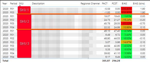
What I currently have is:
Information from original table @ higest granularity
Which would in turn in the grouped level be:
| SKU | FACT | FCST | BIAS |
| SKU 1 | -6.575629991 | 0 | 2 |
| SKU 2 | 111.908 | 93.74465197 | -0.19375 |
| SKU 3 | 200.5332 | 200.5308001 | -1.2E-05 |
*Note in case of SKU 1 I use 2 as BIAS for everything with FCST 0*
When I graph this information with bins created with grouping I get this information:
Which is displaying the 14 rows shown in the highest granularity.
For the purpose of grouping the information I created a measure which returns the amount of grouped SKUs in the category:
CalcBIAS =
VAR BinRange = GENERATESERIES ( -2, 2 , .1 )
Var TempTable =
ADDCOLUMNS(
    SUMMARIZE( 'BIAS (Baseline + FACT)', 'BIAS (Baseline + FACT)'[SKU] ),
    "BIAS", MIN(
        2,
        MAX(
            -2,
            CALCULATE(
                DIVIDE(
                    SUMX(
                        'BIAS (Baseline + FACT)',
                        'BIAS (Baseline + FACT)'[FCST] - 'BIAS (Baseline + FACT)'[FACT]
                    ),
                    SUMX( 'BIAS (Baseline + FACT)', 'BIAS (Baseline + FACT)'[FCST] ),
                    2
                )
            )
        )
    )
)

Return
COUNTX(TempTable, [BIAS])
The result of the TempTable variable is a table which only has SKU and the grouped BIAS
However, when I try to place it in the same graph the result is this:
I get a very similar graph because it's "respecting" the grouping from the original table, so I have a single appearance of SKU 1, 4 SKU 2 and 4 SKU 3 (one for each calculated bin group).
My question is:
How can I change the the axis in my chart to be a series between -2 and 2 (in .1 increments) which doesn't save the original table's relation so I can group info?
- Mark as New
- Bookmark
- Subscribe
- Mute
- Subscribe to RSS Feed
- Permalink
- Report Inappropriate Content
@LABORSAL , I checked out there is no option for tick interval. You can only change the decimal places.
You can try few other Histogram option in custom charts
Refer if this can help for any other : https://spreadsheeto.com/power-bi-histogram/
Please Watch/Like/Share My webinar on Time Intelligence: https://community.powerbi.com/t5/Webinars-and-Video-Gallery/PowerBI-Time-Intelligence-Calendar-WTD-Y...
My Youtube Tips at: https://www.youtube.com/playlist?list=PLPaNVDMhUXGYrm5rm6ME6rjzKGSvT9Jmy
Appreciate your Kudos.
- Mark as New
- Bookmark
- Subscribe
- Mute
- Subscribe to RSS Feed
- Permalink
- Report Inappropriate Content
Current solution for that (which is what I believe is causing the split of groups) is to add a column to the main table
however if I use that column as axis it groups the SKU by bin from main table (which is what I explained in the graphs on original post)
I can recreate this column by adding a calculated column which does the same as the BIAS but rounds down to 1 decimal, however I have no idea how to use this calculated column in the measure for the axis.
- Mark as New
- Bookmark
- Subscribe
- Mute
- Subscribe to RSS Feed
- Permalink
- Report Inappropriate Content
Hi @LABORSAL ,
“I can recreate this column by adding a calculated column which does the same as the BIAS but rounds down to 1 decimal...”
Only methods like this are more effective.
"however I have no idea how to use this calculated column in the measure for the axis."
Measure cannot be added to the axis label, you can understand measure as a dynamic value, so you can only rebuild a calculated column.
Best regards,
Lionel Chen
If this post helps, then please consider Accept it as the solution to help the other members find it more quickly.
Helpful resources

Power BI Monthly Update - November 2025
Check out the November 2025 Power BI update to learn about new features.

Fabric Data Days
Advance your Data & AI career with 50 days of live learning, contests, hands-on challenges, study groups & certifications and more!


