FabCon is coming to Atlanta
Join us at FabCon Atlanta from March 16 - 20, 2026, for the ultimate Fabric, Power BI, AI and SQL community-led event. Save $200 with code FABCOMM.
Register now!- Power BI forums
- Get Help with Power BI
- Desktop
- Service
- Report Server
- Power Query
- Mobile Apps
- Developer
- DAX Commands and Tips
- Custom Visuals Development Discussion
- Health and Life Sciences
- Power BI Spanish forums
- Translated Spanish Desktop
- Training and Consulting
- Instructor Led Training
- Dashboard in a Day for Women, by Women
- Galleries
- Data Stories Gallery
- Themes Gallery
- Contests Gallery
- QuickViz Gallery
- Quick Measures Gallery
- Visual Calculations Gallery
- Notebook Gallery
- Translytical Task Flow Gallery
- TMDL Gallery
- R Script Showcase
- Webinars and Video Gallery
- Ideas
- Custom Visuals Ideas (read-only)
- Issues
- Issues
- Events
- Upcoming Events
View all the Fabric Data Days sessions on demand. View schedule
- Power BI forums
- Forums
- Get Help with Power BI
- Desktop
- Hide names on axis to compare data
- Subscribe to RSS Feed
- Mark Topic as New
- Mark Topic as Read
- Float this Topic for Current User
- Bookmark
- Subscribe
- Printer Friendly Page
- Mark as New
- Bookmark
- Subscribe
- Mute
- Subscribe to RSS Feed
- Permalink
- Report Inappropriate Content
Hide names on axis to compare data
Hello,
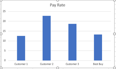
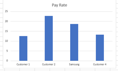
I am working through a report where we are trying to compare customers so we can work with them to show how they are stacking up. What I want to be able to is show only the name of the customer I have selected in the chart while showing other customers in the chart and how they compare. I have some examples below.
Tables of customers
| Company | Company ID | Pay Rate |
| Jones Inc | Customer 1 | 12.5 |
| Apple Products | Customer 2 | 22.75 |
| Samsung | Customer 3 | 18.65 |
| Best Buy | Customer 4 | 13.25 |
View if Best Buy is selected:
View is Samsung is selected:
Any help would be greatly appreciated!
- Mark as New
- Bookmark
- Subscribe
- Mute
- Subscribe to RSS Feed
- Permalink
- Report Inappropriate Content
isn't there a solution yet ?
thanks
- Mark as New
- Bookmark
- Subscribe
- Mute
- Subscribe to RSS Feed
- Permalink
- Report Inappropriate Content
This might not be the easiest way...
but you could create a nearly identical query and only change the names of the cutomers. Then add that data to the chart and create a new slicer.
So you would end up with a chart with 2 slicers. One to display the company name and the other to display Customer X, Y, and Z.
Make sure you do not relate the queries or else the slicers will work on both sets.
Let me know if this is works
- Mark as New
- Bookmark
- Subscribe
- Mute
- Subscribe to RSS Feed
- Permalink
- Report Inappropriate Content
Hello!
Can you please clarify this solution? Maybe some screenshots of what you meant.
Thanks
- Mark as New
- Bookmark
- Subscribe
- Mute
- Subscribe to RSS Feed
- Permalink
- Report Inappropriate Content
This probably would work but I dont like the idea of having to have 2 slicers in order to show the data in one chart correclty.
- Mark as New
- Bookmark
- Subscribe
- Mute
- Subscribe to RSS Feed
- Permalink
- Report Inappropriate Content
I'm trying to do the exact same thing. Did you manage to find a solution?
Helpful resources

Power BI Monthly Update - November 2025
Check out the November 2025 Power BI update to learn about new features.

Fabric Data Days
Advance your Data & AI career with 50 days of live learning, contests, hands-on challenges, study groups & certifications and more!


