Fabric Data Days starts November 4th!
Advance your Data & AI career with 50 days of live learning, dataviz contests, hands-on challenges, study groups & certifications and more!
Get registered- Power BI forums
- Get Help with Power BI
- Desktop
- Service
- Report Server
- Power Query
- Mobile Apps
- Developer
- DAX Commands and Tips
- Custom Visuals Development Discussion
- Health and Life Sciences
- Power BI Spanish forums
- Translated Spanish Desktop
- Training and Consulting
- Instructor Led Training
- Dashboard in a Day for Women, by Women
- Galleries
- Data Stories Gallery
- Themes Gallery
- Contests Gallery
- QuickViz Gallery
- Quick Measures Gallery
- Visual Calculations Gallery
- Notebook Gallery
- Translytical Task Flow Gallery
- TMDL Gallery
- R Script Showcase
- Webinars and Video Gallery
- Ideas
- Custom Visuals Ideas (read-only)
- Issues
- Issues
- Events
- Upcoming Events
Get Fabric Certified for FREE during Fabric Data Days. Don't miss your chance! Request now
- Power BI forums
- Forums
- Get Help with Power BI
- Desktop
- Help with a measure
- Subscribe to RSS Feed
- Mark Topic as New
- Mark Topic as Read
- Float this Topic for Current User
- Bookmark
- Subscribe
- Printer Friendly Page
- Mark as New
- Bookmark
- Subscribe
- Mute
- Subscribe to RSS Feed
- Permalink
- Report Inappropriate Content
Help with a measure
Hi,
I was wondering if someone could help me solve a problem.
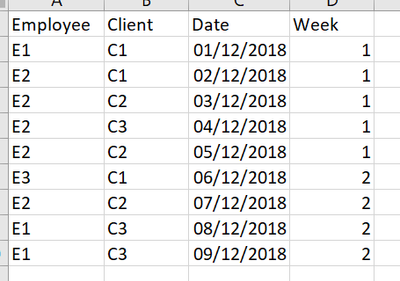
The data I have looks like this:
What I want to achieve is a table that shows how many visits each client had, how many distinct employees worked for the client, and an 'distinct employee-to-visits' ratio. Then, ideally there would be a row or another visual that states how many clients' ratio was below our target (let's say 0.428).
So far I've got:
NoOfVisits = count(Sheet1[Date])
DistinctEmployees = DISTINCTCOUNT(Sheet1[Employee])
EmployeesToVisitsRatio = ROUNDDOWN([DistinctEmployees]/[NoOfVisits],2)
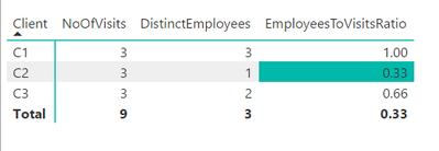
And the table looks like this:
Ideally the solution would enable filtering on week, so it would tell me that in week 1 we had x number of clients hitting the target and in week 2, y number of clients.
Any suggestions? Thank you in advance!
Solved! Go to Solution.
- Mark as New
- Bookmark
- Subscribe
- Mute
- Subscribe to RSS Feed
- Permalink
- Report Inappropriate Content
Hi @redhughes,
Then, ideally there would be a row or another visual that states how many clients' ratio was below our target (let's say 0.428).
If I understand it correctly, you should be able to use the formula below to create a new measure to calculate how many clients' ratio was below the target(0.428). ![]()
Measure =
SUMX (
    SUMMARIZE (
        Sheet1,
        Sheet1[Client],
        "abc", IF ( [EmployeesToVisitsRatio] < 0.428, 1, 0 )
    ),
    [abc]
)
Regards
- Mark as New
- Bookmark
- Subscribe
- Mute
- Subscribe to RSS Feed
- Permalink
- Report Inappropriate Content
worked like a dream, thank you so much!!
- Mark as New
- Bookmark
- Subscribe
- Mute
- Subscribe to RSS Feed
- Permalink
- Report Inappropriate Content
I will have a go with this after xmas - many thanks!
- Mark as New
- Bookmark
- Subscribe
- Mute
- Subscribe to RSS Feed
- Permalink
- Report Inappropriate Content
Add a Slicer visualization based upon Week column?
Follow on LinkedIn
@ me in replies or I'll lose your thread!!!
Instead of a Kudo, please vote for this idea
Become an expert!: Enterprise DNA
External Tools: MSHGQM
YouTube Channel!: Microsoft Hates Greg
Latest book!: DAX For Humans
DAX is easy, CALCULATE makes DAX hard...
- Mark as New
- Bookmark
- Subscribe
- Mute
- Subscribe to RSS Feed
- Permalink
- Report Inappropriate Content
I'm mainly after another measure/way of showing count of clients with the ratio below a certain level. Is the slicer going to achieve this?
Helpful resources

Power BI Monthly Update - November 2025
Check out the November 2025 Power BI update to learn about new features.

Fabric Data Days
Advance your Data & AI career with 50 days of live learning, contests, hands-on challenges, study groups & certifications and more!

| User | Count |
|---|---|
| 97 | |
| 70 | |
| 50 | |
| 42 | |
| 40 |


