This is best Fabric, Power BI, SQL and AI community event. How do we know? The last event sold out! Save €200 with code FABCMTY200.
Register nowThe Fabric community is upgrading! Read all of the details including the timeline and what you can expect. Learn more
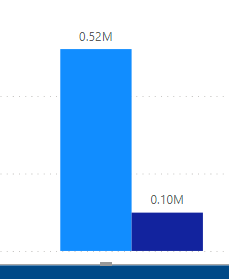
I made a graph with two measures showing Sum of quantities before a certain date Vs after that date-Old Vs new
I made another 2 similar measures that gives output as total amount of the old quantities and Total amount of new quantities.
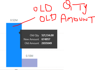
Now if I Hover over, I need it to show Old Qty and Old Amount as description of the first Bar and new qty and $ for the second bar.
at the moment if I put the Old and new amount measure in tool tips, it is showing as below(in the black area), I need the red bit(old with old and new with new)-
Hi @learner03 ,
Sorry, not very clear.
Can you describe your problem in more detail? You can give sample data and expected results.
Best Regards,
Stephen Tao
If this post helps, then please consider Accept it as the solution to help the other members find it more quickly.
Join us in Barcelona for FabCon and SQLCon, the Fabric, Power BI, SQL, and AI community event. Save €200 with code FABCMTY200.
| User | Count |
|---|---|
| 24 | |
| 22 | |
| 20 | |
| 18 | |
| 14 |
| User | Count |
|---|---|
| 31 | |
| 26 | |
| 23 | |
| 20 | |
| 20 |