FabCon is coming to Atlanta
Join us at FabCon Atlanta from March 16 - 20, 2026, for the ultimate Fabric, Power BI, AI and SQL community-led event. Save $200 with code FABCOMM.
Register now!- Power BI forums
- Get Help with Power BI
- Desktop
- Service
- Report Server
- Power Query
- Mobile Apps
- Developer
- DAX Commands and Tips
- Custom Visuals Development Discussion
- Health and Life Sciences
- Power BI Spanish forums
- Translated Spanish Desktop
- Training and Consulting
- Instructor Led Training
- Dashboard in a Day for Women, by Women
- Galleries
- Data Stories Gallery
- Themes Gallery
- Contests Gallery
- Quick Measures Gallery
- Visual Calculations Gallery
- Notebook Gallery
- Translytical Task Flow Gallery
- TMDL Gallery
- R Script Showcase
- Webinars and Video Gallery
- Ideas
- Custom Visuals Ideas (read-only)
- Issues
- Issues
- Events
- Upcoming Events
Calling all Data Engineers! Fabric Data Engineer (Exam DP-700) live sessions are back! Starting October 16th. Sign up.
- Power BI forums
- Forums
- Get Help with Power BI
- Desktop
- Help needed with LookUp Table/List
- Subscribe to RSS Feed
- Mark Topic as New
- Mark Topic as Read
- Float this Topic for Current User
- Bookmark
- Subscribe
- Printer Friendly Page
- Mark as New
- Bookmark
- Subscribe
- Mute
- Subscribe to RSS Feed
- Permalink
- Report Inappropriate Content
Help needed with LookUp Table/List
Hello,
I am trying to do a radar/bar chart with some very basic values.
My final table should have all categories (Quality, Speed, Communication), the count of values (Very Good, Good, Bad) and as legend the lookup table / list (Very Good, Good, Bad). All categories point to the same lookup/list
Customer
| Customer Name | Quality | Speed | Communication |
| A | Very Good | Very Good | Bad |
| B | Good | Good | Bad |
| C | Very Good | Bad | Very Good |
LookUp
| Very Good |
| Good |
| Bad |
| ... |
hope anybody can help me with that simple issue
BR
- Mark as New
- Bookmark
- Subscribe
- Mute
- Subscribe to RSS Feed
- Permalink
- Report Inappropriate Content
@cousinitt13 , not sure I got it. You can join with all three Tables and use userelation to create formulas.
Please check how to use userelation
- Mark as New
- Bookmark
- Subscribe
- Mute
- Subscribe to RSS Feed
- Permalink
- Report Inappropriate Content
@amitchandak Thanks for the reply, but I can't do more than one relationship to my lookuptable
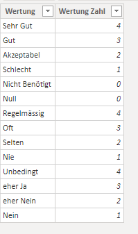
I have about 16 categories (columns) which have the same "legend" values ("Sehr Gut, Gut, Akzeptabel, Schlecht")
here is a screenshot of the data
and my lookup/list table is very basic
so, in this case, I can't create 16 relations to this lookup table.
- Mark as New
- Bookmark
- Subscribe
- Mute
- Subscribe to RSS Feed
- Permalink
- Report Inappropriate Content
- Mark as New
- Bookmark
- Subscribe
- Mute
- Subscribe to RSS Feed
- Permalink
- Report Inappropriate Content
To do that:
1. unpivot columns 2-4 in the query editor (just highlight your Customer Name column, right click on it, and choose unpivot other columns.
2. Load the table.
3. Get a Radar chart by hitting the ellipsis in the Visualization pane and choose Get More Visuals.
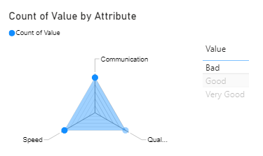
4. Put the Attribute column in the category field well and your value column in the values area (choose Count as the aggregation or provide your own measure).
5. Make a table visual with your Value column to show Very Good, Good, etc. to be used as a slicer.
This is what it will look like
If this works for you, please mark it as solution. Kudos are appreciated too. Please let me know if not.
Regards,
Pat
Did I answer your question? Mark my post as a solution! Kudos are also appreciated!
To learn more about Power BI, follow me on Twitter or subscribe on YouTube.
@mahoneypa HoosierBI on YouTube
- Mark as New
- Bookmark
- Subscribe
- Mute
- Subscribe to RSS Feed
- Permalink
- Report Inappropriate Content
Thanks for your quick answer, but it seems that the Count function is not working with textfields.
it shows only the whole amount of the categories, not the separated (very good, good, bad) value
Helpful resources

FabCon Global Hackathon
Join the Fabric FabCon Global Hackathon—running virtually through Nov 3. Open to all skill levels. $10,000 in prizes!

Power BI Monthly Update - October 2025
Check out the October 2025 Power BI update to learn about new features.


