Get certified for free when you join Fabric Data Days 2026 and dive into Fabric, Power BI, SQL, AI, and other essential data skills.
Join nowJuly 7 - July 17 | Round 2 of the Power BI Dataviz World Championships. Don't miss your chance! Learn more
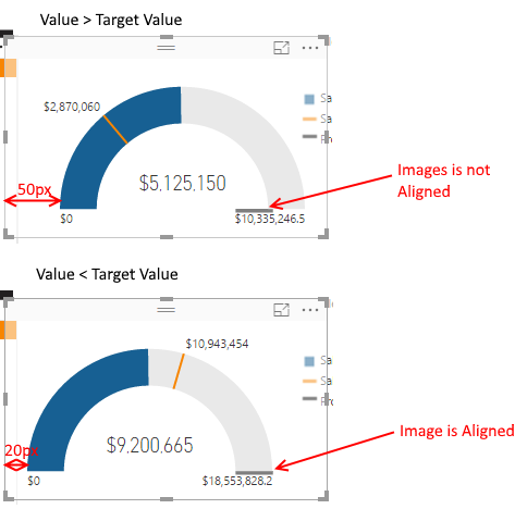
I've noticed the alignment of a guage chart changes depending on the data.
When the Value is smaller than the Target Value, the guage starts 20px from the leftmost point of the widget.
When the Value is greater than the Target Value, the guage starts 50px from the leftmost point of the widget.
Here's a picture:
Is this intended behaviour, or a bug? It is making it impossible to align images with a guage chart (you can see in my screenshot the total mark is aligned in the second example, but not the first).
Solved! Go to Solution.
Hi @andrewmosey,
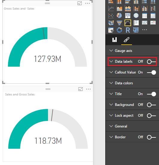
Based on my test, the issue is caused by the data labels in the Gauge chart visual. If we want to display data label on the left or right side, it will take some place and the gauge will move to right or left correspondingly. If you want to align two gauge visual properly, you can turn off data label for each gauge visual.
If you have any question, please feel free to ask.
Best Regards,
Qiuyun Yu
Hi @andrewmosey,
Based on my test, the issue is caused by the data labels in the Gauge chart visual. If we want to display data label on the left or right side, it will take some place and the gauge will move to right or left correspondingly. If you want to align two gauge visual properly, you can turn off data label for each gauge visual.
If you have any question, please feel free to ask.
Best Regards,
Qiuyun Yu
Another excellent reason not to use gauge charts.
The reason for the alignment seems to be the data label for the "current" value. The label extends beyond the arch of the gauge, so the plot area is adjusted.
Instead of a gauge, consider a bullet chart, a much better visualisation, which will not have that problem. You can get them from the Visuals Gallery.
cheers, teylyn
Join us in Barcelona for FabCon and SQLCon, the Fabric, Power BI, SQL, and AI community event. Save €200 with code FABCMTY200.
Join Data Days 2026: 60 days of free live/on-demand sessions, challenges, study groups, and certification opportunities.
| User | Count |
|---|---|
| 29 | |
| 23 | |
| 18 | |
| 18 | |
| 15 |
| User | Count |
|---|---|
| 51 | |
| 44 | |
| 43 | |
| 39 | |
| 32 |