FabCon is coming to Atlanta
Join us at FabCon Atlanta from March 16 - 20, 2026, for the ultimate Fabric, Power BI, AI and SQL community-led event. Save $200 with code FABCOMM.
Register now!- Power BI forums
- Get Help with Power BI
- Desktop
- Service
- Report Server
- Power Query
- Mobile Apps
- Developer
- DAX Commands and Tips
- Custom Visuals Development Discussion
- Health and Life Sciences
- Power BI Spanish forums
- Translated Spanish Desktop
- Training and Consulting
- Instructor Led Training
- Dashboard in a Day for Women, by Women
- Galleries
- Data Stories Gallery
- Themes Gallery
- Contests Gallery
- Quick Measures Gallery
- Notebook Gallery
- Translytical Task Flow Gallery
- TMDL Gallery
- R Script Showcase
- Webinars and Video Gallery
- Ideas
- Custom Visuals Ideas (read-only)
- Issues
- Issues
- Events
- Upcoming Events
To celebrate FabCon Vienna, we are offering 50% off select exams. Ends October 3rd. Request your discount now.
- Power BI forums
- Forums
- Get Help with Power BI
- Desktop
- Re: Gantt chart 2.2.3 creating erroneous end dates
- Subscribe to RSS Feed
- Mark Topic as New
- Mark Topic as Read
- Float this Topic for Current User
- Bookmark
- Subscribe
- Printer Friendly Page
- Mark as New
- Bookmark
- Subscribe
- Mute
- Subscribe to RSS Feed
- Permalink
- Report Inappropriate Content
Gantt chart 2.2.3 creating erroneous end dates
I am in great need of help on the Gantt chart. The chart works fine, unless my start and end date are less than 24 hours different. Then the system is CHANGING my end date to exactly 24 hours past my start date. Can someone please help me fix this asap? I am using Gantt 2.2.3 from the Marketplace. @Gantt, @ChangingDataHello!
I have screenshot showing:
The first row IM201909-001 has a Start DT of 9/2/2019 06:51 and an End DT of 9/2/2019 14:51. I created a “True Duration in Days” as 0.33 days as the actual duration is only 8 hours. But the tooltip and the length of the bar are showing as 24 hours past the start date.
But on the third record 09022019-004 the start date is 9/2/2019 10:54 and the end date is correctly showing as 9/4/2019 11:45. The true duration is 2.035 days.
The problem happens when the true End Date is less than 24 hours from the start date.
Solved! Go to Solution.
- Mark as New
- Bookmark
- Subscribe
- Mute
- Subscribe to RSS Feed
- Permalink
- Report Inappropriate Content
Hi @dkernen,
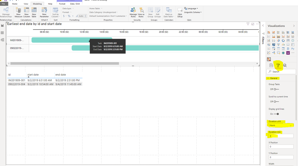
Sorry for that we put the unnessary screenshot of setting files, we can chang this setting in the panel of power bi desktop after clicking the visual you want to change:
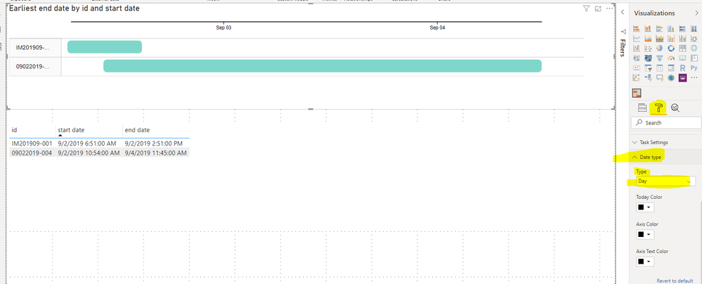
If you use start time and end time columns, we can set the unit to hours and min duration to zero. Then we can change the date type as days to make the x-axis will not be very long.
Best regards,
If this post helps, then please consider Accept it as the solution to help the other members find it more quickly.
- Mark as New
- Bookmark
- Subscribe
- Mute
- Subscribe to RSS Feed
- Permalink
- Report Inappropriate Content
In the configuration of the object I found that I can put it to Hours and this helps me to measure all the activities of the day
- Mark as New
- Bookmark
- Subscribe
- Mute
- Subscribe to RSS Feed
- Permalink
- Report Inappropriate Content
Hi @dkernen ,
Based on my research, the default min duration is set as 1 day in setting.
We can change it to 0 days to fix this problem:
Best regards,
If this post helps, then please consider Accept it as the solution to help the other members find it more quickly.
- Mark as New
- Bookmark
- Subscribe
- Mute
- Subscribe to RSS Feed
- Permalink
- Report Inappropriate Content
Whoa! Thank you SO much for your research. I am a newbie to Power BI. When you say "we can change it to 0" - what does that mean? Does that mean you can change the visual in the marketplace or does that mean I can create my own custom visual by making the change you note below? I am afraid I do not know how to make my own custom visual (yet!) but I am excited to learn.
- Mark as New
- Bookmark
- Subscribe
- Mute
- Subscribe to RSS Feed
- Permalink
- Report Inappropriate Content
Hi @dkernen,
Sorry for that we put the unnessary screenshot of setting files, we can chang this setting in the panel of power bi desktop after clicking the visual you want to change:
If you use start time and end time columns, we can set the unit to hours and min duration to zero. Then we can change the date type as days to make the x-axis will not be very long.
Best regards,
If this post helps, then please consider Accept it as the solution to help the other members find it more quickly.


