Fabric Data Days starts November 4th!
Advance your Data & AI career with 50 days of live learning, dataviz contests, hands-on challenges, study groups & certifications and more!
Get registered- Power BI forums
- Get Help with Power BI
- Desktop
- Service
- Report Server
- Power Query
- Mobile Apps
- Developer
- DAX Commands and Tips
- Custom Visuals Development Discussion
- Health and Life Sciences
- Power BI Spanish forums
- Translated Spanish Desktop
- Training and Consulting
- Instructor Led Training
- Dashboard in a Day for Women, by Women
- Galleries
- Data Stories Gallery
- Themes Gallery
- Contests Gallery
- QuickViz Gallery
- Quick Measures Gallery
- Visual Calculations Gallery
- Notebook Gallery
- Translytical Task Flow Gallery
- TMDL Gallery
- R Script Showcase
- Webinars and Video Gallery
- Ideas
- Custom Visuals Ideas (read-only)
- Issues
- Issues
- Events
- Upcoming Events
Get Fabric Certified for FREE during Fabric Data Days. Don't miss your chance! Request now
- Power BI forums
- Forums
- Get Help with Power BI
- Desktop
- Formatting Arrow in Card
- Subscribe to RSS Feed
- Mark Topic as New
- Mark Topic as Read
- Float this Topic for Current User
- Bookmark
- Subscribe
- Printer Friendly Page
- Mark as New
- Bookmark
- Subscribe
- Mute
- Subscribe to RSS Feed
- Permalink
- Report Inappropriate Content
Formatting Arrow in Card
Hello,
So i have a Single Value Card like below
I`d like to add a Green Arrow Up/ Red Arrow Down depends on the results of another DAX measure:
Measure =

Solved! Go to Solution.
- Mark as New
- Bookmark
- Subscribe
- Mute
- Subscribe to RSS Feed
- Permalink
- Report Inappropriate Content
If you want to set it up yourself, you can follow these steps:
1) Create a new measure for the arrow based on the measure it refers to:
Arrow = IF([% Forecast vs Target]>0;
            UNICHAR(11014);
            UNICHAR(11015))
2) Create a conditional formatting measure to return green or red:
Arrow Condit Format = IF([% Forecast vs Target]>0; 2; 1)
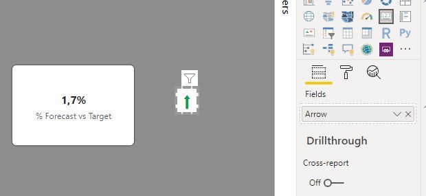
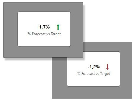
3) Create a new card visual and use the measure for the arrow as your value:
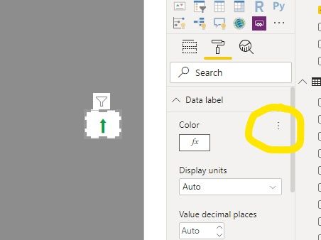
4) Go to the formatting options for the visual and under "Data Label" select the elipsis to access conditional formatting options:
5) Select the measure you have created for the conditional formatting and set the parameters.
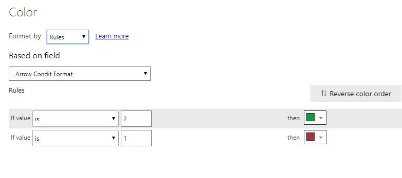
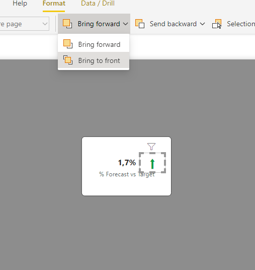
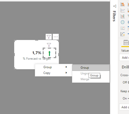
7) (Optional) Select both card visuals by ctrl + clicking on each, right-click and select "Group".
and you will get this result:
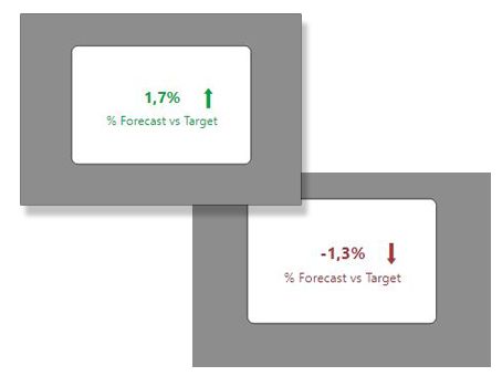
You can of course use the conditional formatting measure to format other elements in the card visual:
Did I answer your question? Mark my post as a solution!
In doing so, you are also helping me. Thank you!
Proud to be a Super User!
Paul on Linkedin.
- Mark as New
- Bookmark
- Subscribe
- Mute
- Subscribe to RSS Feed
- Permalink
- Report Inappropriate Content
Hi @Haidannx ,
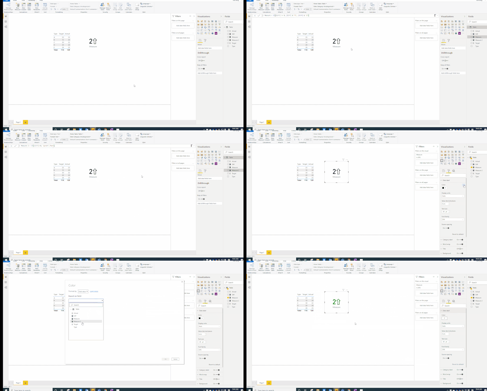
You could reference my sample to have a try.
Measure = IF([Diff] >= 0, [Diff] & "⇧", [Diff] & "⇩")

Measure 2 = IF([Diff]>=0, "green","Red")
Please see the attachment for more details.
Best Regards,
Xue Ding
If this post helps, then please consider Accept it as the solution to help the other members find it more quickly.
Xue Ding
If this post helps, then please consider Accept it as the solution to help the other members find it more quickly.
- Mark as New
- Bookmark
- Subscribe
- Mute
- Subscribe to RSS Feed
- Permalink
- Report Inappropriate Content
If you want to set it up yourself, you can follow these steps:
1) Create a new measure for the arrow based on the measure it refers to:
Arrow = IF([% Forecast vs Target]>0;
            UNICHAR(11014);
            UNICHAR(11015))
2) Create a conditional formatting measure to return green or red:
Arrow Condit Format = IF([% Forecast vs Target]>0; 2; 1)
3) Create a new card visual and use the measure for the arrow as your value:
4) Go to the formatting options for the visual and under "Data Label" select the elipsis to access conditional formatting options:
5) Select the measure you have created for the conditional formatting and set the parameters.

7) (Optional) Select both card visuals by ctrl + clicking on each, right-click and select "Group".
and you will get this result:
You can of course use the conditional formatting measure to format other elements in the card visual:
Did I answer your question? Mark my post as a solution!
In doing so, you are also helping me. Thank you!
Proud to be a Super User!
Paul on Linkedin.
- Mark as New
- Bookmark
- Subscribe
- Mute
- Subscribe to RSS Feed
- Permalink
- Report Inappropriate Content
OMG
Many thanks 🙂
- Mark as New
- Bookmark
- Subscribe
- Mute
- Subscribe to RSS Feed
- Permalink
- Report Inappropriate Content
You can also use KPI card from visualization pane and enter relevent fields to get the result.
Don't forget to give thumbs up 👍and accept this as a solution if it helped you.
Please take a quick glance at newly created dashboards : Restaurant Management Dashboard , HR Analytics Report , Hotel Management Report, Sales Analysis Report , Fortune 500 Companies Analysis , Revenue Tracking Dashboard
- Mark as New
- Bookmark
- Subscribe
- Mute
- Subscribe to RSS Feed
- Permalink
- Report Inappropriate Content
Hi
1. Get from market place custom visual : Infographic Designer
2. Make to visual dependend on tha same valueu and group them just like that
https://www.youtube.com/watch?v=zHzSBNES6jE
Ps. Please mark this as solution if this help you
Helpful resources

Power BI Monthly Update - November 2025
Check out the November 2025 Power BI update to learn about new features.

Fabric Data Days
Advance your Data & AI career with 50 days of live learning, contests, hands-on challenges, study groups & certifications and more!

| User | Count |
|---|---|
| 98 | |
| 72 | |
| 50 | |
| 49 | |
| 42 |
