Fabric Data Days starts November 4th!
Advance your Data & AI career with 50 days of live learning, dataviz contests, hands-on challenges, study groups & certifications and more!
Get registered- Power BI forums
- Get Help with Power BI
- Desktop
- Service
- Report Server
- Power Query
- Mobile Apps
- Developer
- DAX Commands and Tips
- Custom Visuals Development Discussion
- Health and Life Sciences
- Power BI Spanish forums
- Translated Spanish Desktop
- Training and Consulting
- Instructor Led Training
- Dashboard in a Day for Women, by Women
- Galleries
- Data Stories Gallery
- Themes Gallery
- Contests Gallery
- QuickViz Gallery
- Quick Measures Gallery
- Visual Calculations Gallery
- Notebook Gallery
- Translytical Task Flow Gallery
- TMDL Gallery
- R Script Showcase
- Webinars and Video Gallery
- Ideas
- Custom Visuals Ideas (read-only)
- Issues
- Issues
- Events
- Upcoming Events
Get Fabric Certified for FREE during Fabric Data Days. Don't miss your chance! Request now
- Power BI forums
- Forums
- Get Help with Power BI
- Desktop
- Re: Format table to read horizontally
- Subscribe to RSS Feed
- Mark Topic as New
- Mark Topic as Read
- Float this Topic for Current User
- Bookmark
- Subscribe
- Printer Friendly Page
- Mark as New
- Bookmark
- Subscribe
- Mute
- Subscribe to RSS Feed
- Permalink
- Report Inappropriate Content
Format table to read horizontally
I have a report with a line chart that tracks a calculated measure (Satisfaction) over time in monthly intervals (see image).
I also have the data stored in a way that allows it to be calculated in a quarterly basis instead of a monthly basis and I would like to run a table horizontally underneath the line chart formatted as:
FY15 Q4 FY16 Q1 FY16 Q2 FY16 Q3 FY16 Q4
119 121 121 120 124
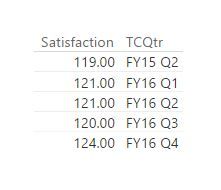
But I can only get a table to look like:
Is there any way to format this table horizontally as I explained above?
Any help is much appreciated,
Chris
Solved! Go to Solution.
- Mark as New
- Bookmark
- Subscribe
- Mute
- Subscribe to RSS Feed
- Permalink
- Report Inappropriate Content
Oof... I feel dumb, it must be late on Friday ![]() Please disregard this topic.
Please disregard this topic.
I just noticed that changing to a Matrix instead of a table allows me to do exactly what I want.
- Mark as New
- Bookmark
- Subscribe
- Mute
- Subscribe to RSS Feed
- Permalink
- Report Inappropriate Content
I also had the same question and wonder how you fixed it using the matrix visuals. I cannot seem to figure that out.
Kindly advise uisng lcgalaxy@gmail.com.
- Mark as New
- Bookmark
- Subscribe
- Mute
- Subscribe to RSS Feed
- Permalink
- Report Inappropriate Content
@nunavutUnder "Values" in the Format Tab, turn on "Show on rows". That should do it!
- Mark as New
- Bookmark
- Subscribe
- Mute
- Subscribe to RSS Feed
- Permalink
- Report Inappropriate Content
Oof... I feel dumb, it must be late on Friday ![]() Please disregard this topic.
Please disregard this topic.
I just noticed that changing to a Matrix instead of a table allows me to do exactly what I want.
- Mark as New
- Bookmark
- Subscribe
- Mute
- Subscribe to RSS Feed
- Permalink
- Report Inappropriate Content
Can you share how you got it?
@ruecj5 wrote:Oof... I feel dumb, it must be late on Friday
Please disregard this topic.
I just noticed that changing to a Matrix instead of a table allows me to do exactly what I want.
Helpful resources

Fabric Data Days
Advance your Data & AI career with 50 days of live learning, contests, hands-on challenges, study groups & certifications and more!

Power BI Monthly Update - October 2025
Check out the October 2025 Power BI update to learn about new features.


