FabCon is coming to Atlanta
Join us at FabCon Atlanta from March 16 - 20, 2026, for the ultimate Fabric, Power BI, AI and SQL community-led event. Save $200 with code FABCOMM.
Register now!- Power BI forums
- Get Help with Power BI
- Desktop
- Service
- Report Server
- Power Query
- Mobile Apps
- Developer
- DAX Commands and Tips
- Custom Visuals Development Discussion
- Health and Life Sciences
- Power BI Spanish forums
- Translated Spanish Desktop
- Training and Consulting
- Instructor Led Training
- Dashboard in a Day for Women, by Women
- Galleries
- Data Stories Gallery
- Themes Gallery
- Contests Gallery
- Quick Measures Gallery
- Notebook Gallery
- Translytical Task Flow Gallery
- TMDL Gallery
- R Script Showcase
- Webinars and Video Gallery
- Ideas
- Custom Visuals Ideas (read-only)
- Issues
- Issues
- Events
- Upcoming Events
To celebrate FabCon Vienna, we are offering 50% off select exams. Ends October 3rd. Request your discount now.
- Power BI forums
- Forums
- Get Help with Power BI
- Desktop
- Re: Format bar chart colours
- Subscribe to RSS Feed
- Mark Topic as New
- Mark Topic as Read
- Float this Topic for Current User
- Bookmark
- Subscribe
- Printer Friendly Page
- Mark as New
- Bookmark
- Subscribe
- Mute
- Subscribe to RSS Feed
- Permalink
- Report Inappropriate Content
Format bar chart colours
Hi
I have a bar chart that needs to show colour changes depending on whether the values have increased or decreased from the previous Month.
For example -
I have a calculated field called MOM Fruit
Jan = 19
Feb = 26
Mar = 14
Apr = 6
May = 8
So, I need Feb to be Red, Mar Green, Apr Green and May Red
Any help would be great
Solved! Go to Solution.
- Mark as New
- Bookmark
- Subscribe
- Mute
- Subscribe to RSS Feed
- Permalink
- Report Inappropriate Content
Hi @kevbrown1980 ,
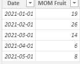
I created some data:
Here are the steps you can follow:
1. Create measure.
Color =
var _current=CALCULATE(SUM('Table'[MOM Fruit]),FILTER(ALL('Table'),MONTH('Table'[Date])=MONTH(MAX('Table'[Date]))))
var _last=CALCULATE(SUM('Table'[MOM Fruit]),FILTER(ALL('Table'),MONTH('Table'[Date])=MONTH(MAX('Table'[Date])-1)))
var _if=
IF(
    _last=BLANK(),_current,_last)
var _su=
_current - _if
return
SWITCH(
    TRUE(),
    _su=0,"blue",
    _su>0,"red",
    _su<0,"green")
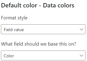
2. Click Visual - Format - Data colors -- fx
3. Enter the Default color interface.
Format style – Field value
What field should we base this on – [color]
4. Result:
Best Regards,
Liu Yang
If this post helps, then please consider Accept it as the solution to help the other members find it more quickly
- Mark as New
- Bookmark
- Subscribe
- Mute
- Subscribe to RSS Feed
- Permalink
- Report Inappropriate Content
Hello @kevbrown1980.
Assuming you have a date table, you could create a measure using this pattern:
Bar formatting =
VAR PriorMonthMOMFruit =
    CALCULATE ( SUM ( 'Table'[MOM Fruit] ), DATEADD ( 'Date'[Date], -1, MONTH ) )
VAR CurrentMonthMOMFruit =
    CALCULATE ( SUM ( 'Table'[MOM Fruit] ) )
VAR Result =
    IF ( ( CurrentMonthMOMFruit - PriorMonthMOMFruit ) > 0, "Green", "Red" )
RETURN
    Result
Note that you can replace "Green" and "Red" with hex values if you want to fine-tune the shade of the colour.
Then, select your bar chart, and in the visualization pane, under Data colors, click the "fx" button:
On the next screen, under the "Format style" drop-down at the top, choose "Field value".
Then, under "What field should we base this on", choose the measure you created above.
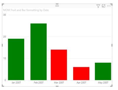
Your results should look something like this:
I created a .pbix file here that you can download if it is helpful.
-Steve
- Mark as New
- Bookmark
- Subscribe
- Mute
- Subscribe to RSS Feed
- Permalink
- Report Inappropriate Content
@kevbrown1980 , create a measure like this example and use it conditional formatting using field value option
Colour =
SWITCH(TRUE(),
max('Table'[Month]) = "Feb", "red",
max('Table'[Month]) = "Mar", "Green",
max('Table'[Month]) = "Apr", "Green",
max('Table'[Month]) = "May", "Red",
//keep on adding
"green")
How to do conditional formatting by measure and apply it on pie?: https://youtu.be/RqBb5eBf_I4


