- Power BI forums
- Updates
- News & Announcements
- Get Help with Power BI
- Desktop
- Service
- Report Server
- Power Query
- Mobile Apps
- Developer
- DAX Commands and Tips
- Custom Visuals Development Discussion
- Health and Life Sciences
- Power BI Spanish forums
- Translated Spanish Desktop
- Power Platform Integration - Better Together!
- Power Platform Integrations (Read-only)
- Power Platform and Dynamics 365 Integrations (Read-only)
- Training and Consulting
- Instructor Led Training
- Dashboard in a Day for Women, by Women
- Galleries
- Community Connections & How-To Videos
- COVID-19 Data Stories Gallery
- Themes Gallery
- Data Stories Gallery
- R Script Showcase
- Webinars and Video Gallery
- Quick Measures Gallery
- 2021 MSBizAppsSummit Gallery
- 2020 MSBizAppsSummit Gallery
- 2019 MSBizAppsSummit Gallery
- Events
- Ideas
- Custom Visuals Ideas
- Issues
- Issues
- Events
- Upcoming Events
- Community Blog
- Power BI Community Blog
- Custom Visuals Community Blog
- Community Support
- Community Accounts & Registration
- Using the Community
- Community Feedback
Register now to learn Fabric in free live sessions led by the best Microsoft experts. From Apr 16 to May 9, in English and Spanish.
- Power BI forums
- Forums
- Get Help with Power BI
- Desktop
- Add a column of charts to a table?
- Subscribe to RSS Feed
- Mark Topic as New
- Mark Topic as Read
- Float this Topic for Current User
- Bookmark
- Subscribe
- Printer Friendly Page
- Mark as New
- Bookmark
- Subscribe
- Mute
- Subscribe to RSS Feed
- Permalink
- Report Inappropriate Content
Add a column of charts to a table?
We have a Tableau visual like the following:
The table has two columns: Class (text) and % of Money Used (decimal such as 8.2 and 0.4). We are migrating from Tableau to Power BI. I am new to Power BI and I know how to create a table visual. How to create a column of bar charts for each Class similar to that in the Tableau visual? Even add a greyish background color as in the Tableau visual?
If there is no straight solution, any workaround?
Thanks for any info!
Solved! Go to Solution.
- Mark as New
- Bookmark
- Subscribe
- Mute
- Subscribe to RSS Feed
- Permalink
- Report Inappropriate Content
Hi @Curious1_209 ,
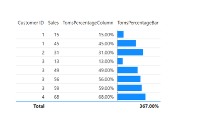
I got partly to a solution:
Click on the for the column you would like to get the bars for. Then Conditional formatting > Data bars:
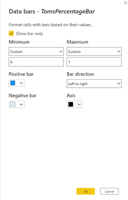
Apply the following settings and click ok:
As you can see, I was not able to add a grey background to the bar either. I managed to color the whole column grey though, but I do not believe that is what you are looking for...
Hope this helps you anyway 🙂
/Tom
https://www.tackytech.blog/
https://www.instagram.com/tackytechtom/
| Did I answer your question❓➡️ Please, mark my post as a solution ✔️ |
| Also happily accepting Kudos 🙂 |
| Feel free to connect with me on LinkedIn! | |
| #proudtobeasuperuser |  |
- Mark as New
- Bookmark
- Subscribe
- Mute
- Subscribe to RSS Feed
- Permalink
- Report Inappropriate Content
Hi @Curious1_209 ,
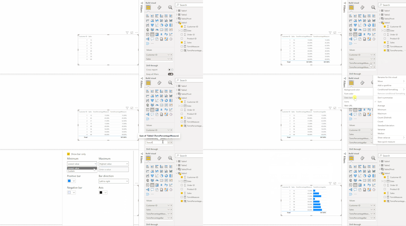
It should work if you rename the second column to something different. Just double click on the column in the Values pane to give it another name.
/Tom
https://www.tackytech.blog/
https://www.instagram.com/tackytechtom/
| Did I answer your question❓➡️ Please, mark my post as a solution ✔️ |
| Also happily accepting Kudos 🙂 |
| Feel free to connect with me on LinkedIn! | |
| #proudtobeasuperuser |  |
- Mark as New
- Bookmark
- Subscribe
- Mute
- Subscribe to RSS Feed
- Permalink
- Report Inappropriate Content
Thanks for your follow up. I deleted my earlier reply because I thought you used two columns. By "rename the second column", you mean you created two columns with the same percentage data in each row?
I have only one column and added it twice to the table. However, if I rename one column, the name of the other column changes too. And when I added conditional formatting, it affects two columns at the same time.
- Mark as New
- Bookmark
- Subscribe
- Mute
- Subscribe to RSS Feed
- Permalink
- Report Inappropriate Content
Hi @Curious1_209 ,
The column that shall show the values needs to have a different summarization level than the one that shows the bars. See the screencast below:
Hope this helps!
/Tom
https://www.tackytech.blog/
https://www.instagram.com/tackytechtom/
| Did I answer your question❓➡️ Please, mark my post as a solution ✔️ |
| Also happily accepting Kudos 🙂 |
| Feel free to connect with me on LinkedIn! | |
| #proudtobeasuperuser |  |
- Mark as New
- Bookmark
- Subscribe
- Mute
- Subscribe to RSS Feed
- Permalink
- Report Inappropriate Content
Thanks for the additional info!
Regards.
- Mark as New
- Bookmark
- Subscribe
- Mute
- Subscribe to RSS Feed
- Permalink
- Report Inappropriate Content
Hi @Curious1_209 ,
I got partly to a solution:
Click on the for the column you would like to get the bars for. Then Conditional formatting > Data bars:
Apply the following settings and click ok:
As you can see, I was not able to add a grey background to the bar either. I managed to color the whole column grey though, but I do not believe that is what you are looking for...
Hope this helps you anyway 🙂
/Tom
https://www.tackytech.blog/
https://www.instagram.com/tackytechtom/
| Did I answer your question❓➡️ Please, mark my post as a solution ✔️ |
| Also happily accepting Kudos 🙂 |
| Feel free to connect with me on LinkedIn! | |
| #proudtobeasuperuser |  |
Helpful resources

Microsoft Fabric Learn Together
Covering the world! 9:00-10:30 AM Sydney, 4:00-5:30 PM CET (Paris/Berlin), 7:00-8:30 PM Mexico City

Power BI Monthly Update - April 2024
Check out the April 2024 Power BI update to learn about new features.

| User | Count |
|---|---|
| 111 | |
| 94 | |
| 83 | |
| 67 | |
| 59 |
| User | Count |
|---|---|
| 151 | |
| 121 | |
| 104 | |
| 87 | |
| 67 |


