A new Data Days event is coming soon!
This time we’re going bigger than ever. Fabric, Power BI, SQL, AI and more. We're covering it all. You won't want to miss it.
Learn more- Power BI forums
- Get Help with Power BI
- Desktop
- Service
- Report Server
- Power Query
- Mobile Apps
- Developer
- DAX Commands and Tips
- Custom Visuals Development Discussion
- Health and Life Sciences
- Power BI Spanish forums
- Translated Spanish Desktop
- Training and Consulting
- Instructor Led Training
- Dashboard in a Day for Women, by Women
- Galleries
- Data Stories Gallery
- Themes Gallery
- Contests Gallery
- QuickViz Gallery
- Quick Measures Gallery
- Visual Calculations Gallery
- Notebook Gallery
- Translytical Task Flow Gallery
- TMDL Gallery
- R Script Showcase
- Webinars and Video Gallery
- Ideas
- Custom Visuals Ideas (read-only)
- Issues
- Issues
- Events
- Upcoming Events
Level up your Power BI skills this month - build one visual each week and tell better stories with data! Get started
- Power BI forums
- Forums
- Get Help with Power BI
- Desktop
- Re: Forecasting
- Subscribe to RSS Feed
- Mark Topic as New
- Mark Topic as Read
- Float this Topic for Current User
- Bookmark
- Subscribe
- Printer Friendly Page
- Mark as New
- Bookmark
- Subscribe
- Mute
- Subscribe to RSS Feed
- Permalink
- Report Inappropriate Content
Forecasting
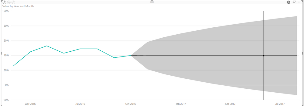
So I have the July 2017 update and I'm trying to do some forecasting on a simple line graph. I have dates on my x-axis (1st of every month in date format) and a count value. So far, so good. I can see the Forecasting option on the Analytics tab and the graph looks very pretty, even if I haven't a clue what it actually tells me ....
Then I switch my x-axis to CATEGORICAL (so it shows me actual dates and not just years) and BOOM - the forecasting vanishes. Completely. WHY? Why on earth should it matter how I choose to display my dates?
Debbie
Solved! Go to Solution.
- Mark as New
- Bookmark
- Subscribe
- Mute
- Subscribe to RSS Feed
- Permalink
- Report Inappropriate Content
Thanks, @Anonymous I've got it working. But as I said, I had to do everything in a very specific order! It's flaky, but I'm sure it will settle down in future releases ...
Debbie
- Mark as New
- Bookmark
- Subscribe
- Mute
- Subscribe to RSS Feed
- Permalink
- Report Inappropriate Content
So ... to get it to work, I had to do things in a *very* specific order - otherwise the Forecasting option doesn't even show up!
- Add line graph
- Add dimensions to x and y axis
- Swicth on max/min/average & forecast
- Switch x-axis to CATEGORICAL(which makes CONCATENATE LABELS visible)
- Switch CONCATENATE LABELS off
- Switch x-axis back to CONTINUOUS
If I mess with my x-axis *before* I set the forecast, the forecast option doesn't appear at all - even if I set it all back to default.
Debbie
- Mark as New
- Bookmark
- Subscribe
- Mute
- Subscribe to RSS Feed
- Permalink
- Report Inappropriate Content
That's the functionality as I understand it. You have to have a date axis and it has to be continuous.
Follow on LinkedIn
@ me in replies or I'll lose your thread!!!
Instead of a Kudo, please vote for this idea
Become an expert!: Enterprise DNA
External Tools: MSHGQM
YouTube Channel!: Microsoft Hates Greg
Latest book!: DAX For Humans
DAX is easy, CALCULATE makes DAX hard...
- Mark as New
- Bookmark
- Subscribe
- Mute
- Subscribe to RSS Feed
- Permalink
- Report Inappropriate Content
My date axis is continuous - it's just the display I'm trying to set. I want my months to be visible on the x-axis as well as the years.
Debbie
- Mark as New
- Bookmark
- Subscribe
- Mute
- Subscribe to RSS Feed
- Permalink
- Report Inappropriate Content
Hi @Anonymous,
>>My date axis is continuous - it's just the display I'm trying to set. I want my months to be visible on the x-axis as well as the years.
So you want to show month year at the x-axis, right ?
If this is a case, you can refer to below steps:
1. Switch date column to hierarchy mode and only keep year and month.
2. Turn on the drill down mode, double click on one point to drill down.
Regards,
Xiaoxin Sheng
- Mark as New
- Bookmark
- Subscribe
- Mute
- Subscribe to RSS Feed
- Permalink
- Report Inappropriate Content
Thanks, @Anonymous I've got it working. But as I said, I had to do everything in a very specific order! It's flaky, but I'm sure it will settle down in future releases ...
Debbie
Helpful resources

Power BI Monthly Update - April 2026
Check out the April 2026 Power BI update to learn about new features.

Data Days 2026 coming soon!
Sign up to receive a private message when registration opens and key events begin.

New to Fabric Survey
If you have recently started exploring Fabric, we'd love to hear how it's going. Your feedback can help with product improvements.

| User | Count |
|---|---|
| 36 | |
| 28 | |
| 28 | |
| 20 | |
| 18 |
| User | Count |
|---|---|
| 66 | |
| 36 | |
| 33 | |
| 26 | |
| 24 |


