FabCon is coming to Atlanta
Join us at FabCon Atlanta from March 16 - 20, 2026, for the ultimate Fabric, Power BI, AI and SQL community-led event. Save $200 with code FABCOMM.
Register now!- Power BI forums
- Get Help with Power BI
- Desktop
- Service
- Report Server
- Power Query
- Mobile Apps
- Developer
- DAX Commands and Tips
- Custom Visuals Development Discussion
- Health and Life Sciences
- Power BI Spanish forums
- Translated Spanish Desktop
- Training and Consulting
- Instructor Led Training
- Dashboard in a Day for Women, by Women
- Galleries
- Data Stories Gallery
- Themes Gallery
- Contests Gallery
- QuickViz Gallery
- Quick Measures Gallery
- Visual Calculations Gallery
- Notebook Gallery
- Translytical Task Flow Gallery
- TMDL Gallery
- R Script Showcase
- Webinars and Video Gallery
- Ideas
- Custom Visuals Ideas (read-only)
- Issues
- Issues
- Events
- Upcoming Events
The Power BI Data Visualization World Championships is back! It's time to submit your entry. Live now!
- Power BI forums
- Forums
- Get Help with Power BI
- Desktop
- Re: Fixed curve on Power BI scatterplot or line gr...
- Subscribe to RSS Feed
- Mark Topic as New
- Mark Topic as Read
- Float this Topic for Current User
- Bookmark
- Subscribe
- Printer Friendly Page
- Mark as New
- Bookmark
- Subscribe
- Mute
- Subscribe to RSS Feed
- Permalink
- Report Inappropriate Content
Fixed curve on Power BI scatterplot or line graph
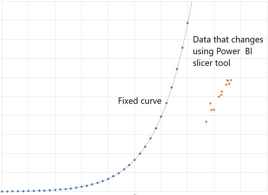
I have this Excel graph I want the fixed curve to stay put in a Power BI scatterplot or line graph. I know how to graph the data and I use the slicer tool to change the data, but I want to have this curve fixed in a scatterplot or line graph as the control limit of the data. I also want the curve to stay fixed even when I select another set of data using the slicer tool.
- Mark as New
- Bookmark
- Subscribe
- Mute
- Subscribe to RSS Feed
- Permalink
- Report Inappropriate Content
Without seeing your model, I would think you could do the following:
- set fixed values for the x and y range in your visual (so they don't change with slicers)
- create a table that has your x values and put your fixed curve data in one table and your other data in another
- create a relationship between the x table and each of the other two tables (on the x values columns); use the shared x column in your visual, along with two measures (one for each of the y value columns)
- add slicers, etc. to filter your other data table (so the fixed curve one is unaffected)
Pat
Did I answer your question? Mark my post as a solution! Kudos are also appreciated!
To learn more about Power BI, follow me on Twitter or subscribe on YouTube.
@mahoneypa HoosierBI on YouTube
- Mark as New
- Bookmark
- Subscribe
- Mute
- Subscribe to RSS Feed
- Permalink
- Report Inappropriate Content
I would like the curved graph to show on the graph with the batches and stay even though I use a slicer to select a different batch number.
Is there a way to merge them or that a scatter plot shows two graphs in the same visual?
Helpful resources

Power BI Dataviz World Championships
The Power BI Data Visualization World Championships is back! It's time to submit your entry.

Power BI Monthly Update - January 2026
Check out the January 2026 Power BI update to learn about new features.

| User | Count |
|---|---|
| 57 | |
| 40 | |
| 27 | |
| 25 | |
| 23 |
| User | Count |
|---|---|
| 127 | |
| 105 | |
| 55 | |
| 39 | |
| 33 |


