Go To
- Power BI forums
- Get Help with Power BI
- Desktop
- Service
- Report Server
- Power Query
- Mobile Apps
- Developer
- DAX Commands and Tips
- Custom Visuals Development Discussion
- Health and Life Sciences
- Power BI Spanish forums
- Translated Spanish Desktop
- Training and Consulting
- Instructor Led Training
- Dashboard in a Day for Women, by Women
- Galleries
- Data Stories Gallery
- Themes Gallery
- Contests Gallery
- QuickViz Gallery
- Quick Measures Gallery
- Visual Calculations Gallery
- Notebook Gallery
- Translytical Task Flow Gallery
- TMDL Gallery
- R Script Showcase
- Webinars and Video Gallery
- Ideas
- Custom Visuals Ideas (read-only)
- Issues
- Issues
- Events
- Upcoming Events
Turn on suggestions
Auto-suggest helps you quickly narrow down your search results by suggesting possible matches as you type.
Showing results for
Learn from the best! Meet the four finalists headed to the FINALS of the Power BI Dataviz World Championships! Register now
- Power BI forums
- Forums
- Get Help with Power BI
- Desktop
- Re: Fitted Line Plot
Reply
Topic Options
- Subscribe to RSS Feed
- Mark Topic as New
- Mark Topic as Read
- Float this Topic for Current User
- Bookmark
- Subscribe
- Printer Friendly Page
- Mark as New
- Bookmark
- Subscribe
- Mute
- Subscribe to RSS Feed
- Permalink
- Report Inappropriate Content
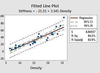
Fitted Line Plot
12-09-2020
11:58 PM
1 ACCEPTED SOLUTION
- Mark as New
- Bookmark
- Subscribe
- Mute
- Subscribe to RSS Feed
- Permalink
- Report Inappropriate Content
12-10-2020
12:30 AM
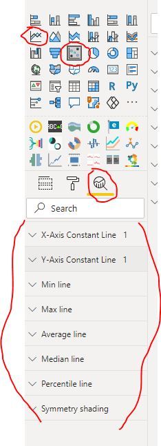
You can select a scatter chart or line chart --> then go to Analytics tab in Visualisations pane and add the type of line you want.
e.g Average Line, Trend Line, Pecrentile Line
Image below:
1 REPLY 1
- Mark as New
- Bookmark
- Subscribe
- Mute
- Subscribe to RSS Feed
- Permalink
- Report Inappropriate Content
12-10-2020
12:30 AM
You can select a scatter chart or line chart --> then go to Analytics tab in Visualisations pane and add the type of line you want.
e.g Average Line, Trend Line, Pecrentile Line
Image below:
Helpful resources
Featured Topics
Top Solution Authors
| User | Count |
|---|---|
| 50 | |
| 39 | |
| 29 | |
| 18 | |
| 17 |
Top Kudoed Authors
| User | Count |
|---|---|
| 68 | |
| 57 | |
| 40 | |
| 22 | |
| 19 |


