FabCon is coming to Atlanta
Join us at FabCon Atlanta from March 16 - 20, 2026, for the ultimate Fabric, Power BI, AI and SQL community-led event. Save $200 with code FABCOMM.
Register now!- Power BI forums
- Get Help with Power BI
- Desktop
- Service
- Report Server
- Power Query
- Mobile Apps
- Developer
- DAX Commands and Tips
- Custom Visuals Development Discussion
- Health and Life Sciences
- Power BI Spanish forums
- Translated Spanish Desktop
- Training and Consulting
- Instructor Led Training
- Dashboard in a Day for Women, by Women
- Galleries
- Data Stories Gallery
- Themes Gallery
- Contests Gallery
- QuickViz Gallery
- Quick Measures Gallery
- Visual Calculations Gallery
- Notebook Gallery
- Translytical Task Flow Gallery
- TMDL Gallery
- R Script Showcase
- Webinars and Video Gallery
- Ideas
- Custom Visuals Ideas (read-only)
- Issues
- Issues
- Events
- Upcoming Events
Learn from the best! Meet the four finalists headed to the FINALS of the Power BI Dataviz World Championships! Register now
- Power BI forums
- Forums
- Get Help with Power BI
- Desktop
- Fit to width Line chart
- Subscribe to RSS Feed
- Mark Topic as New
- Mark Topic as Read
- Float this Topic for Current User
- Bookmark
- Subscribe
- Printer Friendly Page
- Mark as New
- Bookmark
- Subscribe
- Mute
- Subscribe to RSS Feed
- Permalink
- Report Inappropriate Content
Fit to width Line chart
Hi there, I have a 3 room temperature datas and 1 outdoor temperature data, each recorded for every minute for 7 days. Totally 10080 rows of data. I have created a line chart to compare the room temperatures with outdoor temperature. As this has huge data, i need to scroll to see the rest of the graph. Is there a way to fit all these data into a single page to compare the temperatures without scrolling?
Thanks in advance.
Solved! Go to Solution.
- Mark as New
- Bookmark
- Subscribe
- Mute
- Subscribe to RSS Feed
- Permalink
- Report Inappropriate Content
Hi, @Anonymous
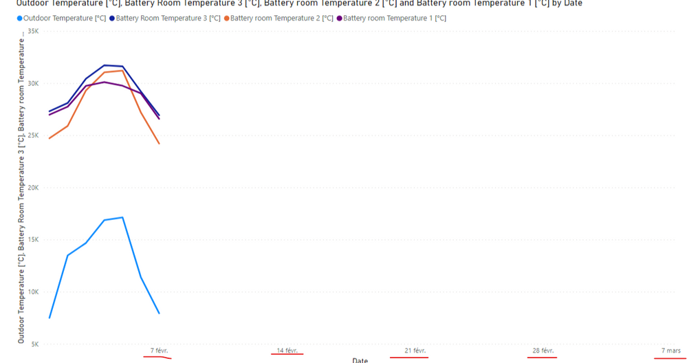
According to your sample picture, it seems like the time period between the Start and End you set is over 7 days.
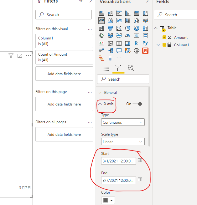
You can try to go to the X-axis setting to set the Start as “2021-01-02” and the End as “2021-01-08”.
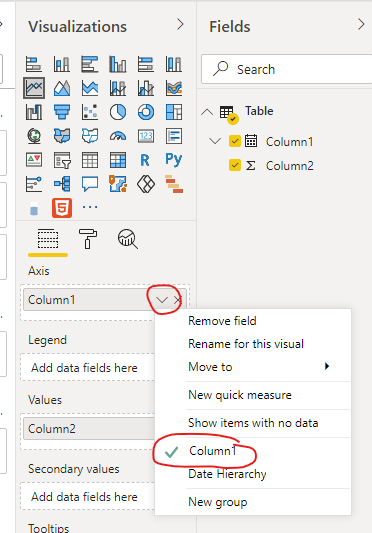
To avoid the aggregation value in your line chart, you can try to set the Date column in your line chart like this:
If you still have a problem, you can post your sample pbix file (without sensitive data) so that we can help you in advance.
How to Get Your Question Answered Quickly
Best Regards,
Community Support Team _Robert Qin
If this post helps, then please consider Accept it as the solution to help the other members find it more quickly.
- Mark as New
- Bookmark
- Subscribe
- Mute
- Subscribe to RSS Feed
- Permalink
- Report Inappropriate Content
Hi, @Anonymous
According to your description, you said you have 10080 rows of data and you want to make them displayed on one single page, I think paginated reports in Power BI can perfectly meet your requirement, you can follow these documents:
https://docs.microsoft.com/en-us/power-bi/paginated-reports/paginated-reports-faq
If you still have a problem, you can reply to me.
How to Get Your Question Answered Quickly
Thank you very much!
Best Regards,
Community Support Team _Robert Qin
If this post helps, then please consider Accept it as the solution to help the other members find it more quickly.
- Mark as New
- Bookmark
- Subscribe
- Mute
- Subscribe to RSS Feed
- Permalink
- Report Inappropriate Content
Hi @v-robertq-msft ,
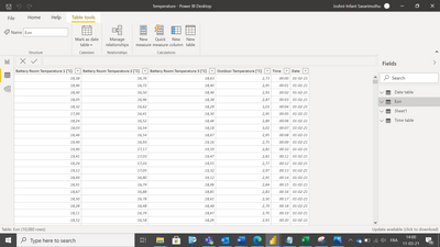
Thanks for your reply. I don't want paginated reports as tables. I need a line chart with date and time in X axis and temperature readings in Y axis. Here is the data. The temperature is recorded for every minute for 7 days.
I have created time tables and date tables to create a link. I need a chart like this.
When I try to make line chart, I'm getting data for every minute of all 7 days. Instead, I need it for 24 hours of each day.
Is it possible to create a line chart showing all 7 day values with date and time?
How can I solve this?
Thanks in advance.
- Mark as New
- Bookmark
- Subscribe
- Mute
- Subscribe to RSS Feed
- Permalink
- Report Inappropriate Content
Hi, @Anonymous
According to your description and sample picture, I can understand your requirement clearly. I think you can go to the “Format” setting of this line chart->X-Axis->set the Start and End date of this chart to go across all the 7 days, like this:
And you can get what you want.
More info about line chart in Power BI
Best Regards,
Community Support Team _Robert Qin
If this post helps, then please consider Accept it as the solution to help the other members find it more quickly.
- Mark as New
- Bookmark
- Subscribe
- Mute
- Subscribe to RSS Feed
- Permalink
- Report Inappropriate Content
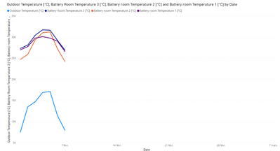
Thanks. I've tried this. I ended up with the below graph which is giving me the aggregated values.
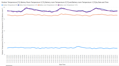
But, all I need is the exact temperature values. If I drill down to next level in the hierachy, I am getting the graph with date, time and exact values without aggregation which is what I need.
But, since I have data recorded for every 1 minute for 7 days, I am getting only 1 hour of data in the report view of the chart and I need to scroll to see the rest. Is there a way to see all the datas in a single page without scrolling to check for maximum and minimum values for all 7 days?
Thanks in advance.
- Mark as New
- Bookmark
- Subscribe
- Mute
- Subscribe to RSS Feed
- Permalink
- Report Inappropriate Content
Hi, @Anonymous
According to your sample picture, it seems like the time period between the Start and End you set is over 7 days.
You can try to go to the X-axis setting to set the Start as “2021-01-02” and the End as “2021-01-08”.
To avoid the aggregation value in your line chart, you can try to set the Date column in your line chart like this:
If you still have a problem, you can post your sample pbix file (without sensitive data) so that we can help you in advance.
How to Get Your Question Answered Quickly
Best Regards,
Community Support Team _Robert Qin
If this post helps, then please consider Accept it as the solution to help the other members find it more quickly.
Helpful resources

Join our Fabric User Panel
Share feedback directly with Fabric product managers, participate in targeted research studies and influence the Fabric roadmap.

Power BI Monthly Update - February 2026
Check out the February 2026 Power BI update to learn about new features.

| User | Count |
|---|---|
| 66 | |
| 60 | |
| 45 | |
| 19 | |
| 15 |
| User | Count |
|---|---|
| 109 | |
| 108 | |
| 39 | |
| 30 | |
| 27 |
