Join the Fabric User Panel to shape the future of Fabric.
Share feedback directly with Fabric product managers, participate in targeted research studies and influence the Fabric roadmap.
Sign up now- Power BI forums
- Get Help with Power BI
- Desktop
- Service
- Report Server
- Power Query
- Mobile Apps
- Developer
- DAX Commands and Tips
- Custom Visuals Development Discussion
- Health and Life Sciences
- Power BI Spanish forums
- Translated Spanish Desktop
- Training and Consulting
- Instructor Led Training
- Dashboard in a Day for Women, by Women
- Galleries
- Data Stories Gallery
- Themes Gallery
- Contests Gallery
- QuickViz Gallery
- Quick Measures Gallery
- Visual Calculations Gallery
- Notebook Gallery
- Translytical Task Flow Gallery
- TMDL Gallery
- R Script Showcase
- Webinars and Video Gallery
- Ideas
- Custom Visuals Ideas (read-only)
- Issues
- Issues
- Events
- Upcoming Events
Get Fabric certified for FREE! Don't miss your chance! Learn more
- Power BI forums
- Forums
- Get Help with Power BI
- Desktop
- Re: Filtering based on different Measure/Dimension
- Subscribe to RSS Feed
- Mark Topic as New
- Mark Topic as Read
- Float this Topic for Current User
- Bookmark
- Subscribe
- Printer Friendly Page
- Mark as New
- Bookmark
- Subscribe
- Mute
- Subscribe to RSS Feed
- Permalink
- Report Inappropriate Content
Filtering based on different Measure/Dimension
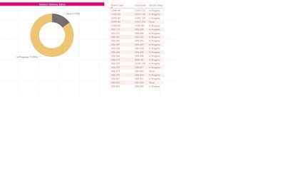
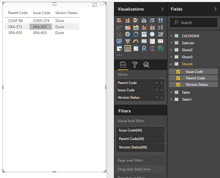
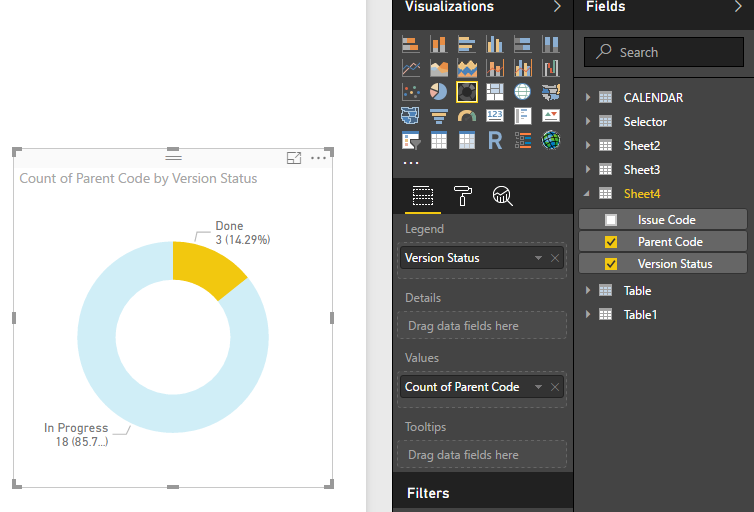
HI, I have below table that shows parent Code, Issue Code (Child) , Issue Status. If User clicks on Pie chart with Status "Done". He would like to see all the parent code with all Issue with atleast one issue has status ='Done'
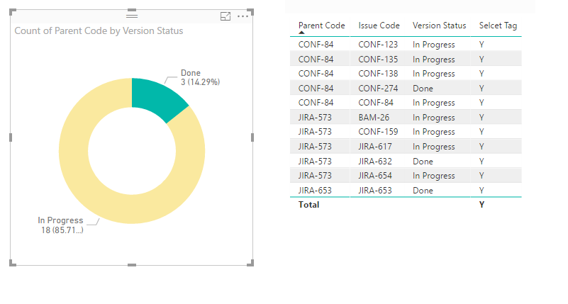
e.g in Below scenario if Done is clicked on Pie the matrix should show following parent codes (CONF-84,JIRA-573,JIRA-653) listinging all Issues And Staus for these parent codes. Please let me know if there is a way of doing this.
Thanks
Solved! Go to Solution.
- Mark as New
- Bookmark
- Subscribe
- Mute
- Subscribe to RSS Feed
- Permalink
- Report Inappropriate Content
Hi @pkohli38,
I don't think donut chart visual will support to do like this.
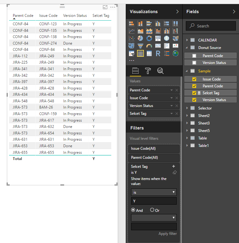
For your scenario, you can write a measure to get selecet item and show the speicfic tag, then drag this measrue to table visual and setting visual level filter to filter the unmatched tag.
Sample:
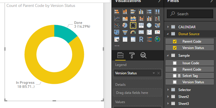
1. Create new table as source of donut chart.
Donut Source = SELECTCOLUMNS('Sample',"Version Status",[Version Status],"Parent Code",[Parent Code])
2. Write a measure to check parent code and display tag.
Selcet Tag =
var selectCode=CALCULATETABLE(VALUES('Donut Source'[Parent Code]),ALLSELECTED('Donut Source'[Version Status]))
var current_parent=LASTNONBLANK('Sample'[Parent Code],[Parent Code])
return
IF(CONTAINS(selectCode,[Parent Code],current_parent),"Y","N")
3. Create visuals.
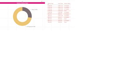
Result:
Regrds,
Xiaoxin Sheng
- Mark as New
- Bookmark
- Subscribe
- Mute
- Subscribe to RSS Feed
- Permalink
- Report Inappropriate Content
Hi @pkohli38,
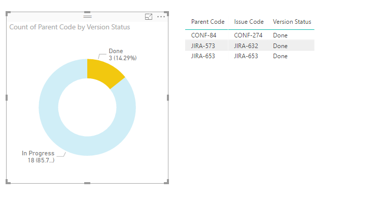
You can direct use original table columns to create table visual and donut chart to achieve your requirement.
Notice: you should turn on the interaction of these visuals to enable the filter effect.
Regards,
Xiaoxin Sheng
- Mark as New
- Bookmark
- Subscribe
- Mute
- Subscribe to RSS Feed
- Permalink
- Report Inappropriate Content
Hi Xiaoxin,
Thanks for replying. Sorry I wasn't clear enough about requirement. If done is clicked, I would like to show following matrix.
Please see below screenshot, it has all the parent code(that has atleast one issue code with status='Done') with their child regardless of their status.
Please let me know if this possible in BI
- Mark as New
- Bookmark
- Subscribe
- Mute
- Subscribe to RSS Feed
- Permalink
- Report Inappropriate Content
Hi @pkohli38,
I don't think donut chart visual will support to do like this.
For your scenario, you can write a measure to get selecet item and show the speicfic tag, then drag this measrue to table visual and setting visual level filter to filter the unmatched tag.
Sample:
1. Create new table as source of donut chart.
Donut Source = SELECTCOLUMNS('Sample',"Version Status",[Version Status],"Parent Code",[Parent Code])
2. Write a measure to check parent code and display tag.
Selcet Tag =
var selectCode=CALCULATETABLE(VALUES('Donut Source'[Parent Code]),ALLSELECTED('Donut Source'[Version Status]))
var current_parent=LASTNONBLANK('Sample'[Parent Code],[Parent Code])
return
IF(CONTAINS(selectCode,[Parent Code],current_parent),"Y","N")
3. Create visuals.
Result:
Regrds,
Xiaoxin Sheng
Helpful resources

Join our Fabric User Panel
Share feedback directly with Fabric product managers, participate in targeted research studies and influence the Fabric roadmap.

| User | Count |
|---|---|
| 63 | |
| 62 | |
| 42 | |
| 19 | |
| 16 |
| User | Count |
|---|---|
| 113 | |
| 105 | |
| 36 | |
| 28 | |
| 28 |
