Become a Certified Power BI Data Analyst!
Join us for an expert-led overview of the tools and concepts you'll need to pass exam PL-300. The first session starts on June 11th. See you there!
Get registered- Power BI forums
- Get Help with Power BI
- Desktop
- Service
- Report Server
- Power Query
- Mobile Apps
- Developer
- DAX Commands and Tips
- Custom Visuals Development Discussion
- Health and Life Sciences
- Power BI Spanish forums
- Translated Spanish Desktop
- Training and Consulting
- Instructor Led Training
- Dashboard in a Day for Women, by Women
- Galleries
- Webinars and Video Gallery
- Data Stories Gallery
- Themes Gallery
- Contests Gallery
- Quick Measures Gallery
- Notebook Gallery
- Translytical Task Flow Gallery
- R Script Showcase
- Ideas
- Custom Visuals Ideas (read-only)
- Issues
- Issues
- Events
- Upcoming Events
Power BI is turning 10! Let’s celebrate together with dataviz contests, interactive sessions, and giveaways. Register now.
- Power BI forums
- Forums
- Get Help with Power BI
- Desktop
- Re: Filter by clicking on chart legend
- Subscribe to RSS Feed
- Mark Topic as New
- Mark Topic as Read
- Float this Topic for Current User
- Bookmark
- Subscribe
- Printer Friendly Page
- Mark as New
- Bookmark
- Subscribe
- Mute
- Subscribe to RSS Feed
- Permalink
- Report Inappropriate Content
Filter by clicking on chart legend
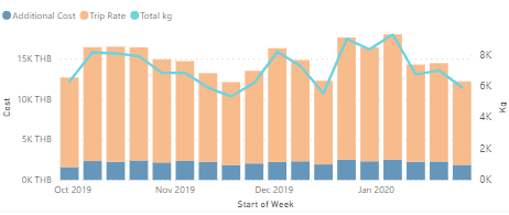
Hi, I have a chart as follow:
The data is loaded from 4 columns in a table: Date, Additional Cost, Trip Rate, and kg. I created a measure for each of the cost.
What I'm trying to do is create a cost card that change when clicking on the legend (Total cost when none is selected, or only additional cost/trip rate).
Your help would be greatly appreciated.
Solved! Go to Solution.
- Mark as New
- Bookmark
- Subscribe
- Mute
- Subscribe to RSS Feed
- Permalink
- Report Inappropriate Content
Hi @Anonymous ,
You cannot do this directly you need to do a workaround:
- Create a table with the following information:
| Measure |
| Total Cost |
| Trip Rate |
Now do the following measure:
Selection Measure = SWITCH(SELECTEDVALUE('Legend_Table'[Measure]);"Trip Rate";[Trip rate measure];"Total Cost";[Total cost measure];[Total cost measure])
Now create your chart in the following way:
- Shared Axis Date
- Column Series: Measure column (previous create column)
- Columns Values: Selection Measure
- Line Values: Kgs Measure
For your card you just need to add the Selection Measure and everything will work accordingly.
Check a PBIX file, altough the axis is a category works the same for dates.
Regards
Miguel Félix
Did I answer your question? Mark my post as a solution!
Proud to be a Super User!
Check out my blog: Power BI em Português- Mark as New
- Bookmark
- Subscribe
- Mute
- Subscribe to RSS Feed
- Permalink
- Report Inappropriate Content
Helpful resources

Join our Fabric User Panel
This is your chance to engage directly with the engineering team behind Fabric and Power BI. Share your experiences and shape the future.

Power BI Monthly Update - June 2025
Check out the June 2025 Power BI update to learn about new features.

| User | Count |
|---|---|
| 84 | |
| 75 | |
| 68 | |
| 41 | |
| 35 |
| User | Count |
|---|---|
| 102 | |
| 56 | |
| 52 | |
| 46 | |
| 40 |

