FabCon is coming to Atlanta
Join us at FabCon Atlanta from March 16 - 20, 2026, for the ultimate Fabric, Power BI, AI and SQL community-led event. Save $200 with code FABCOMM.
Register now!- Power BI forums
- Get Help with Power BI
- Desktop
- Service
- Report Server
- Power Query
- Mobile Apps
- Developer
- DAX Commands and Tips
- Custom Visuals Development Discussion
- Health and Life Sciences
- Power BI Spanish forums
- Translated Spanish Desktop
- Training and Consulting
- Instructor Led Training
- Dashboard in a Day for Women, by Women
- Galleries
- Data Stories Gallery
- Themes Gallery
- Contests Gallery
- QuickViz Gallery
- Quick Measures Gallery
- Visual Calculations Gallery
- Notebook Gallery
- Translytical Task Flow Gallery
- TMDL Gallery
- R Script Showcase
- Webinars and Video Gallery
- Ideas
- Custom Visuals Ideas (read-only)
- Issues
- Issues
- Events
- Upcoming Events
Get Fabric Certified for FREE during Fabric Data Days. Don't miss your chance! Request now
- Power BI forums
- Forums
- Get Help with Power BI
- Desktop
- Exploded pie chart (pie of a pie)
- Subscribe to RSS Feed
- Mark Topic as New
- Mark Topic as Read
- Float this Topic for Current User
- Bookmark
- Subscribe
- Printer Friendly Page
- Mark as New
- Bookmark
- Subscribe
- Mute
- Subscribe to RSS Feed
- Permalink
- Report Inappropriate Content
Exploded pie chart (pie of a pie)
I am looking for a visual that will give me a pie of a pie, or something similar.
This is to show how different funds make up the total amount of the portfolio. Then within each fund show the number of projects that make up each fund. So for example just because #1 fund may be the highest in $ value, is also has the least amount of projects in it, where as fund #2 may be less in $ vaule but has more projects.
I want to use this visual to start creating insights on our funds and high value projects vrs lower value projects etc. At the moment I am creating 2 x separte pie charts and just placing them side by side, one by sum amount and one by count. Would love a tidier way to show this.
Solved! Go to Solution.
- Mark as New
- Bookmark
- Subscribe
- Mute
- Subscribe to RSS Feed
- Permalink
- Report Inappropriate Content
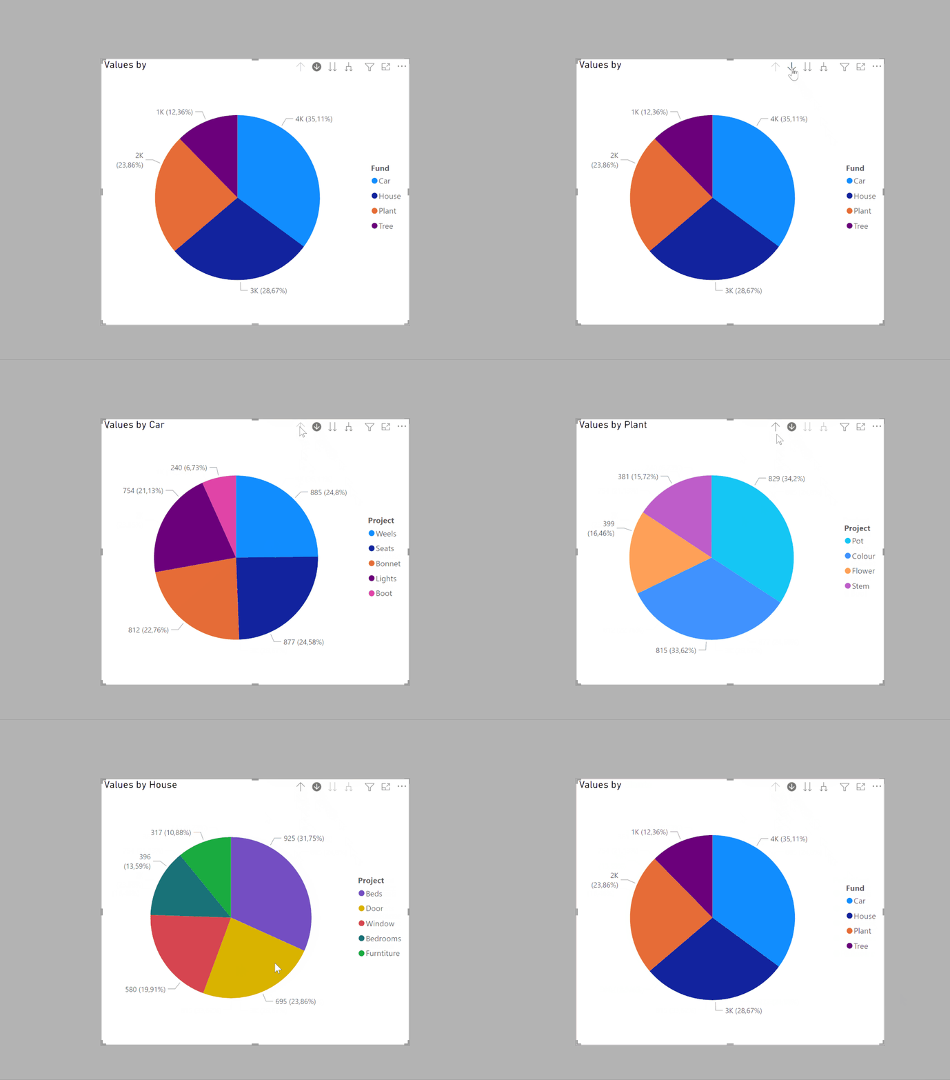
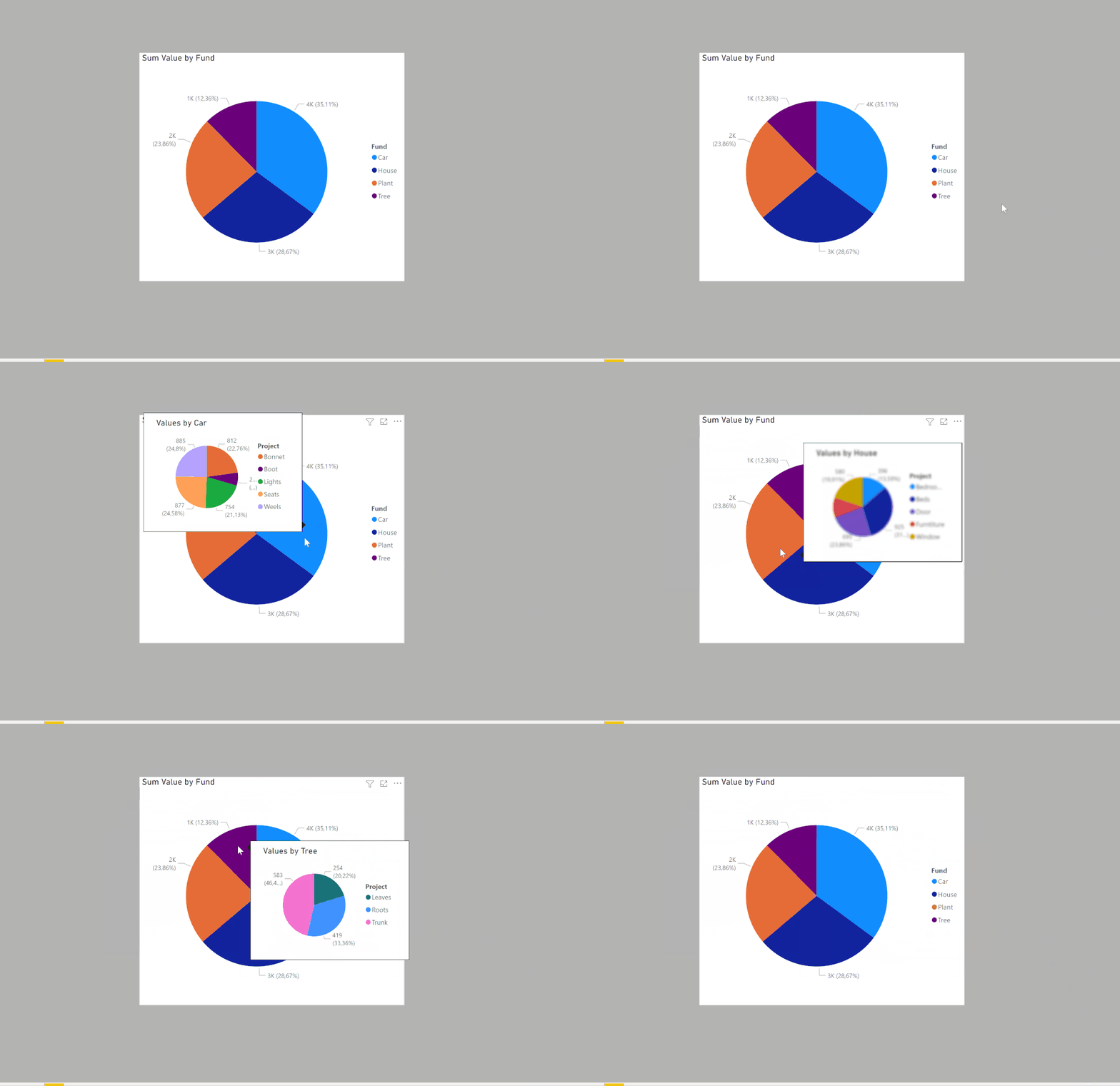
Create the pie chart using both the fund and project field. Then use the Drill-Through option on the chart: select the icon in the header with an arrow within a circle. When you then click on a fund section of the pie, the pie will then show the detail by project.
Or, use a report page Tootip if you want to keep the fund pie chart in view
For report page Tootlips, see:
https://learn.microsoft.com/en-us/power-bi/create-reports/desktop-tooltips?tabs=powerbi-desktop
Sample PBIX file attached
Did I answer your question? Mark my post as a solution!
In doing so, you are also helping me. Thank you!
Proud to be a Super User!
Paul on Linkedin.
- Mark as New
- Bookmark
- Subscribe
- Mute
- Subscribe to RSS Feed
- Permalink
- Report Inappropriate Content
Thanks, this looks like as close as I'm gonna get to the visual I need, thank you!! I will keep an eye out for new custom visuals that may get me closer to what I'm looking for, but this is choice.
- Mark as New
- Bookmark
- Subscribe
- Mute
- Subscribe to RSS Feed
- Permalink
- Report Inappropriate Content
- Mark as New
- Bookmark
- Subscribe
- Mute
- Subscribe to RSS Feed
- Permalink
- Report Inappropriate Content
yeah, I saw this but not going to reply here 🙂
- Mark as New
- Bookmark
- Subscribe
- Mute
- Subscribe to RSS Feed
- Permalink
- Report Inappropriate Content
@Anonymous , For that you need a double donut chart, check if this visual can help
https://appsource.microsoft.com/en-us/product/power-bi-visuals/WA104380858?tab=Overview
- Mark as New
- Bookmark
- Subscribe
- Mute
- Subscribe to RSS Feed
- Permalink
- Report Inappropriate Content
Have tried the Advance pie and Donut visual from xViz and also a sunburst, and they aren't quite right. Rather than a layered donut/pie chart I need a expanded/exploded out one like Excel offers.
Like the one shown in the below link
https://www.officetooltips.com/excel_2016/tips/creating_pie_of_pie_and_bar_of_pie_charts.html
Helpful resources

Power BI Monthly Update - November 2025
Check out the November 2025 Power BI update to learn about new features.

Fabric Data Days
Advance your Data & AI career with 50 days of live learning, contests, hands-on challenges, study groups & certifications and more!


