FabCon is coming to Atlanta
Join us at FabCon Atlanta from March 16 - 20, 2026, for the ultimate Fabric, Power BI, AI and SQL community-led event. Save $200 with code FABCOMM.
Register now!- Power BI forums
- Get Help with Power BI
- Desktop
- Service
- Report Server
- Power Query
- Mobile Apps
- Developer
- DAX Commands and Tips
- Custom Visuals Development Discussion
- Health and Life Sciences
- Power BI Spanish forums
- Translated Spanish Desktop
- Training and Consulting
- Instructor Led Training
- Dashboard in a Day for Women, by Women
- Galleries
- Data Stories Gallery
- Themes Gallery
- Contests Gallery
- QuickViz Gallery
- Quick Measures Gallery
- Visual Calculations Gallery
- Notebook Gallery
- Translytical Task Flow Gallery
- TMDL Gallery
- R Script Showcase
- Webinars and Video Gallery
- Ideas
- Custom Visuals Ideas (read-only)
- Issues
- Issues
- Events
- Upcoming Events
The Power BI Data Visualization World Championships is back! Get ahead of the game and start preparing now! Learn more
- Power BI forums
- Forums
- Get Help with Power BI
- Desktop
- Expanding a data set from fixed (30 days) to open ...
- Subscribe to RSS Feed
- Mark Topic as New
- Mark Topic as Read
- Float this Topic for Current User
- Bookmark
- Subscribe
- Printer Friendly Page
- Mark as New
- Bookmark
- Subscribe
- Mute
- Subscribe to RSS Feed
- Permalink
- Report Inappropriate Content
Expanding a data set from fixed (30 days) to open (running data set)
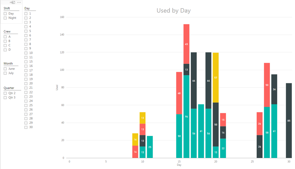
My data is a running data set, meaning I started tracking on June 15th. I understand that I can use the Slicer function to break the data into months, is there a way to see the data set in its entirity, right now it looks like it is limited to 30 days.
Thanks for the help!
CincyKidd
Solved! Go to Solution.
- Mark as New
- Bookmark
- Subscribe
- Mute
- Subscribe to RSS Feed
- Permalink
- Report Inappropriate Content
The solution is to go into the "Date" field, dropdown and tick the "Date" vs "Date Hierachy".
- Mark as New
- Bookmark
- Subscribe
- Mute
- Subscribe to RSS Feed
- Permalink
- Report Inappropriate Content
Based on the information provided you have started tracking from June 15. And as on date we are at July 15. The day column i presume refers to the day portion (DD) of the date column. June has only upto 30 days and July is not yet complete. Once you have the data until end july 31st, you will see the day 31 appearing.
When you say you want to see the data in entirety , can you share some more details on how you want the data to shown. By Month or by Day etc.
Cheers
CheenuSing
- Mark as New
- Bookmark
- Subscribe
- Mute
- Subscribe to RSS Feed
- Permalink
- Report Inappropriate Content
CheenuSing-
Thanks for the reply!
I would like to see all data, meaning from June 15 through today (whatever that will be. I can't figure out how to get that done!
Thanks again.
CincyKidd
- Mark as New
- Bookmark
- Subscribe
- Mute
- Subscribe to RSS Feed
- Permalink
- Report Inappropriate Content
- Mark as New
- Bookmark
- Subscribe
- Mute
- Subscribe to RSS Feed
- Permalink
- Report Inappropriate Content
I would like the x axis to display all data points, say 6/15-7-19. It currently shows only 30 days, non concurrent, meaning June or July or a combination of June and July, but only 30 days at a time..
Thanks.
CincyKidd
- Mark as New
- Bookmark
- Subscribe
- Mute
- Subscribe to RSS Feed
- Permalink
- Report Inappropriate Content
Ok. I clearly have confused everyone here, since there are no solutions, which I find hard to believe.
My revised summary.
I have been collecting data from 4 machines and sometimes a machine will have up to 4 data points on a day, I have been collecting this data since 6/15 and I would like to see all the data points in a bar graph along the X axis. I have been helped to figure out how to show the mulitiple data points, now I just need to figure out how to display ALL the data. Right now I get only 30 or 31 day chuncks.
Thanks for the help!
CincyKidd
- Mark as New
- Bookmark
- Subscribe
- Mute
- Subscribe to RSS Feed
- Permalink
- Report Inappropriate Content
The solution is to go into the "Date" field, dropdown and tick the "Date" vs "Date Hierachy".
Helpful resources

Power BI Monthly Update - November 2025
Check out the November 2025 Power BI update to learn about new features.

Fabric Data Days
Advance your Data & AI career with 50 days of live learning, contests, hands-on challenges, study groups & certifications and more!

| User | Count |
|---|---|
| 57 | |
| 44 | |
| 40 | |
| 21 | |
| 18 |

