- Subscribe to RSS Feed
- Mark Topic as New
- Mark Topic as Read
- Float this Topic for Current User
- Bookmark
- Subscribe
- Printer Friendly Page
- Mark as New
- Bookmark
- Subscribe
- Mute
- Subscribe to RSS Feed
- Permalink
- Report Inappropriate Content
Exclude/Include to act as filters & Exclude/Include for Granular data
Hi,
I am struggling with how can I achieve two things with respect to Exclude/Include functionality (when you right click on column in a column chart you can exclude that column/data category). Now from what I see this basically hides the data points/column in that chart. Or basically it acts as a visual level filter. I am not sure if that in itself is very useful/powerful.
1. I wanted to know is there a way to extend this - that is say when I exclude an item category from a column chart, the underlying data point should be excluded from all charts on that page/report (at least from all the other visuals that have interact/filter off this column chart). That is the exclude option should be page/report level filter not just a visual level filter. I believe this is more powerful.
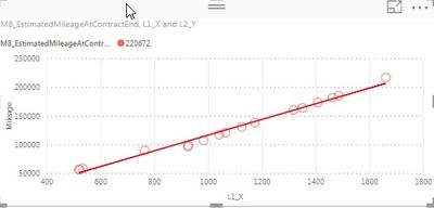
2. The include exclude feature does not work on scatter plots (where there is granular data). I dont understand why. It would be very useful to exclude certain data points (that are mostly outliers), and hence result in the scatter plot axis resizing (and trend lines rebuilt) for the remaining data points.
While most of the above can be done by filters, but using the exclude feature makes Power BI more powerful & interactive, especially for end-users who are new to the platform. Does anyone have ideas how to achive this or will this have to be put up as an idea?
- Mark as New
- Bookmark
- Subscribe
- Mute
- Subscribe to RSS Feed
- Permalink
- Report Inappropriate Content
Hi @cyclist007,
Currently, the exclude option works as a visual level filter, and I don't think there is an option to extend this to be page/report level filter. So you can put it up as an idea on Power BI Ideas, and I believe it will be a great idea. ![]()
2. The include exclude feature does not work on scatter plots (where there is granular data). I dont understand why. It would be very useful to exclude certain data points (that are mostly outliers), and hence result in the scatter plot axis resizing (and trend lines rebuilt) for the remaining data points.
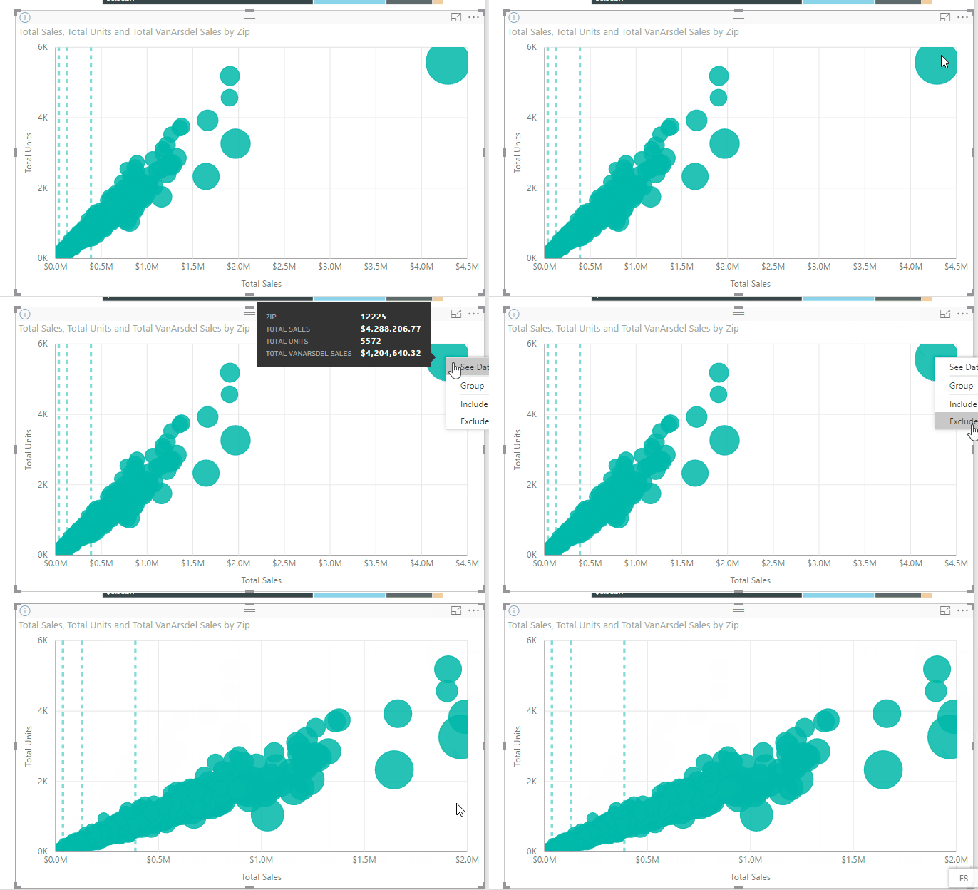
Based on my test, the include/exclude feature works on Scatter chart visual.
Regards
- Mark as New
- Bookmark
- Subscribe
- Mute
- Subscribe to RSS Feed
- Permalink
- Report Inappropriate Content
@v-ljerr-msft Thank you for the response
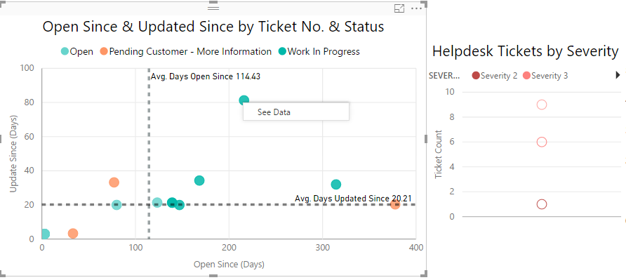
I am sharing two images and you can see below the include/exclude options do not show up on the left hand side scatter plot that has granular data (that is, I cannot filter out individual tickets), while it does allow me to exclude a ticket category (in this case Severity 2) on the 2nd scatter plot (does not have granular data and was originally a column chart). Is there some other reason that I could be in play?
- Mark as New
- Bookmark
- Subscribe
- Mute
- Subscribe to RSS Feed
- Permalink
- Report Inappropriate Content
Has this issue been addressed? Or at least do we have an acknowledgement from PBI team that this is something they are looking in to?
- Mark as New
- Bookmark
- Subscribe
- Mute
- Subscribe to RSS Feed
- Permalink
- Report Inappropriate Content
No, there was no further action on this 😞
Just posted this is as an idea, please vote for it here: https://ideas.powerbi.com/forums/265200-power-bi-ideas/suggestions/19698331-excluding-data-on-a-visu...
- Mark as New
- Bookmark
- Subscribe
- Mute
- Subscribe to RSS Feed
- Permalink
- Report Inappropriate Content

By excluding some outliers in the visual level filter the measure should calculate the new estimation, but it just ignores the exclude filter.
I've voted the idea, hoping the feature coming soon.
Thanks for posting it.
- Mark as New
- Bookmark
- Subscribe
- Mute
- Subscribe to RSS Feed
- Permalink
- Report Inappropriate Content
Thanks for posting the feature request, I just voted for it. Being able to put the filters in the page level by clicking would be really powerful. This would allow my users to quickly look at certain segments of data across all the charts (i.e. males, one year in the program, in school #4).
Helpful resources
| User | Count |
|---|---|
| 113 | |
| 89 | |
| 84 | |
| 54 | |
| 46 |


