Become a Certified Power BI Data Analyst!
Join us for an expert-led overview of the tools and concepts you'll need to pass exam PL-300. The first session starts on June 11th. See you there!
Get registered- Power BI forums
- Get Help with Power BI
- Desktop
- Service
- Report Server
- Power Query
- Mobile Apps
- Developer
- DAX Commands and Tips
- Custom Visuals Development Discussion
- Health and Life Sciences
- Power BI Spanish forums
- Translated Spanish Desktop
- Training and Consulting
- Instructor Led Training
- Dashboard in a Day for Women, by Women
- Galleries
- Webinars and Video Gallery
- Data Stories Gallery
- Themes Gallery
- Contests Gallery
- Quick Measures Gallery
- Notebook Gallery
- Translytical Task Flow Gallery
- R Script Showcase
- Ideas
- Custom Visuals Ideas (read-only)
- Issues
- Issues
- Events
- Upcoming Events
Power BI is turning 10! Let’s celebrate together with dataviz contests, interactive sessions, and giveaways. Register now.
- Power BI forums
- Forums
- Get Help with Power BI
- Desktop
- Re: Employee home address vs working address, map
- Subscribe to RSS Feed
- Mark Topic as New
- Mark Topic as Read
- Float this Topic for Current User
- Bookmark
- Subscribe
- Printer Friendly Page
- Mark as New
- Bookmark
- Subscribe
- Mute
- Subscribe to RSS Feed
- Permalink
- Report Inappropriate Content
Employee home address vs working address, map
Hi,
I am new to this forum and new in Power BI,
I have recently finish my first course.
Now I want to see where my employees live and where they work.
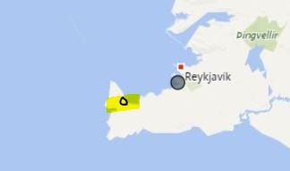
In my map I want to see John in one colour (two dots, home and work address), Alice in another colour (two dots).
I have made three tables, which are connected.
Table 1, staff name
Table 2, staff name and home address
Table 3, staff name and working address
I get the dots right, at right places.
What I don't get right.
If I choose "John" I only get his home address or his working address. Not both, as I wished for.
See attachment. Black dot is right, but I want another black dot to show his working address (black circle with yellow line).
Solved! Go to Solution.
- Mark as New
- Bookmark
- Subscribe
- Mute
- Subscribe to RSS Feed
- Permalink
- Report Inappropriate Content
Hi @Reykjavik,
Believe that this is an issue for the relationship betwen both tables that have home and work adress.
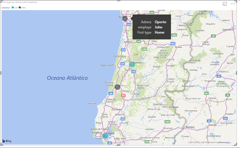
I created a table with 3 column (kept the Staff table as a connection):
- Staff
- Adress
- Type - Work / Home
Then added:
- Adress - Location
- Staff (related table) - Legend
- Type - Tooltip
As you can see below I have two dots for each and stoping on one gives me the detail if it's home or work.
Regards,
MFelix
Regards
Miguel Félix
Did I answer your question? Mark my post as a solution!
Proud to be a Super User!
Check out my blog: Power BI em Português- Mark as New
- Bookmark
- Subscribe
- Mute
- Subscribe to RSS Feed
- Permalink
- Report Inappropriate Content
Great MFelix,
Thank you
Helpful resources

Join our Fabric User Panel
This is your chance to engage directly with the engineering team behind Fabric and Power BI. Share your experiences and shape the future.

Power BI Monthly Update - June 2025
Check out the June 2025 Power BI update to learn about new features.

| User | Count |
|---|---|
| 84 | |
| 76 | |
| 73 | |
| 42 | |
| 36 |
| User | Count |
|---|---|
| 109 | |
| 56 | |
| 52 | |
| 48 | |
| 42 |


