FabCon is coming to Atlanta
Join us at FabCon Atlanta from March 16 - 20, 2026, for the ultimate Fabric, Power BI, AI and SQL community-led event. Save $200 with code FABCOMM.
Register now!- Power BI forums
- Get Help with Power BI
- Desktop
- Service
- Report Server
- Power Query
- Mobile Apps
- Developer
- DAX Commands and Tips
- Custom Visuals Development Discussion
- Health and Life Sciences
- Power BI Spanish forums
- Translated Spanish Desktop
- Training and Consulting
- Instructor Led Training
- Dashboard in a Day for Women, by Women
- Galleries
- Data Stories Gallery
- Themes Gallery
- Contests Gallery
- Quick Measures Gallery
- Notebook Gallery
- Translytical Task Flow Gallery
- TMDL Gallery
- R Script Showcase
- Webinars and Video Gallery
- Ideas
- Custom Visuals Ideas (read-only)
- Issues
- Issues
- Events
- Upcoming Events
Calling all Data Engineers! Fabric Data Engineer (Exam DP-700) live sessions are back! Starting October 16th. Sign up.
- Power BI forums
- Forums
- Get Help with Power BI
- Desktop
- Re: Embedding up and down arrows in visual and cha...
- Subscribe to RSS Feed
- Mark Topic as New
- Mark Topic as Read
- Float this Topic for Current User
- Bookmark
- Subscribe
- Printer Friendly Page
- Mark as New
- Bookmark
- Subscribe
- Mute
- Subscribe to RSS Feed
- Permalink
- Report Inappropriate Content
Embedding up and down arrows in visual and changing them based on condition
Hi
I need to add an up and down arrow image to my report which displays the arrow based on specific condition.
I have created a new measure show_image where
show_image = if sum(sales) > 1000 then 'Image url of up arrow' else 'Image url of down arrow'
The problem with this approach is that it returns the url of the image but I cannot format a measure to display the image URL. It can only be done with columns.
and If i use a column then it returns me both the URL.
Now is there a way to display just one result based on the condition.
Any help would be appreciated.
Thanks
Solved! Go to Solution.
- Mark as New
- Bookmark
- Subscribe
- Mute
- Subscribe to RSS Feed
- Permalink
- Report Inappropriate Content
Hi @tarun16feb,
It seems no green arrow in unichar. Maybe you can try to format the column. Please refer to Power-BI-Desktop-DAX-Using-Unicode-Arrows-as-Measures-in-a-Tabl.
Measure =
IF ( MIN ( 'Table1'[Column1] ) < 600, UNICHAR ( 9650 ), UNICHAR ( 128315 ) )
Best Regards,
Dale
If this post helps, then please consider Accept it as the solution to help the other members find it more quickly.
- Mark as New
- Bookmark
- Subscribe
- Mute
- Subscribe to RSS Feed
- Permalink
- Report Inappropriate Content
This video explains this very well:)
- Mark as New
- Bookmark
- Subscribe
- Mute
- Subscribe to RSS Feed
- Permalink
- Report Inappropriate Content
There are a few ways you can do this but the way I currently do this is based on the following:
1) Growth % Measure: %YoY = Divide(([CYTD] - [PYTD]),([PYTD]))
2) Secondary Measure for Icons included within the %YOY:
YOY%Icons =
VAR Arrow =
SWITCH (
TRUE (),
[%YoY] < 0, UNICHAR ( 8659 ),
[%YoY] = 0, UNICHAR ( 8660 ),
[%YoY] > 0, UNICHAR ( 8657 )
)
RETURN
FORMAT ( [%YoY], "Percent" ) & " " & Arrow
3) Create conditional formatting on that column or card.
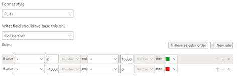
If >0 then green, if <0 then red.
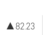
Final Result within card:
Please like this message if this helped you figure out a viable solution to your issue. 🙂
- Mark as New
- Bookmark
- Subscribe
- Mute
- Subscribe to RSS Feed
- Permalink
- Report Inappropriate Content
This worked perfectly for me, thanks you!
- Mark as New
- Bookmark
- Subscribe
- Mute
- Subscribe to RSS Feed
- Permalink
- Report Inappropriate Content
Hi everyone
I have the same situation but comparing weeks so basically its on a card and the number is showing a week but the arrow would compare with previous week. if this week number is higher then up and vice versa. this is the measure we created but dont know how to include the up and down arrow.
- Mark as New
- Bookmark
- Subscribe
- Mute
- Subscribe to RSS Feed
- Permalink
- Report Inappropriate Content
There are a few ways you can do this but the way I currently do this is based on the following:
1) Growth % Measure: %YoY = Divide(([CYTD] - [PYTD]),([PYTD]))
2) Secondary Measure for Icons included within the %YOY:
YOY%Icons =
VAR Arrow =
SWITCH (
TRUE (),
[%YoY] < 0, UNICHAR ( 8659 ),
[%YoY] = 0, UNICHAR ( 8660 ),
[%YoY] > 0, UNICHAR ( 8657 )
)
RETURN
FORMAT ( [%YoY], "Percent" ) & " " & Arrow
3) Create conditional formatting on that column or card.
If >0 then green, if <0 then red.
Final Result within card:
Please like this message if this helped you figure out a viable solution to your issue.
- Mark as New
- Bookmark
- Subscribe
- Mute
- Subscribe to RSS Feed
- Permalink
- Report Inappropriate Content
Hi.
Please follow the steps below.
- in the Values section, expand the options for the field you want the arrows.
- click Conditional formatting
- select Icons
- select the Style (the type of icon you want)
- set the rules
And you are done. 🙂
Let me know if this helps.
Thanks
Rohtashv
- Mark as New
- Bookmark
- Subscribe
- Mute
- Subscribe to RSS Feed
- Permalink
- Report Inappropriate Content
Hi @tarun16feb
Here is the solution I discovered,
use UNICHAR(9650) for up arrow and

I hope this helps.
Thanks,
Pragati Sidana
- Mark as New
- Bookmark
- Subscribe
- Mute
- Subscribe to RSS Feed
- Permalink
- Report Inappropriate Content
Thank you so much, I've been searching all day for this, Thank you!!
- Mark as New
- Bookmark
- Subscribe
- Mute
- Subscribe to RSS Feed
- Permalink
- Report Inappropriate Content
Glad I was of any help!!
- Mark as New
- Bookmark
- Subscribe
- Mute
- Subscribe to RSS Feed
- Permalink
- Report Inappropriate Content
Hi @tarun16feb,
Maybe you can use unichar instead. You can try it like this. You can find out more arrows here.
Measure =
IF ( MIN ( 'Table2'[Column1] ) < 600, UNICHAR ( 11014 ), UNICHAR ( 11015 ) )
Best Regards,
Dale
If this post helps, then please consider Accept it as the solution to help the other members find it more quickly.
- Mark as New
- Bookmark
- Subscribe
- Mute
- Subscribe to RSS Feed
- Permalink
- Report Inappropriate Content
- Mark as New
- Bookmark
- Subscribe
- Mute
- Subscribe to RSS Feed
- Permalink
- Report Inappropriate Content
Hi
Thanks for getting back.
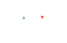
I am looking for an upward triangle with green color and downward triangle with red color.
I couldn't find the colored ones. Can you please point me in the right direction.
- Mark as New
- Bookmark
- Subscribe
- Mute
- Subscribe to RSS Feed
- Permalink
- Report Inappropriate Content
Hi @tarun16feb,
It seems no green arrow in unichar. Maybe you can try to format the column. Please refer to Power-BI-Desktop-DAX-Using-Unicode-Arrows-as-Measures-in-a-Tabl.
Measure =
IF ( MIN ( 'Table1'[Column1] ) < 600, UNICHAR ( 9650 ), UNICHAR ( 128315 ) )
Best Regards,
Dale
If this post helps, then please consider Accept it as the solution to help the other members find it more quickly.
- Mark as New
- Bookmark
- Subscribe
- Mute
- Subscribe to RSS Feed
- Permalink
- Report Inappropriate Content
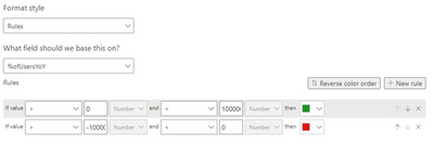
We cannot really say that Green up Arrow problem is solved because even if you give green color default in formatting and give condition to change it to RED COLOR Arrow in measure calculation, when you pin that tile/table to Dashboard it won't take Green color which is defaulted in formatting.
Dashboard can only accept colored Arrows/symbol which are given through measures.


Is there any formatting techniques Power BI has for Dashboards?
Helpful resources

FabCon Global Hackathon
Join the Fabric FabCon Global Hackathon—running virtually through Nov 3. Open to all skill levels. $10,000 in prizes!

Power BI Monthly Update - September 2025
Check out the September 2025 Power BI update to learn about new features.


