Join us at FabCon Vienna from September 15-18, 2025
The ultimate Fabric, Power BI, SQL, and AI community-led learning event. Save €200 with code FABCOMM.
Get registered- Power BI forums
- Get Help with Power BI
- Desktop
- Service
- Report Server
- Power Query
- Mobile Apps
- Developer
- DAX Commands and Tips
- Custom Visuals Development Discussion
- Health and Life Sciences
- Power BI Spanish forums
- Translated Spanish Desktop
- Training and Consulting
- Instructor Led Training
- Dashboard in a Day for Women, by Women
- Galleries
- Data Stories Gallery
- Themes Gallery
- Contests Gallery
- Quick Measures Gallery
- Notebook Gallery
- Translytical Task Flow Gallery
- TMDL Gallery
- R Script Showcase
- Webinars and Video Gallery
- Ideas
- Custom Visuals Ideas (read-only)
- Issues
- Issues
- Events
- Upcoming Events
Enhance your career with this limited time 50% discount on Fabric and Power BI exams. Ends August 31st. Request your voucher.
- Power BI forums
- Forums
- Get Help with Power BI
- Desktop
- Re: Embed the Y-Axis category into the bars of a b...
- Subscribe to RSS Feed
- Mark Topic as New
- Mark Topic as Read
- Float this Topic for Current User
- Bookmark
- Subscribe
- Printer Friendly Page
- Mark as New
- Bookmark
- Subscribe
- Mute
- Subscribe to RSS Feed
- Permalink
- Report Inappropriate Content
Embed the Y-Axis category into the bars of a bar chart
Hi all!
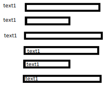
Is there a solution to embed the Y-Axis Textes into the bars of the bar chart?
Example how it looks like normally and how I want it to look:
Solved! Go to Solution.
- Mark as New
- Bookmark
- Subscribe
- Mute
- Subscribe to RSS Feed
- Permalink
- Report Inappropriate Content
Hi there @Sean
Good to hear from you 🙂
My original solution had some limitations, which you have highlighted.
1. The reason the numerical data labels outside the bars disappear is that the bars I had created for them were a fixed size of 1, and data labels can't spill when 2+ bars are stacked. I'm not sure there's a great solution to this, but we could make the bar size scale with the other bars, e.g.
Zero Measure Top =
-- Used to give space to plot data label outside end of bar
VAR ScaleFactor = 0.2
VAR MaxPositiveValue =
CALCULATE (
    MAXX (
        VALUES ( Dummy[Label] ),
        [Value Sum]
    ),
    ALLSELECTED ()
)
VAR BarSize =
    MaxPositiveValue * ScaleFactor
VAR ValueSum =
    [Value Sum]
RETURN
    IF (
        NOT ISBLANK ( ValueSum ),
        BarSize * SIGN ( ValueSum )
    )
Also, to make negative labels (outside the bar) behave, I had to change the format string expression to:
VAR ValueSum = [Value Sum]
RETURN
    SWITCH (
        TRUE (),
        ISSELECTEDMEASURE ( [Zero Measure Base] ), SELECTEDMEASUREFORMATSTRING (),
        -- Number format for axis
        ISSELECTEDMEASURE ( [Zero Measure Top] ),
            VAR FormatInitial =
                FORMAT ( ValueSum, "0.0" )
            -- Correct for extra negative sign that shows up in data label
            -- Maybe a better way of doing this!
            VAR FormatFixed =
                IF (
                    ValueSum < 0,
                    RIGHT ( FormatInitial, LEN ( FormatInitial ) - 1 ),
                    FormatInitial
                )
            RETURN
                """" & FormatFixed & """",
        -- Number format to appear outside bars
        """" & SELECTEDVALUE ( 'Dummy'[Label] ) & """" & ";"""
            & SELECTEDVALUE ( 'Dummy'[Label] ) & """" -- Label value surrounded by quotes
    )
2. The reason the Text labels disappear is similar, since data labels can't overflow. I imagine that some tweaking of format string expressions could get them showing up against another measure in an appropriate place - I will leave to you or anyone else as an exercise 🙂
I've attached my file with the updates mentioned above.
All the best,
Owen
- Mark as New
- Bookmark
- Subscribe
- Mute
- Subscribe to RSS Feed
- Permalink
- Report Inappropriate Content
Hi @lynnsop
Here's one idea: Create a Calculation Group with a Calculation Item whose number format is the Label text.
I've attached a sample PBIX demonstrating this.
Initially, I created a Calculation Group with a single Calculation Item:
- Expression:
SELECTEDMEASURE()
- Format String Expression (original version):
"""" & SELECTEDVALUE ( 'Dummy'[Label] ) & """
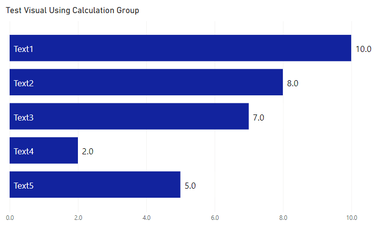
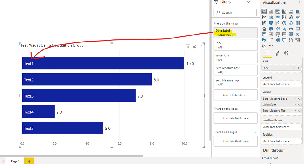
Then I applied this single Calculation Item as a filter on the visual, and set the Position for the data labels to "Inside base".
After that, I played around with some additional measures [Zero Measure Base] and [Zero Measure Top] to ensure the horizontal axis number format looks sensible and allow for numerical data labels outside the bars, so I changed the Format String Expression to:
SWITCH (
    TRUE (),
    ISSELECTEDMEASURE ( [Zero Measure Base] ),
    SELECTEDMEASUREFORMATSTRING (), -- Number format for axis
    ISSELECTEDMEASURE ( [Zero Measure Top] ),
    """" & FORMAT ( [Value Sum], "0.0" ) & """", -- Number format to appear outside bars
    """" & SELECTEDVALUE ( 'Dummy'[Label] ) & """" -- Label value surrounded by quotes
)
Tooltips might need tweaking (e.g. report page tooltips) or switching off.
Hopefully this is of some use - I would be interested in whether this works for your report.
Regards,
Owen
- Mark as New
- Bookmark
- Subscribe
- Mute
- Subscribe to RSS Feed
- Permalink
- Report Inappropriate Content
@OwenAuger
Ok so actually I have no clue what you are doing, so I just downloaded your PowerBi Report, copy pasted your chart and swapped out your data/columns with mine.
It kinda looks good - though not yet correct:
Instead of showing the Barnames (in our example this would be "text xy") it shows the seperate counts.
The Barnames are not shown at all.
- Mark as New
- Bookmark
- Subscribe
- Mute
- Subscribe to RSS Feed
- Permalink
- Report Inappropriate Content
Hi @lynnsop
To make this work, the key requirement is to create a Calculation Group - I apologise that I didn't go through all the steps required to do that.
The reason Calculation Groups are useful here is that one of their features is over-riding number formats, which we want to do in order to change the data labels. Unfortunately Power BI doesn't natively allow measure-driven data labels, so this is a technique to get around that.
In your example, we can override number formats with the text value of the Barnames. When the Calculation Item is applied as a filter on the visual, the data labels will use the number format defined in the Calculation Item, rather than the usual number format.
If you haven't encountered Calculation Groups before, I recommend this article, or there are various other articles online.
Here is a rough guide to the steps I followed to create the visual in my PBIX file:
- Install Tabular Editor in order to be able to conveniently create/modify Calculation Groups in Power BI Desktop.
- Ensure that you create explicit measures for any values you want to dispal on your visuals.
In my example I had this measure:
Value Sum = SUM ( Dummy[Value] ) - On the ribbon, select External Tools > Tabular Editor
- In Tabular Editor, right-click on Tables > Create Calculation Group
- Rename the Calculation Group and the "Name" column within the Calculation Group to something appropriate.
- Right-click on the Calculation Group Name > Create New > Calculation Item, and give it an appropriate name.
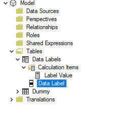
- After these steps my example looked like this (Calculation Item named Lavel Value in my case):
- Then we need to set the Expression and Format String Expression for the Calculation Item.
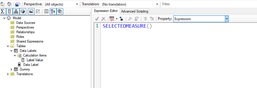
- Select the Calculation Item, and in the Expression Editor enter SELECTEDMEASURE() (This means that the value of the measure will be left as-is)
- In the Format String Expression editor, we need to enter an expression that over-rides the default number format. In my final version, I wrote an expression that sets the number format depending on the current measure in the visual.
Line 7 is the one that sets the number format to the value of the text field you want to show on the visual, in my case 'Dummy'[Label]. This should be replaced with the relevan field in your data model. The rest of the formula handles some special measures I created to go above & below the main data bar in the visual, but you could omit these if you just want a simple visual.
- Select the Calculation Item, and in the Expression Editor enter SELECTEDMEASURE() (This means that the value of the measure will be left as-is)
- Ctrl-S to save these changes back to Power BI Desktop, then you may be prompted to Refresh in Power BI Desktop.
- In Power BI Desktop, create a visual using an explicit measure as a value, and enable data labels, setting the position to Inside Base.
- Apply a visual level filter with your Calculation Item is selected. This is what my visual looked like. Note that the Zero Measure Base & Zero Measure Top measures are optional. I used Zero Measure Base to correct the axis labels (as the first measure in a stacked bar sets the axis forma
- By applying the Calculation Item as a filter, the data labels are over-ridden and instead use the Format String Expression entered in Tabular Editor.
Hopefully that helps!
Kind regards,
Owen
- Mark as New
- Bookmark
- Subscribe
- Mute
- Subscribe to RSS Feed
- Permalink
- Report Inappropriate Content
Hi @OwenAuger !
Great solution as always! 🙂
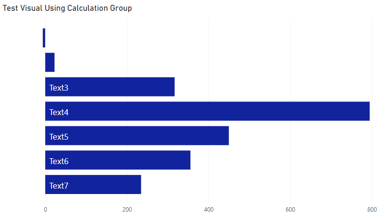
If we modify the sample data a bit
| Text1 | -6 |
| Text2 | 23 |
| Text3 | 317 |
| Text4 | 795 |
| Text5 | 450 |
| Text6 | 356 |
| Text7 | 235 |
the first 2 values no longer show their data labels and ALL values disappear? 🤔
It seems if the numbers are not close together the Zero Top Measure Values are no longer displayed? Any suggestions or ideas?
Thanks! 🙂
Sean
- Mark as New
- Bookmark
- Subscribe
- Mute
- Subscribe to RSS Feed
- Permalink
- Report Inappropriate Content
Hi there @Sean
Good to hear from you 🙂
My original solution had some limitations, which you have highlighted.
1. The reason the numerical data labels outside the bars disappear is that the bars I had created for them were a fixed size of 1, and data labels can't spill when 2+ bars are stacked. I'm not sure there's a great solution to this, but we could make the bar size scale with the other bars, e.g.
Zero Measure Top =
-- Used to give space to plot data label outside end of bar
VAR ScaleFactor = 0.2
VAR MaxPositiveValue =
CALCULATE (
    MAXX (
        VALUES ( Dummy[Label] ),
        [Value Sum]
    ),
    ALLSELECTED ()
)
VAR BarSize =
    MaxPositiveValue * ScaleFactor
VAR ValueSum =
    [Value Sum]
RETURN
    IF (
        NOT ISBLANK ( ValueSum ),
        BarSize * SIGN ( ValueSum )
    )
Also, to make negative labels (outside the bar) behave, I had to change the format string expression to:
VAR ValueSum = [Value Sum]
RETURN
    SWITCH (
        TRUE (),
        ISSELECTEDMEASURE ( [Zero Measure Base] ), SELECTEDMEASUREFORMATSTRING (),
        -- Number format for axis
        ISSELECTEDMEASURE ( [Zero Measure Top] ),
            VAR FormatInitial =
                FORMAT ( ValueSum, "0.0" )
            -- Correct for extra negative sign that shows up in data label
            -- Maybe a better way of doing this!
            VAR FormatFixed =
                IF (
                    ValueSum < 0,
                    RIGHT ( FormatInitial, LEN ( FormatInitial ) - 1 ),
                    FormatInitial
                )
            RETURN
                """" & FormatFixed & """",
        -- Number format to appear outside bars
        """" & SELECTEDVALUE ( 'Dummy'[Label] ) & """" & ";"""
            & SELECTEDVALUE ( 'Dummy'[Label] ) & """" -- Label value surrounded by quotes
    )
2. The reason the Text labels disappear is similar, since data labels can't overflow. I imagine that some tweaking of format string expressions could get them showing up against another measure in an appropriate place - I will leave to you or anyone else as an exercise 🙂
I've attached my file with the updates mentioned above.
All the best,
Owen
- Mark as New
- Bookmark
- Subscribe
- Mute
- Subscribe to RSS Feed
- Permalink
- Report Inappropriate Content
@lynnsop , I doubt the option is there for standard visual
Check some custom visual - https://appsource.microsoft.com/en-us/marketplace/apps?product=power-bi-visuals
Helpful resources
| User | Count |
|---|---|
| 78 | |
| 77 | |
| 36 | |
| 32 | |
| 29 |
| User | Count |
|---|---|
| 93 | |
| 79 | |
| 57 | |
| 48 | |
| 48 |
