Join us in Barcelona for FabCon and SQLCon, September 28 - October 1, 2026.
This is best Fabric, Power BI, SQL and AI community event. How do we know? The last event sold out! Save €200 with code FABCMTY200.
Register now- Power BI forums
- Get Help with Power BI
- Desktop
- Service
- Report Server
- Power Query
- Mobile Apps
- Developer
- DAX Commands and Tips
- Custom Visuals Development Discussion
- Health and Life Sciences
- Power BI Spanish forums
- Translated Spanish Desktop
- Training and Consulting
- Instructor Led Training
- Dashboard in a Day for Women, by Women
- Galleries
- Data Stories Gallery
- Themes Gallery
- Contests Gallery
- QuickViz Gallery
- Quick Measures Gallery
- Visual Calculations Gallery
- Fabric Apps Gallery
- Notebook Gallery
- Translytical Task Flow Gallery
- TMDL Gallery
- R Script Showcase
- Webinars and Video Gallery
- Ideas
- Custom Visuals Ideas (read-only)
- Issues
- Issues
- Events
- Upcoming Events
The Fabric community is upgrading! Read all of the details including the timeline and what you can expect. Learn more
- Power BI forums
- Forums
- Get Help with Power BI
- Desktop
- Re: Dynamically filter table based on slicer
- Subscribe to RSS Feed
- Mark Topic as New
- Mark Topic as Read
- Float this Topic for Current User
- Bookmark
- Subscribe
- Printer Friendly Page

- Mark as New
- Bookmark
- Subscribe
- Mute
- Subscribe to RSS Feed
- Permalink
- Report Inappropriate Content
Dynamically filter table based on slicer
Hello,
I am trying to dinamically filter a table visualization based on a slicer.
I have a data table like the one below:
| Date | Attribute 1 | Attribute 2 |
| 01/01/2010 | A | red |
| 01/02/2010 | B | red |
| 01/03/2010 | C | red |
| 01/04/2010 | D | red |
| 01/05/2010 | A | blue |
| 01/06/2010 | B | blue |
| 01/07/2010 | C | blue |
| 01/08/2010 | A | green |
| 01/09/2010 | B | green |
| 01/10/2010 | C | green |
The slicer has red, blue, and green as choices, and when clicking one of them, the table visualization should only show the rows corresponding to that choice.
I have created a slicer which outputs into a measure, however I can't find a way to link that into a filter for a table visualization. I've seen similar posts on the forum but they all seem to relate to calculating summaries based on a slicer, creating a measure which uses the SWITCH function , but here I don't need a summary eg. a sum, but I need all the values to show.
Any help or suggestion would be greatly appreciated.

- Mark as New
- Bookmark
- Subscribe
- Mute
- Subscribe to RSS Feed
- Permalink
- Report Inappropriate Content
Hello @Anonymous ,
I'm not sure what you're asking for here, sorry!
You want the Slicer to filter the table based on an option chosen from a measure?
You can look into SELECTEDVALUE
https://docs.microsoft.com/en-us/dax/selectedvalue-function
Without more information I can't specifically help you, can you show me the measure you have?
- Mark as New
- Bookmark
- Subscribe
- Mute
- Subscribe to RSS Feed
- Permalink
- Report Inappropriate Content
I don't understand your question. This is a simple table visual. If you add a slicer with that dimension, the rows in the visual will show only those rows.
- Mark as New
- Bookmark
- Subscribe
- Mute
- Subscribe to RSS Feed
- Permalink
- Report Inappropriate Content
Heya,
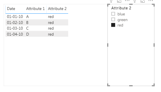
You can just put Attribute 2 in a slicer and select the color you'd like. The table should automaticly pick up and show only the red rows.


- Mark as New
- Bookmark
- Subscribe
- Mute
- Subscribe to RSS Feed
- Permalink
- Report Inappropriate Content
@Anonymous can you demonstrate using the data what you want to come out with?
are you saying if you click red only red rows should remain?
If I took the time to answer your question and I came up with a solution, please mark my post as a solution and /or give kudos freely for the effort 🙂 Thank you!
Proud to be a Super User!
- Mark as New
- Bookmark
- Subscribe
- Mute
- Subscribe to RSS Feed
- Permalink
- Report Inappropriate Content
@vanessafvg Yes here is an example:
If I click on red, then this will be the output:
| Date | Attribute 1 | Attribute 2 |
| 01/01/2010 | A | red |
| 01/02/2010 | B | red |
| 01/03/2010 | C | red |
| 01/04/2010 | D | red |
If I select green, this will be the output:
| Date | Attribute 1 | Attribute 2 |
| 01/08/2010 | A | green |
| 01/09/2010 | B | green |
| 01/10/2010 | C | green |


- Mark as New
- Bookmark
- Subscribe
- Mute
- Subscribe to RSS Feed
- Permalink
- Report Inappropriate Content
hi @Anonymous
You could just create a table visual that contains these three columns and a slicer that used Attribute 2.
Result:
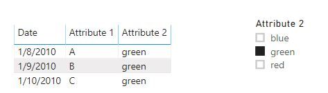
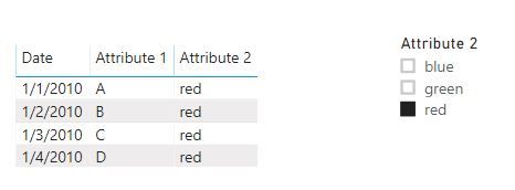
and here is sample pbix file, please try it.
Regards,
Lin
If this post helps, then please consider Accept it as the solution to help the other members find it more quickly.
- Mark as New
- Bookmark
- Subscribe
- Mute
- Subscribe to RSS Feed
- Permalink
- Report Inappropriate Content
@Anonymous what is the code for the measure?
im a little confused why can't this be achieved with a slicer?
If I took the time to answer your question and I came up with a solution, please mark my post as a solution and /or give kudos freely for the effort 🙂 Thank you!
Proud to be a Super User!
Helpful resources

FabCon & SQLCon – Barcelona 2026
Join us in Barcelona for FabCon and SQLCon, the Fabric, Power BI, SQL, and AI community event. Save €200 with code FABCMTY200.

Power BI DataViz World Championships - June 2026
A new Power BI DataViz World Championship is coming this June! Don't miss out on submitting your entry.

| User | Count |
|---|---|
| 24 | |
| 22 | |
| 20 | |
| 18 | |
| 14 |


| User | Count |
|---|---|
| 27 | |
| 21 | |
| 21 | |
| 20 | |
| 20 |


