This is best Fabric, Power BI, SQL and AI community event. How do we know? The last event sold out! Save €200 with code FABCMTY200.
Register nowA new Data Days event is coming soon! This time we’re going bigger than ever. Fabric, Power BI, SQL, AI and more. Don't miss out.
Hello,
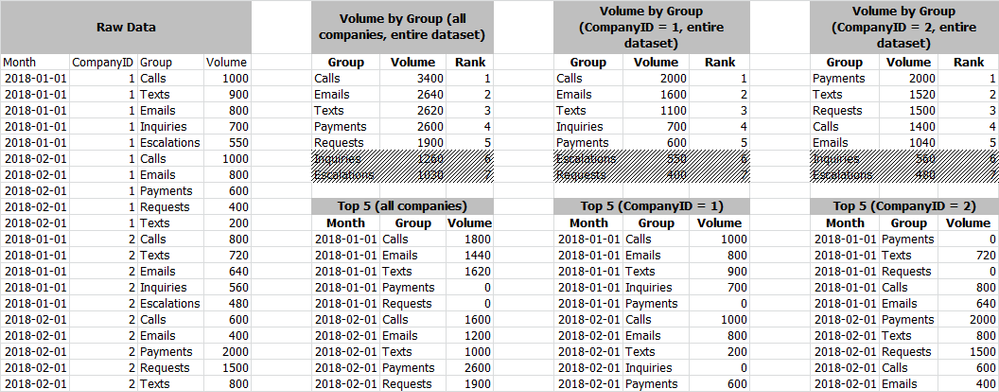
I have a requirement to show the top-5 values within a dataset based on user selections.
I have a dataset that returns volume by:
What I'm looking to do:
I've attached an image that points out what I'm trying to accomplish.
I hope this makes sense.
Thanks in advance!
Solved! Go to Solution.
Hi @ww1711,
Please check out the demo in the attachment. Since there are some groups that don't exist in some days, we need to create a [Groups] table first.
1. Create a new table.
Groups = VALUES(Table1[Group])
2. Create a measure.
Rank =
VAR ranks =
CALCULATE (
RANKX ( ALL ( Groups[Group] ), CALCULATE ( SUM ( Table1[Volume] ) ) ),
ALL ( Table1[Month] )
)
RETURN
IF ( ranks <= 5, ranks, BLANK () )
Best Regards,
Dale
Hi @ww1711,
Please check out the demo in the attachment. Since there are some groups that don't exist in some days, we need to create a [Groups] table first.
1. Create a new table.
Groups = VALUES(Table1[Group])
2. Create a measure.
Rank =
VAR ranks =
CALCULATE (
RANKX ( ALL ( Groups[Group] ), CALCULATE ( SUM ( Table1[Volume] ) ) ),
ALL ( Table1[Month] )
)
RETURN
IF ( ranks <= 5, ranks, BLANK () )
Best Regards,
Dale
Really fantastic stuff here, Dale. Thank you for your assistance.
One last ask regarding this... I've rendered what you've got in the table in a stacked column chart and I'm curious as to whether or not I can bypass the automatic coloring of the series. I've got company standard color guidelines that I'd like to apply to each rank at render-time. Is this possible?
Ex: Rank 1 gets #FF0000, 2 gets #FFFF00, etc... It should be mentioned that I'm using PBI Desktop for Report Server (March 2018).
Thanks in advance!
Hi @ww1711,
Maybe you can customize the color in the settings. Please refer to the snapshot below. How does the Stacked Column chart look like?
Best Regards,
Dale
Check out the May 2026 Power BI update to learn about new features.
Sign up to receive a private message when registration opens and key events begin.
If you have recently started exploring Fabric, we'd love to hear how it's going. Your feedback can help with product improvements.
| User | Count |
|---|---|
| 32 | |
| 26 | |
| 25 | |
| 24 | |
| 15 |
| User | Count |
|---|---|
| 62 | |
| 48 | |
| 27 | |
| 21 | |
| 20 |