Join us at FabCon Vienna from September 15-18, 2025
The ultimate Fabric, Power BI, SQL, and AI community-led learning event. Save €200 with code FABCOMM.
Get registered- Power BI forums
- Get Help with Power BI
- Desktop
- Service
- Report Server
- Power Query
- Mobile Apps
- Developer
- DAX Commands and Tips
- Custom Visuals Development Discussion
- Health and Life Sciences
- Power BI Spanish forums
- Translated Spanish Desktop
- Training and Consulting
- Instructor Led Training
- Dashboard in a Day for Women, by Women
- Galleries
- Data Stories Gallery
- Themes Gallery
- Contests Gallery
- Quick Measures Gallery
- Notebook Gallery
- Translytical Task Flow Gallery
- TMDL Gallery
- R Script Showcase
- Webinars and Video Gallery
- Ideas
- Custom Visuals Ideas (read-only)
- Issues
- Issues
- Events
- Upcoming Events
Compete to become Power BI Data Viz World Champion! First round ends August 18th. Get started.
- Power BI forums
- Forums
- Get Help with Power BI
- Desktop
- Re: Dynamic color ramp or classification
- Subscribe to RSS Feed
- Mark Topic as New
- Mark Topic as Read
- Float this Topic for Current User
- Bookmark
- Subscribe
- Printer Friendly Page
- Mark as New
- Bookmark
- Subscribe
- Mute
- Subscribe to RSS Feed
- Permalink
- Report Inappropriate Content
Dynamic color ramp or classification
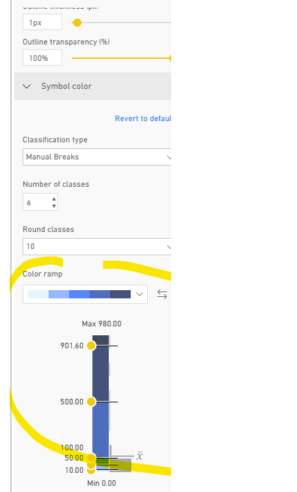
Is it possible to show the manual or natural color breaks from a map dynamically in a report? When editing an ESRI map with point data/symbols, you can color the symbols with a range of colors based on one of their properties. However, I have not found a way to then display the color ramp with its break points as a legend in the map or as a separate visual in the report. Is there a way to do this, including with R, Python, or DAX? Screenshot below shows a manually created color ramp. The goal is then to display this ramp, or at least the break points, within the report itself. Any ideas would be appreciated.
- Mark as New
- Bookmark
- Subscribe
- Mute
- Subscribe to RSS Feed
- Permalink
- Report Inappropriate Content
Hi @Anonymous ,
Esri provides comprehensive documentation on the feature set of ArcGIS Maps for Power BI.
You can ask questions, find the latest information, report issues, and find answers on the Power BI community thread related to ArcGIS Maps for Power BI.
If you have a suggestion for an improvement, please submit it to Power BI's ideas list.
If this post helps, then please consider Accept it as the solution to help the others find it more quickly.
- Mark as New
- Bookmark
- Subscribe
- Mute
- Subscribe to RSS Feed
- Permalink
- Report Inappropriate Content
Thanks for the references. So far, I have not seen any methods that would allow showing dynamic color ramp/classification legends. If someone has found anything specific, please let me know.


