FabCon is coming to Atlanta
Join us at FabCon Atlanta from March 16 - 20, 2026, for the ultimate Fabric, Power BI, AI and SQL community-led event. Save $200 with code FABCOMM.
Register now!- Power BI forums
- Get Help with Power BI
- Desktop
- Service
- Report Server
- Power Query
- Mobile Apps
- Developer
- DAX Commands and Tips
- Custom Visuals Development Discussion
- Health and Life Sciences
- Power BI Spanish forums
- Translated Spanish Desktop
- Training and Consulting
- Instructor Led Training
- Dashboard in a Day for Women, by Women
- Galleries
- Data Stories Gallery
- Themes Gallery
- Contests Gallery
- Quick Measures Gallery
- Notebook Gallery
- Translytical Task Flow Gallery
- TMDL Gallery
- R Script Showcase
- Webinars and Video Gallery
- Ideas
- Custom Visuals Ideas (read-only)
- Issues
- Issues
- Events
- Upcoming Events
To celebrate FabCon Vienna, we are offering 50% off select exams. Ends October 3rd. Request your discount now.
- Power BI forums
- Forums
- Get Help with Power BI
- Desktop
- Dynamic bar chart doesn't scale for all measures
- Subscribe to RSS Feed
- Mark Topic as New
- Mark Topic as Read
- Float this Topic for Current User
- Bookmark
- Subscribe
- Printer Friendly Page
- Mark as New
- Bookmark
- Subscribe
- Mute
- Subscribe to RSS Feed
- Permalink
- Report Inappropriate Content
Dynamic bar chart doesn't scale for all measures
Hello everyone,
Wondering if anyone knows how to solve the following:
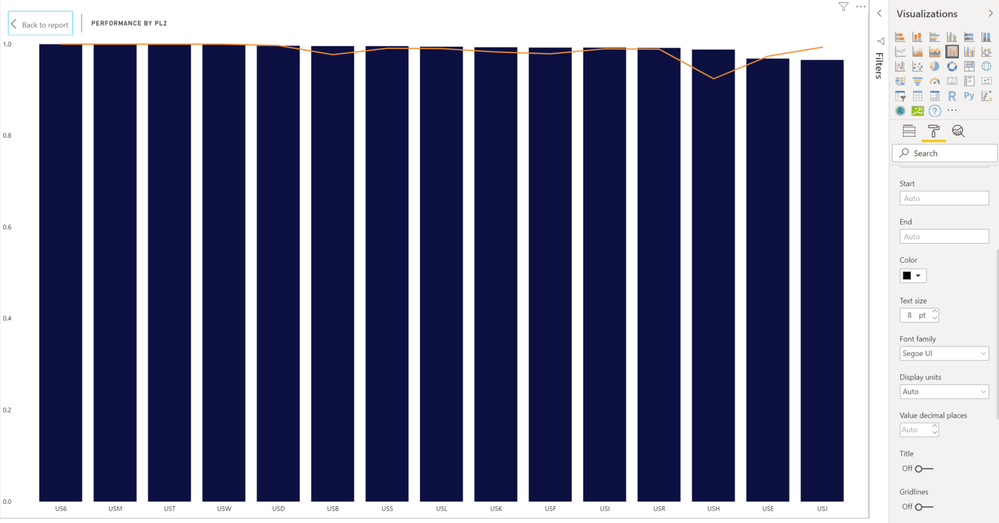
I have a drop down list of measures. Based on the measure that the user selects a column bar chart is populated with the data for that measure. The Y column has start, end, and display units set to 'auto.' Most of them appear fine, however there are 2 measures which don't have much variation (maybe 5% difference between the best and worst performer) that the scale doesn't show the difference at all.
Is there a way to better magnify the differences where it's relevant without hardcoding the ranges since the ranges vary between the measures? Thanks for your help
Here's an example of one of the measure where it's hard to see the variation and I'd like to be able to magnify it
Solved! Go to Solution.
- Mark as New
- Bookmark
- Subscribe
- Mute
- Subscribe to RSS Feed
- Permalink
- Report Inappropriate Content
Hi @Anonymous ,
By my tests and research, I'm afraid that there is no better way for us to let the range to be more obviouse between the measures in the bar chart other than you set the Y axis manually.
Best Regards,
Cherry
If this post helps, then please consider Accept it as the solution to help the other members find it more quickly.
- Mark as New
- Bookmark
- Subscribe
- Mute
- Subscribe to RSS Feed
- Permalink
- Report Inappropriate Content
FYI - for the 2 meausures that had low variation (results all hovered between 95% - 99%) I multiplied the results by 100 but that didn't change the visual at all. Looks like it's an issue
Helpful resources
| User | Count |
|---|---|
| 98 | |
| 76 | |
| 74 | |
| 49 | |
| 26 |


