Get Fabric certified for FREE!
Don't miss your chance to take the Fabric Data Engineer (DP-600) exam for FREE! Find out how by attending the DP-600 session on April 23rd (pacific time), live or on-demand.
Learn more- Power BI forums
- Get Help with Power BI
- Desktop
- Service
- Report Server
- Power Query
- Mobile Apps
- Developer
- DAX Commands and Tips
- Custom Visuals Development Discussion
- Health and Life Sciences
- Power BI Spanish forums
- Translated Spanish Desktop
- Training and Consulting
- Instructor Led Training
- Dashboard in a Day for Women, by Women
- Galleries
- Data Stories Gallery
- Themes Gallery
- Contests Gallery
- QuickViz Gallery
- Quick Measures Gallery
- Visual Calculations Gallery
- Notebook Gallery
- Translytical Task Flow Gallery
- TMDL Gallery
- R Script Showcase
- Webinars and Video Gallery
- Ideas
- Custom Visuals Ideas (read-only)
- Issues
- Issues
- Events
- Upcoming Events
Next up in the FabCon + SQLCon recap series: The roadmap for Microsoft SQL and Maximizing Developer experiences in Fabric. All sessions are available on-demand after the live show. Register now
- Power BI forums
- Forums
- Get Help with Power BI
- Desktop
- Re: Dynamic Value
- Subscribe to RSS Feed
- Mark Topic as New
- Mark Topic as Read
- Float this Topic for Current User
- Bookmark
- Subscribe
- Printer Friendly Page
- Mark as New
- Bookmark
- Subscribe
- Mute
- Subscribe to RSS Feed
- Permalink
- Report Inappropriate Content
Dynamic Value
Hello All,
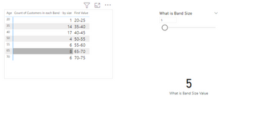
My requirement is to identify a group of age from an age column using a filter. While the filter value is 10 means, I want the x-axis value as the sum of 10 like 0-10,10-20......etc.depends upon data.
Actually, I did this one with static data by using the age group method in the table.
But I want to generate age difference(0-10,10-20......) dynamically based on slicer value, without static data how can I achieve this one.
Please help with this one. Thanks in advance.
Solved! Go to Solution.
- Mark as New
- Bookmark
- Subscribe
- Mute
- Subscribe to RSS Feed
- Permalink
- Report Inappropriate Content
Hi @Anonymous ,
Here are the steps you can follow:
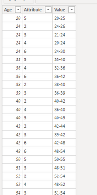
1. Use column [Attribute] as slicer.
2. Create measure.
measure_value =
var _select =SELECTEDVALUE('Table'[Attribute])
var _age1=SUMX(FILTER('Table','Table'[Attribute]=_select),[Age]
var _age2=_age1+_select
var _age3=_age1-_select
return
SWITCH(
    TRUE(),
_select in {2,5,6},_age1 &"-"& _age2,
_select in {3,4} ,_age3 &"-"& _age1)
3. Result:
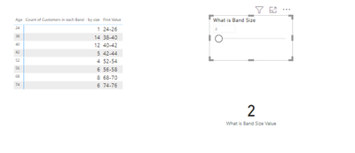
When Attribute=2 is selected, it is displayed as:
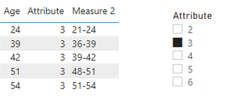
When Attribute= 3 is selected, it is displayed as:
Best Regards,
Liu Yang
If this post helps, then please consider Accept it as the solution to help the other members find it more quickly
- Mark as New
- Bookmark
- Subscribe
- Mute
- Subscribe to RSS Feed
- Permalink
- Report Inappropriate Content
@Anonymous , Power Bi Axis has come from some static columns at the end. while you can create a measure with those values. I doubt you can use that on axis
Helpful resources

New to Fabric Survey
If you have recently started exploring Fabric, we'd love to hear how it's going. Your feedback can help with product improvements.

Power BI DataViz World Championships - June 2026
A new Power BI DataViz World Championship is coming this June! Don't miss out on submitting your entry.

| User | Count |
|---|---|
| 44 | |
| 43 | |
| 38 | |
| 19 | |
| 15 |
| User | Count |
|---|---|
| 68 | |
| 64 | |
| 31 | |
| 29 | |
| 24 |


