Join us at FabCon Vienna from September 15-18, 2025
The ultimate Fabric, Power BI, SQL, and AI community-led learning event. Save €200 with code FABCOMM.
Get registered- Power BI forums
- Get Help with Power BI
- Desktop
- Service
- Report Server
- Power Query
- Mobile Apps
- Developer
- DAX Commands and Tips
- Custom Visuals Development Discussion
- Health and Life Sciences
- Power BI Spanish forums
- Translated Spanish Desktop
- Training and Consulting
- Instructor Led Training
- Dashboard in a Day for Women, by Women
- Galleries
- Data Stories Gallery
- Themes Gallery
- Contests Gallery
- Quick Measures Gallery
- Notebook Gallery
- Translytical Task Flow Gallery
- TMDL Gallery
- R Script Showcase
- Webinars and Video Gallery
- Ideas
- Custom Visuals Ideas (read-only)
- Issues
- Issues
- Events
- Upcoming Events
Enhance your career with this limited time 50% discount on Fabric and Power BI exams. Ends September 15. Request your voucher.
- Power BI forums
- Forums
- Get Help with Power BI
- Desktop
- Re: Dynamic Line and Column chart from bipatterns....
- Subscribe to RSS Feed
- Mark Topic as New
- Mark Topic as Read
- Float this Topic for Current User
- Bookmark
- Subscribe
- Printer Friendly Page
- Mark as New
- Bookmark
- Subscribe
- Mute
- Subscribe to RSS Feed
- Permalink
- Report Inappropriate Content
Dynamic Line and Column chart from bipatterns.com
Learn how to create a Line and Column chart that is dynamically created via slicers. Go to bipatterns.com for a guide.
Solved! Go to Solution.
- Mark as New
- Bookmark
- Subscribe
- Mute
- Subscribe to RSS Feed
- Permalink
- Report Inappropriate Content
If you're in PowerPivot: you can create the table in excel and import it into Powerpivot.
PowerBI: Select "Enter Data" and type or paste your measure names into the table.
SSAS (any version before 2016): You can paste data from the clipboard, similar to PowerPivot.
The remaining option would be to add a simple SQL table statement to the ETL that loads the cube.
If you have more details on what you're using/where your data is coming from, or any other questions let me know.
- Mark as New
- Bookmark
- Subscribe
- Mute
- Subscribe to RSS Feed
- Permalink
- Report Inappropriate Content
I added it to the bottom of the post on my blog. If you have any issues with opening it, please let me know. I hope this helps, but let me know if you need anything else. I'm working on building out my blog with a lot of techniques I've been using, and this has been just one of them.
Thanks
- Mark as New
- Bookmark
- Subscribe
- Mute
- Subscribe to RSS Feed
- Permalink
- Report Inappropriate Content
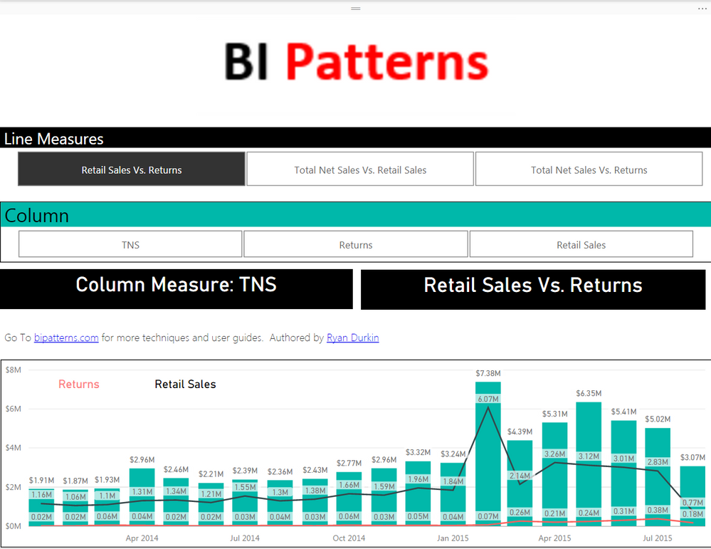
Or were you refferring to something like this:
Please mark it as a solution or give a kudo if it works for you, otherwise let me know if you run into an issue and I'll do my best to assist. Go To bipatterns.com for more techniques and user guides.
Thanks,
- Mark as New
- Bookmark
- Subscribe
- Mute
- Subscribe to RSS Feed
- Permalink
- Report Inappropriate Content
Hi @Anonymous
Thanks for sharing the dynamic slicer based visualisation.
I have gone through the Bipatterns.com.
Could you please help me with the syntax/Dax to create new disconnected table in this case
setp2:
Create the disconnected tables, highlighted in red above. These tables will consist of two columns, Position and Variable (Column or Line Variable for example). The position column serves as a row index, while the Variable column will contain the names of the measures you want to use dynamically.
- Mark as New
- Bookmark
- Subscribe
- Mute
- Subscribe to RSS Feed
- Permalink
- Report Inappropriate Content
If you're in PowerPivot: you can create the table in excel and import it into Powerpivot.
PowerBI: Select "Enter Data" and type or paste your measure names into the table.
SSAS (any version before 2016): You can paste data from the clipboard, similar to PowerPivot.
The remaining option would be to add a simple SQL table statement to the ETL that loads the cube.
If you have more details on what you're using/where your data is coming from, or any other questions let me know.
- Mark as New
- Bookmark
- Subscribe
- Mute
- Subscribe to RSS Feed
- Permalink
- Report Inappropriate Content
Any chance can we get the PowerBI file and PowerPivot model.
- Mark as New
- Bookmark
- Subscribe
- Mute
- Subscribe to RSS Feed
- Permalink
- Report Inappropriate Content
I added it to the bottom of the post on my blog. If you have any issues with opening it, please let me know. I hope this helps, but let me know if you need anything else. I'm working on building out my blog with a lot of techniques I've been using, and this has been just one of them.
Thanks
- Mark as New
- Bookmark
- Subscribe
- Mute
- Subscribe to RSS Feed
- Permalink
- Report Inappropriate Content
Hi @Anonymous
I have been using the given BI pattern and it was very useful.
Any chance that we can apply this to Line and clustered column chart. What I mean is to choose multiple measures on Line displaying multiple line on the chart each line for each measure and similar case with Multiple measures on column.
Please advise. Thank you!
- Mark as New
- Bookmark
- Subscribe
- Mute
- Subscribe to RSS Feed
- Permalink
- Report Inappropriate Content
Or were you refferring to something like this:
Please mark it as a solution or give a kudo if it works for you, otherwise let me know if you run into an issue and I'll do my best to assist. Go To bipatterns.com for more techniques and user guides.
Thanks,
- Mark as New
- Bookmark
- Subscribe
- Mute
- Subscribe to RSS Feed
- Permalink
- Report Inappropriate Content
Hi @Anonymous
Yes, it is similar to this. Multiple bars and multiple lines chart.
It looks like you have taken two variables into one single variable and mapped it to the line.
Similar logic should work for columns as well which I will try.
Could you please share the pbix for the latest chart.
Also, What I am trying to achieve is little different from this.
I have two Line and column measures as below
Column:
Sales TY
Sales LY
Line:
Units TY
Units LY
Instead of chiclet slicer, I have taken regular slicer on pbi. Enabled the multiselect option. This allows me to select both the values from column and line.
Selecting sales TY & Sales LY should display two bars on chart with diff colors.
Selecting Units TY & Units LY should display two lines on Chart with diff colors.
In your case, to get this you are trying to map Units TY & Units LY to one variable and using which restricts the selection.
I want this to be dynamic, user should be able to chose either one measure at a time on column and line or two measures each at a time
Thank you!
- Mark as New
- Bookmark
- Subscribe
- Mute
- Subscribe to RSS Feed
- Permalink
- Report Inappropriate Content
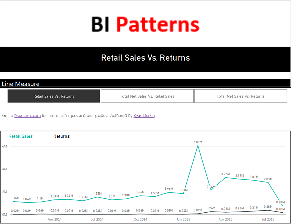
Are you looking for something like this?
Please mark it as a solution or give a kudo if it works for you, otherwise let me know if you run into an issue and I'll do my best to assist. Go To bipatterns.com for more techniques and user guides.
Thanks,
Helpful resources
| User | Count |
|---|---|
| 65 | |
| 60 | |
| 60 | |
| 53 | |
| 27 |
| User | Count |
|---|---|
| 181 | |
| 88 | |
| 70 | |
| 48 | |
| 46 |


