Become a Certified Power BI Data Analyst!
Join us for an expert-led overview of the tools and concepts you'll need to pass exam PL-300. The first session starts on June 11th. See you there!
Get registered- Power BI forums
- Get Help with Power BI
- Desktop
- Service
- Report Server
- Power Query
- Mobile Apps
- Developer
- DAX Commands and Tips
- Custom Visuals Development Discussion
- Health and Life Sciences
- Power BI Spanish forums
- Translated Spanish Desktop
- Training and Consulting
- Instructor Led Training
- Dashboard in a Day for Women, by Women
- Galleries
- Webinars and Video Gallery
- Data Stories Gallery
- Themes Gallery
- Contests Gallery
- Quick Measures Gallery
- Notebook Gallery
- Translytical Task Flow Gallery
- R Script Showcase
- Ideas
- Custom Visuals Ideas (read-only)
- Issues
- Issues
- Events
- Upcoming Events
Power BI is turning 10! Let’s celebrate together with dataviz contests, interactive sessions, and giveaways. Register now.
- Power BI forums
- Forums
- Get Help with Power BI
- Desktop
- Dynamic Legends Via Slicer
- Subscribe to RSS Feed
- Mark Topic as New
- Mark Topic as Read
- Float this Topic for Current User
- Bookmark
- Subscribe
- Printer Friendly Page
- Mark as New
- Bookmark
- Subscribe
- Mute
- Subscribe to RSS Feed
- Permalink
- Report Inappropriate Content
Dynamic Legends Via Slicer
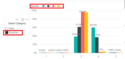
I have viewed/read the article on Dynamically change the information within a visual via a slicer and have put the technique to good use. However, I now need to have a clustered column chart in which I can dynamically change the legend from one category to another (see below). The dynamic changing approach above does not work with legends as they do not accept measures, only column names. Any ideas on how to use a slicer to dynamically change the Legend value?


Solved! Go to Solution.
- Mark as New
- Bookmark
- Subscribe
- Mute
- Subscribe to RSS Feed
- Permalink
- Report Inappropriate Content
Hi @tjd,
So far, i dont think it's possible to achieve, but you could introduce for end-users drill-down with hierarchy buttons in the top left of charts.

- Mark as New
- Bookmark
- Subscribe
- Mute
- Subscribe to RSS Feed
- Permalink
- Report Inappropriate Content
Hi @tjd,
So far, i dont think it's possible to achieve, but you could introduce for end-users drill-down with hierarchy buttons in the top left of charts.

- Mark as New
- Bookmark
- Subscribe
- Mute
- Subscribe to RSS Feed
- Permalink
- Report Inappropriate Content
Obviously not as elegant and intuitive as using slicers but workable. Thanks.
- Mark as New
- Bookmark
- Subscribe
- Mute
- Subscribe to RSS Feed
- Permalink
- Report Inappropriate Content
Dane Belarmino | Microsoft MVP | Proud to be a Super User!
Did I answer your question? Mark my post as a solution!
"Tell me and I’ll forget; show me and I may remember; involve me and I’ll understand."
Need Power BI consultation, get in touch with me on LinkedIn or hire me on UpWork.
Learn with me on YouTube @DAXJutsu or follow my page on Facebook @DAXJutsuPBI.
- Mark as New
- Bookmark
- Subscribe
- Mute
- Subscribe to RSS Feed
- Permalink
- Report Inappropriate Content
I know this thread is old... but just incase there are others like me that were searching for a solution and found this first, I thought I'd share how to get around this.
It involves making a new table with a CROSSJOIN... I've made a video showing how to do it here:
And here is a dashboard showing it working:
- Mark as New
- Bookmark
- Subscribe
- Mute
- Subscribe to RSS Feed
- Permalink
- Report Inappropriate Content
This should be the selected answer... Thank you
Helpful resources
| User | Count |
|---|---|
| 84 | |
| 78 | |
| 70 | |
| 47 | |
| 41 |
| User | Count |
|---|---|
| 108 | |
| 52 | |
| 50 | |
| 40 | |
| 40 |


