Get Fabric certified for FREE!
Don't miss your chance to take the Fabric Data Engineer (DP-600) exam for FREE! Find out how by attending the DP-600 session on April 23rd (pacific time), live or on-demand.
Learn more- Power BI forums
- Get Help with Power BI
- Desktop
- Service
- Report Server
- Power Query
- Mobile Apps
- Developer
- DAX Commands and Tips
- Custom Visuals Development Discussion
- Health and Life Sciences
- Power BI Spanish forums
- Translated Spanish Desktop
- Training and Consulting
- Instructor Led Training
- Dashboard in a Day for Women, by Women
- Galleries
- Data Stories Gallery
- Themes Gallery
- Contests Gallery
- QuickViz Gallery
- Quick Measures Gallery
- Visual Calculations Gallery
- Notebook Gallery
- Translytical Task Flow Gallery
- TMDL Gallery
- R Script Showcase
- Webinars and Video Gallery
- Ideas
- Custom Visuals Ideas (read-only)
- Issues
- Issues
- Events
- Upcoming Events
Next up in the FabCon + SQLCon recap series: The roadmap for Microsoft SQL and Maximizing Developer experiences in Fabric. All sessions are available on-demand after the live show. Register now
- Power BI forums
- Forums
- Get Help with Power BI
- Desktop
- Dynamic Histogram with Measures
- Subscribe to RSS Feed
- Mark Topic as New
- Mark Topic as Read
- Float this Topic for Current User
- Bookmark
- Subscribe
- Printer Friendly Page
- Mark as New
- Bookmark
- Subscribe
- Mute
- Subscribe to RSS Feed
- Permalink
- Report Inappropriate Content
Dynamic Histogram with Measures
Hi everybody ! How are you?
I need to do a dynamic histogram where the value is a measure. It is a possible?
Basically, I need a histogram that is based on a measurement and that changes according to the selected date slicer changes.
The example would be as follows:
I have a measurement ranging from -100% to 100% and I need to group stores with values from -100% to 100% in 10% intervals.
Thanks !
Regards!
Solved! Go to Solution.
- Mark as New
- Bookmark
- Subscribe
- Mute
- Subscribe to RSS Feed
- Permalink
- Report Inappropriate Content
Hi @Anonymous ,
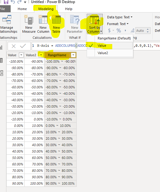
First of all, We can create a calculated table as the Axis:
X-Axis =
ADDCOLUMNS (
    ADDCOLUMNS ( GENERATESERIES ( -1, 0.9, 0.1 ), "Value2", [Value] + 0.1 ),
    "RangeName", FORMAT ( [Value], "Percent" ) & "  ~  "
        & FORMAT ( [Value2], "Percent" )
)
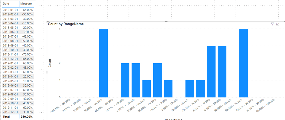
Then we can create a measure to count the value dynamicly
Count =
COUNTROWS (
    FILTER (
        'Table',
        [Measure] >= MIN ( 'X-Axis'[Value] )
            && [Measure] <= MAX ( 'X-Axis'[Value2] )
    )
)
If it doesn't meet your requirement, kindly share your sample data and expected result to me if you don't have any Confidential Information. Please upload your files to One Drive and share the link here.
Best regards,
If this post helps, then please consider Accept it as the solution to help the other members find it more quickly.
- Mark as New
- Bookmark
- Subscribe
- Mute
- Subscribe to RSS Feed
- Permalink
- Report Inappropriate Content
Hi guys,
great and clear example. I have an additional question: I have build a distribution measure as suggested, however it seems to be ignoring any date filters I am applying. Any thoughts how I can make it reactive to changes in the date filter? Good to know the measure draws it's data from a different table than the one the COUNTROWS is applied to.
- Mark as New
- Bookmark
- Subscribe
- Mute
- Subscribe to RSS Feed
- Permalink
- Report Inappropriate Content
Hi @Anonymous ,
First of all, We can create a calculated table as the Axis:
X-Axis =
ADDCOLUMNS (
    ADDCOLUMNS ( GENERATESERIES ( -1, 0.9, 0.1 ), "Value2", [Value] + 0.1 ),
    "RangeName", FORMAT ( [Value], "Percent" ) & "  ~  "
        & FORMAT ( [Value2], "Percent" )
)
Then we can create a measure to count the value dynamicly
Count =
COUNTROWS (
    FILTER (
        'Table',
        [Measure] >= MIN ( 'X-Axis'[Value] )
            && [Measure] <= MAX ( 'X-Axis'[Value2] )
    )
)
If it doesn't meet your requirement, kindly share your sample data and expected result to me if you don't have any Confidential Information. Please upload your files to One Drive and share the link here.
Best regards,
If this post helps, then please consider Accept it as the solution to help the other members find it more quickly.
- Mark as New
- Bookmark
- Subscribe
- Mute
- Subscribe to RSS Feed
- Permalink
- Report Inappropriate Content
to avoid a value that lies on the edge of a category being counted in both the the lower and higher categories, I recommend changing the count measure from
Count =
COUNTROWS (
    FILTER (
        'Table',
        [Measure] >= MIN ( 'X-Axis'[Value] )
            && [Measure] <= MAX ( 'X-Axis'[Value2] )
    )
)
to
Count =
COUNTROWS(
FILTER(
'Table',
[Measure]
> MIN( 'X-Axis'[Value] )
&& [Measure]
<= MAX( 'X-Axis'[Value2] )
)
)
- Mark as New
- Bookmark
- Subscribe
- Mute
- Subscribe to RSS Feed
- Permalink
- Report Inappropriate Content
Helpful resources

New to Fabric Survey
If you have recently started exploring Fabric, we'd love to hear how it's going. Your feedback can help with product improvements.

Power BI DataViz World Championships - June 2026
A new Power BI DataViz World Championship is coming this June! Don't miss out on submitting your entry.

Join our Fabric User Panel
Share feedback directly with Fabric product managers, participate in targeted research studies and influence the Fabric roadmap.

| User | Count |
|---|---|
| 48 | |
| 45 | |
| 41 | |
| 20 | |
| 18 |
| User | Count |
|---|---|
| 69 | |
| 64 | |
| 32 | |
| 31 | |
| 27 |


