A new Data Days event is coming soon!
This time we’re going bigger than ever. Fabric, Power BI, SQL, AI and more. We're covering it all. You won't want to miss it.
Learn more- Power BI forums
- Get Help with Power BI
- Desktop
- Service
- Report Server
- Power Query
- Mobile Apps
- Developer
- DAX Commands and Tips
- Custom Visuals Development Discussion
- Health and Life Sciences
- Power BI Spanish forums
- Translated Spanish Desktop
- Training and Consulting
- Instructor Led Training
- Dashboard in a Day for Women, by Women
- Galleries
- Data Stories Gallery
- Themes Gallery
- Contests Gallery
- QuickViz Gallery
- Quick Measures Gallery
- Visual Calculations Gallery
- Notebook Gallery
- Translytical Task Flow Gallery
- TMDL Gallery
- R Script Showcase
- Webinars and Video Gallery
- Ideas
- Custom Visuals Ideas (read-only)
- Issues
- Issues
- Events
- Upcoming Events
Level up your Power BI skills this month - build one visual each week and tell better stories with data! Get started
- Power BI forums
- Forums
- Get Help with Power BI
- Desktop
- Dynamic Grouping for Tree Map
- Subscribe to RSS Feed
- Mark Topic as New
- Mark Topic as Read
- Float this Topic for Current User
- Bookmark
- Subscribe
- Printer Friendly Page
- Mark as New
- Bookmark
- Subscribe
- Mute
- Subscribe to RSS Feed
- Permalink
- Report Inappropriate Content
Dynamic Grouping for Tree Map
Hello,
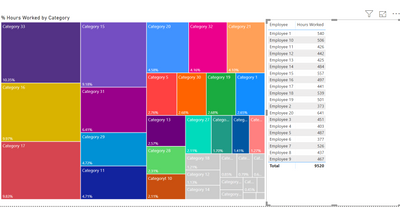
I am trying to create a tree map that has dynamic grouping. The measurement is sum of total hours spent on certain categorys. Some categorys would be customer service, auditing, etc. The top 90% of total hours spent will all be default colors set by microsoft. But I would like to block the bottom 10% into a gray color. The issue is when I filter on one of the employees the conditoinal formatting doesn't change color based on the employee I filter on. It doesn't adjust the conditional formatting to the employee I select.
Here is how the map is unfiltered. Which is what I want.
This is what happens when the dashboard is filtered by employee. You can see those original grey boxes are still grey. I want the conditional formating (lower 10% grey color) to adjust when the table is filtered.
Want it to look like this when filtered by employee.
I'm not sure if this is possible or not. Thank you!
- Mark as New
- Bookmark
- Subscribe
- Mute
- Subscribe to RSS Feed
- Permalink
- Report Inappropriate Content
@Anonymous - it appears that the calculation on which the conditional formatting is based could be tweaked to provide the correct results - could you provide that information, or even better a sample pbix?
- Mark as New
- Bookmark
- Subscribe
- Mute
- Subscribe to RSS Feed
- Permalink
- Report Inappropriate Content
Of course, here is the calculation I am using is

- Mark as New
- Bookmark
- Subscribe
- Mute
- Subscribe to RSS Feed
- Permalink
- Report Inappropriate Content
@Anonymous -
You actually don't need to use a measure for this - the TreeMap % will do the calculation for you on the straight Hours Worked.
However, as you said, the Treemap locks in the colors and does not update dynamically.
A Hack Work-Around: You can switch a Column Chart, apply your rules and then switch back to a TreeMap.
Please let us know whether that works.
I also appreciate Kudos.
Helpful resources

Power BI Monthly Update - April 2026
Check out the April 2026 Power BI update to learn about new features.

Data Days 2026 coming soon!
Sign up to receive a private message when registration opens and key events begin.

New to Fabric Survey
If you have recently started exploring Fabric, we'd love to hear how it's going. Your feedback can help with product improvements.

| User | Count |
|---|---|
| 34 | |
| 26 | |
| 25 | |
| 22 | |
| 18 |
| User | Count |
|---|---|
| 65 | |
| 35 | |
| 32 | |
| 25 | |
| 23 |


