FabCon is coming to Atlanta
Join us at FabCon Atlanta from March 16 - 20, 2026, for the ultimate Fabric, Power BI, AI and SQL community-led event. Save $200 with code FABCOMM.
Register now!- Power BI forums
- Get Help with Power BI
- Desktop
- Service
- Report Server
- Power Query
- Mobile Apps
- Developer
- DAX Commands and Tips
- Custom Visuals Development Discussion
- Health and Life Sciences
- Power BI Spanish forums
- Translated Spanish Desktop
- Training and Consulting
- Instructor Led Training
- Dashboard in a Day for Women, by Women
- Galleries
- Data Stories Gallery
- Themes Gallery
- Contests Gallery
- QuickViz Gallery
- Quick Measures Gallery
- Visual Calculations Gallery
- Notebook Gallery
- Translytical Task Flow Gallery
- TMDL Gallery
- R Script Showcase
- Webinars and Video Gallery
- Ideas
- Custom Visuals Ideas (read-only)
- Issues
- Issues
- Events
- Upcoming Events
The Power BI Data Visualization World Championships is back! Get ahead of the game and start preparing now! Learn more
- Power BI forums
- Forums
- Get Help with Power BI
- Desktop
- Re: Dual axis chart - lines only?
- Subscribe to RSS Feed
- Mark Topic as New
- Mark Topic as Read
- Float this Topic for Current User
- Bookmark
- Subscribe
- Printer Friendly Page
- Mark as New
- Bookmark
- Subscribe
- Mute
- Subscribe to RSS Feed
- Permalink
- Report Inappropriate Content
Dual axis chart - lines only?
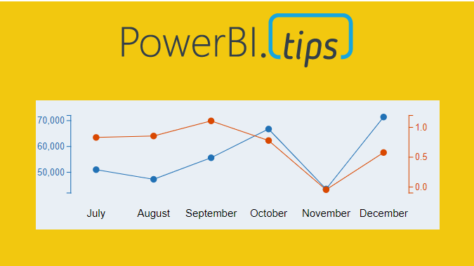
Hello - I frequently come across scenarios where I want to show line graphs but they have different magnitudes. I know how to make a dual axis chart with a line + column combo, but I can't find the option to make a line-only version work. (Excel can easily do this however.)
An example I'm dealing with is where I'd have an absolute measure (such as $ amount of annual GDP) on the left y axis and the YoY % measure on the right y axis.
Again, this has to be lines for both. Thanks in advance for the help!
-Matt
Solved! Go to Solution.
- Mark as New
- Bookmark
- Subscribe
- Mute
- Subscribe to RSS Feed
- Permalink
- Report Inappropriate Content
You can use the charticulator,
Here's a tutorial on how to make what you want. There's also included a github link with the finished visual if you want.
Thanks!
Appreciate your Kudos
Connect with me!
Stay up to date on
Read my blogs on
Did I answer your question? Mark my post as a solution! Proud to be a Super User!
Connect with me!
Stay up to date on
Read my blogs on
- Mark as New
- Bookmark
- Subscribe
- Mute
- Subscribe to RSS Feed
- Permalink
- Report Inappropriate Content
Hi @SteveCampbell ,
This charticulator is only for csv files, but if somebody is making dashboards using oracle database live data, then it is not possible to use charticulator.
Am i right ?
Is there any provision for the same ?
Thanks !
- Mark as New
- Bookmark
- Subscribe
- Mute
- Subscribe to RSS Feed
- Permalink
- Report Inappropriate Content
It will export a custom visual that you can use in power bi with any data, just like any other visual.
There’s a custom visual available to download already built on that link, so you can try it without having to make one yourself.
Did I answer your question? Mark my post as a solution! Proud to be a Super User!
Connect with me!
Stay up to date on
Read my blogs on
- Mark as New
- Bookmark
- Subscribe
- Mute
- Subscribe to RSS Feed
- Permalink
- Report Inappropriate Content
Did you try Multiple axis chart in Power BI?
- Mark as New
- Bookmark
- Subscribe
- Mute
- Subscribe to RSS Feed
- Permalink
- Report Inappropriate Content
@Anonymous Show me where that is please? Not sure what you are referring to
- Mark as New
- Bookmark
- Subscribe
- Mute
- Subscribe to RSS Feed
- Permalink
- Report Inappropriate Content
- Mark as New
- Bookmark
- Subscribe
- Mute
- Subscribe to RSS Feed
- Permalink
- Report Inappropriate Content
- Mark as New
- Bookmark
- Subscribe
- Mute
- Subscribe to RSS Feed
- Permalink
- Report Inappropriate Content
@Anonymous Thank you for the recommendation, but that is a third party plug-in that leaves a lot to be desired. (Not to mention that it tries to nudge you into paying for it.) Is there not a standard microsoft-built option for this? It seems like a rather big issue that PBI cannot easily replicate excel features.
Helpful resources

Power BI Dataviz World Championships
The Power BI Data Visualization World Championships is back! Get ahead of the game and start preparing now!

| User | Count |
|---|---|
| 38 | |
| 36 | |
| 33 | |
| 32 | |
| 28 |
| User | Count |
|---|---|
| 129 | |
| 88 | |
| 79 | |
| 68 | |
| 63 |


