Join the #PBI10 DataViz contest
Power BI is turning 10, and we’re marking the occasion with a special community challenge. Use your creativity to tell a story, uncover trends, or highlight something unexpected.
Get started- Power BI forums
- Get Help with Power BI
- Desktop
- Service
- Report Server
- Power Query
- Mobile Apps
- Developer
- DAX Commands and Tips
- Custom Visuals Development Discussion
- Health and Life Sciences
- Power BI Spanish forums
- Translated Spanish Desktop
- Training and Consulting
- Instructor Led Training
- Dashboard in a Day for Women, by Women
- Galleries
- Webinars and Video Gallery
- Data Stories Gallery
- Themes Gallery
- Contests Gallery
- Quick Measures Gallery
- Notebook Gallery
- Translytical Task Flow Gallery
- R Script Showcase
- Ideas
- Custom Visuals Ideas (read-only)
- Issues
- Issues
- Events
- Upcoming Events
Join us for an expert-led overview of the tools and concepts you'll need to become a Certified Power BI Data Analyst and pass exam PL-300. Register now.
- Power BI forums
- Forums
- Get Help with Power BI
- Desktop
- Re: Double Stacked Column Chart / Combination of S...
- Subscribe to RSS Feed
- Mark Topic as New
- Mark Topic as Read
- Float this Topic for Current User
- Bookmark
- Subscribe
- Printer Friendly Page
- Mark as New
- Bookmark
- Subscribe
- Mute
- Subscribe to RSS Feed
- Permalink
- Report Inappropriate Content
Double Stacked Column Chart / Combination of Stacked and Column Chart
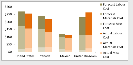
Hi, my client requested to create a chart that combine stacked and column chart together.
From my research, most of the solution only say "You can't"
https://community.powerbi.com/t5/Desktop/Clustered-stacked-column-chart/m-p/144714
also, there are custom visual from 3rd party company, which I can't use due to security reason
http://www.defteam.com/stacked-clustered-bar-chart/
I mean, Are there any workaround to get into that chart, i.,e. manipulating the data so the axis can be adjusted (there are tips in excel to manipulating the axis, but i am not sure how to do it in powerBI) ?
https://peltiertech.com/clustered-stacked-column-bar-charts/
thanks
Andre
Solved! Go to Solution.
- Mark as New
- Bookmark
- Subscribe
- Mute
- Subscribe to RSS Feed
- Permalink
- Report Inappropriate Content
Hi @andrehawari
Currently, It is not possible to create a Combination of Stacked and Column Chart, you can vote for this idea.
A workaround described in the fiist link would like below
Best Regards
Maggie
- Mark as New
- Bookmark
- Subscribe
- Mute
- Subscribe to RSS Feed
- Permalink
- Report Inappropriate Content
I have put together this solution that uses measures and is not depending on the data structure to be in just one table if it's still interesting.
https://www.villezekeviking.com/how-to-combine-a-clustered-and-stacked-chart-in-power-bi/
- Mark as New
- Bookmark
- Subscribe
- Mute
- Subscribe to RSS Feed
- Permalink
- Report Inappropriate Content
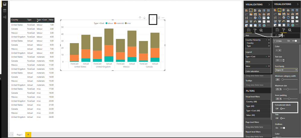
I followed this and my X axis are United States Forecast, United States Actual, United Kingdom Forecast, United Kingdom Actual - even with turning concat off. I cannot get Country on a seperate line.
- Mark as New
- Bookmark
- Subscribe
- Mute
- Subscribe to RSS Feed
- Permalink
- Report Inappropriate Content
Hi @andrehawari
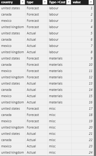
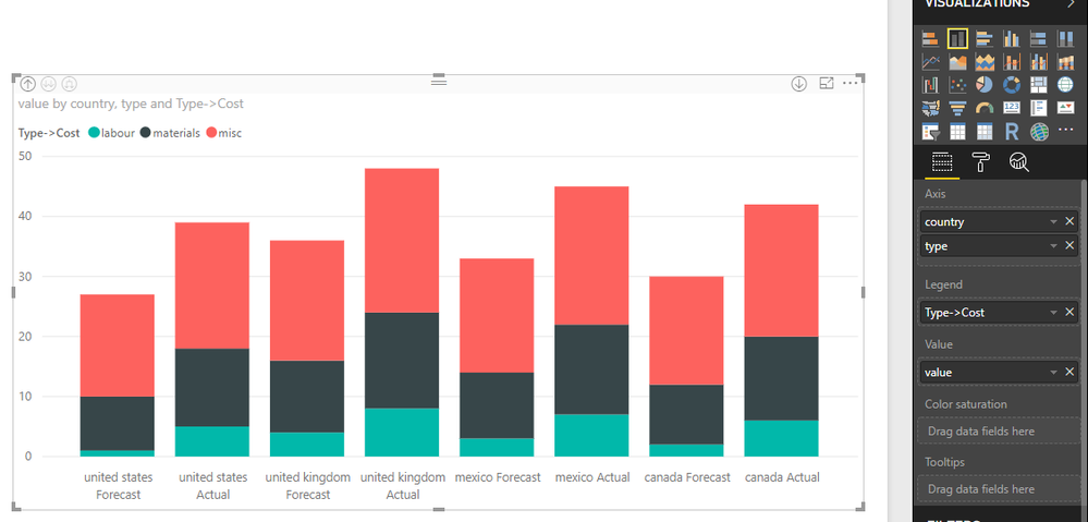
You can do that in another way, create a hierarchy of Country=>Type and use that value in the x-axis, and use `Type->Cost` as the legend.
I think this would help you to get what you are looking for.
The below Image will give you more clarity.
you can vote for this idea.
- Mark as New
- Bookmark
- Subscribe
- Mute
- Subscribe to RSS Feed
- Permalink
- Report Inappropriate Content
HI Partik ,
i need to remove space beween forecast and actual bars and need space after country grouped bars ,it is possible ?
- Mark as New
- Bookmark
- Subscribe
- Mute
- Subscribe to RSS Feed
- Permalink
- Report Inappropriate Content
@PratikB Hi Pratik - Do you happen to have a sample pbix of this that you could share?
- Mark as New
- Bookmark
- Subscribe
- Mute
- Subscribe to RSS Feed
- Permalink
- Report Inappropriate Content
I followed this but when I drill through I get United States Forecast, United States Actual, United Kingdom Forecast, United Kingdom Actual. I don't get the Country on a seperate line for X axis; even with turning concat off.
- Mark as New
- Bookmark
- Subscribe
- Mute
- Subscribe to RSS Feed
- Permalink
- Report Inappropriate Content
Hi @andrehawari
Currently, It is not possible to create a Combination of Stacked and Column Chart, you can vote for this idea.
A workaround described in the fiist link would like below
Best Regards
Maggie
Helpful resources

Join our Fabric User Panel
This is your chance to engage directly with the engineering team behind Fabric and Power BI. Share your experiences and shape the future.

Power BI Monthly Update - June 2025
Check out the June 2025 Power BI update to learn about new features.

| User | Count |
|---|---|
| 79 | |
| 73 | |
| 58 | |
| 36 | |
| 32 |
| User | Count |
|---|---|
| 90 | |
| 62 | |
| 61 | |
| 49 | |
| 45 |


