FabCon is coming to Atlanta
Join us at FabCon Atlanta from March 16 - 20, 2026, for the ultimate Fabric, Power BI, AI and SQL community-led event. Save $200 with code FABCOMM.
Register now!- Power BI forums
- Get Help with Power BI
- Desktop
- Service
- Report Server
- Power Query
- Mobile Apps
- Developer
- DAX Commands and Tips
- Custom Visuals Development Discussion
- Health and Life Sciences
- Power BI Spanish forums
- Translated Spanish Desktop
- Training and Consulting
- Instructor Led Training
- Dashboard in a Day for Women, by Women
- Galleries
- Data Stories Gallery
- Themes Gallery
- Contests Gallery
- QuickViz Gallery
- Quick Measures Gallery
- Visual Calculations Gallery
- Notebook Gallery
- Translytical Task Flow Gallery
- TMDL Gallery
- R Script Showcase
- Webinars and Video Gallery
- Ideas
- Custom Visuals Ideas (read-only)
- Issues
- Issues
- Events
- Upcoming Events
Learn from the best! Meet the four finalists headed to the FINALS of the Power BI Dataviz World Championships! Register now
- Power BI forums
- Forums
- Get Help with Power BI
- Desktop
- Dot Plot Chart
- Subscribe to RSS Feed
- Mark Topic as New
- Mark Topic as Read
- Float this Topic for Current User
- Bookmark
- Subscribe
- Printer Friendly Page
- Mark as New
- Bookmark
- Subscribe
- Mute
- Subscribe to RSS Feed
- Permalink
- Report Inappropriate Content
Dot Plot Chart
Hi Everyone,
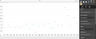
Can some one help me to replicate the below chart ,
I have just two columns,
1. Currency Code,
2. Variance(in %)

I tried to use DOT PLOT BY MAQ SOFTWARE and do this,

Any help is very much appreciated.
Thank you
Solved! Go to Solution.
- Mark as New
- Bookmark
- Subscribe
- Mute
- Subscribe to RSS Feed
- Permalink
- Report Inappropriate Content
Hi @pxg08680
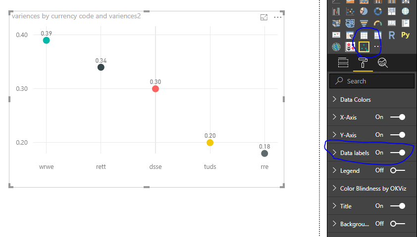
As tested, i'm unable to find any option to have data lables on the DOT PLOT BY MAQ SOFTWARE .
Could you consider "Dot plot ny OKViz" custom visual?
Best Regards
Maggie
- Mark as New
- Bookmark
- Subscribe
- Mute
- Subscribe to RSS Feed
- Permalink
- Report Inappropriate Content
Hello @pxg08680,
Currently, Dot Plot by MAQ Software does not support to have data labels for the dots plotted.
We have added your request to our backlog.
We will notify you on this thread when we upgrade Dot Plot with this feature.
Thanks.
- Mark as New
- Bookmark
- Subscribe
- Mute
- Subscribe to RSS Feed
- Permalink
- Report Inappropriate Content
Hi @pxg08680
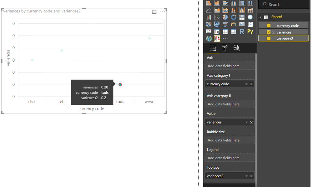
As tested, if i drag the same Variance field into Tooltip , it did not work.
But if i copy the [Variance] column as [Variance2] column, then add it in the Tooltip, it can work.
Best Regards
Maggie
- Mark as New
- Bookmark
- Subscribe
- Mute
- Subscribe to RSS Feed
- Permalink
- Report Inappropriate Content
Thank you for the suggestion but I am looking for a different view.
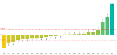
I need the variances to be displayed along with the dots even before hovering.
In this bar chart the values are displayed on top of every currencycode. In the same manner I am trying to create it for dot plot.
Thank you
- Mark as New
- Bookmark
- Subscribe
- Mute
- Subscribe to RSS Feed
- Permalink
- Report Inappropriate Content
Hi @pxg08680
As tested, i'm unable to find any option to have data lables on the DOT PLOT BY MAQ SOFTWARE .
Could you consider "Dot plot ny OKViz" custom visual?
Best Regards
Maggie
- Mark as New
- Bookmark
- Subscribe
- Mute
- Subscribe to RSS Feed
- Permalink
- Report Inappropriate Content
Thank you @slounsbury, your soultion looks close to mine.
Thank you @v-juanli-msft for all the time.
- Mark as New
- Bookmark
- Subscribe
- Mute
- Subscribe to RSS Feed
- Permalink
- Report Inappropriate Content
Can you provide your PBIX file or the data you are wanting to use so I can replicate?
Thanks,
Scott Lounsbury
Helpful resources

Join our Fabric User Panel
Share feedback directly with Fabric product managers, participate in targeted research studies and influence the Fabric roadmap.

Power BI Monthly Update - February 2026
Check out the February 2026 Power BI update to learn about new features.

| User | Count |
|---|---|
| 52 | |
| 51 | |
| 35 | |
| 15 | |
| 14 |
| User | Count |
|---|---|
| 92 | |
| 75 | |
| 41 | |
| 26 | |
| 25 |


