FabCon is coming to Atlanta
Join us at FabCon Atlanta from March 16 - 20, 2026, for the ultimate Fabric, Power BI, AI and SQL community-led event. Save $200 with code FABCOMM.
Register now!- Power BI forums
- Get Help with Power BI
- Desktop
- Service
- Report Server
- Power Query
- Mobile Apps
- Developer
- DAX Commands and Tips
- Custom Visuals Development Discussion
- Health and Life Sciences
- Power BI Spanish forums
- Translated Spanish Desktop
- Training and Consulting
- Instructor Led Training
- Dashboard in a Day for Women, by Women
- Galleries
- Data Stories Gallery
- Themes Gallery
- Contests Gallery
- QuickViz Gallery
- Quick Measures Gallery
- Visual Calculations Gallery
- Notebook Gallery
- Translytical Task Flow Gallery
- TMDL Gallery
- R Script Showcase
- Webinars and Video Gallery
- Ideas
- Custom Visuals Ideas (read-only)
- Issues
- Issues
- Events
- Upcoming Events
The Power BI Data Visualization World Championships is back! Get ahead of the game and start preparing now! Learn more
- Power BI forums
- Forums
- Get Help with Power BI
- Desktop
- Re: Distribution of data
- Subscribe to RSS Feed
- Mark Topic as New
- Mark Topic as Read
- Float this Topic for Current User
- Bookmark
- Subscribe
- Printer Friendly Page
- Mark as New
- Bookmark
- Subscribe
- Mute
- Subscribe to RSS Feed
- Permalink
- Report Inappropriate Content
Distribution of data
Hello everyone,
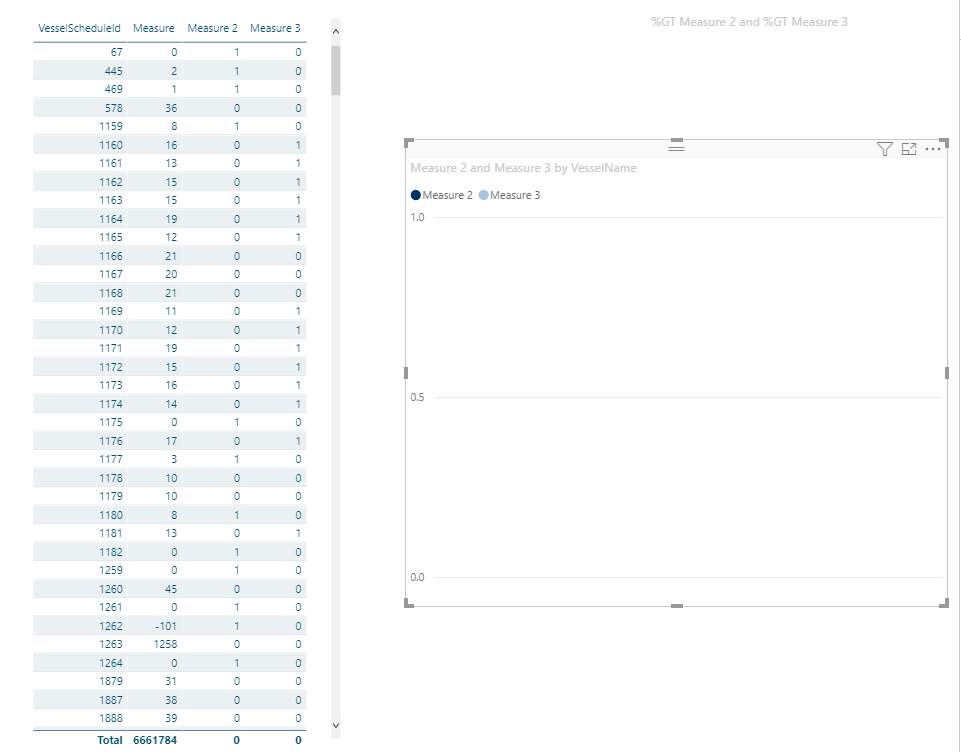
This is part of my data
I would like to show distribution of this data "Measure" and show on the column chart how many of measures falls into 0-10, how many 10-20 and so one... but since I used measure for it, it doesnt work with standard charts...
I would like to ask for adivce how to solve it.
Solved! Go to Solution.
- Mark as New
- Bookmark
- Subscribe
- Mute
- Subscribe to RSS Feed
- Permalink
- Report Inappropriate Content
Hi @Anonymous ,
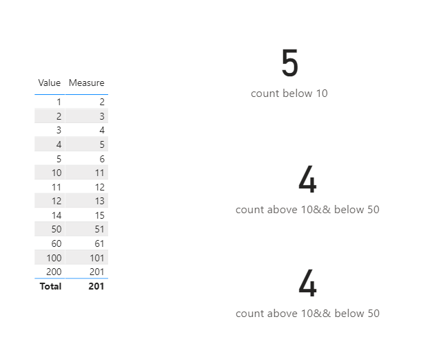
So is below what you need?
Here is the .pbix file.
Kelly
- Mark as New
- Bookmark
- Subscribe
- Mute
- Subscribe to RSS Feed
- Permalink
- Report Inappropriate Content
@Anonymous , Histogram or Segmentation should help
https://spreadsheeto.com/power-bi-histogram/
or
https://www.daxpatterns.com/dynamic-segmentation/
https://www.daxpatterns.com/static-segmentation/
https://www.poweredsolutions.co/2020/01/11/dax-vs-power-query-static-segmentation-in-power-bi-dax-power-query/
https://radacad.com/grouping-and-binning-step-towards-better-data-visualization
- Mark as New
- Bookmark
- Subscribe
- Mute
- Subscribe to RSS Feed
- Permalink
- Report Inappropriate Content
@amitchandakThank you for your reply
I have tried and usually it works but since this is measure, im not getting any result.. I think. I have tried to make additional columns where I have "1" for values between 0 and 10 and "0" for other values. And didive in this was all my data points... but it doesnt work
- Mark as New
- Bookmark
- Subscribe
- Mute
- Subscribe to RSS Feed
- Permalink
- Report Inappropriate Content
- Mark as New
- Bookmark
- Subscribe
- Mute
- Subscribe to RSS Feed
- Permalink
- Report Inappropriate Content
@amitchandak so here you can see: the "measure" is initial value, then "measure2" is where the value is less than 10 and "measure3" where the value is between 10 and 20. Just to strat with. And i wanted to show this on the graph - I chose cusered column chart with values "Measure2" and "Measure3"
- Mark as New
- Bookmark
- Subscribe
- Mute
- Subscribe to RSS Feed
- Permalink
- Report Inappropriate Content
Hi @Anonymous,
Not quite sure whether it is what you want,see below:
Here is the .pbix file.
Kelly
- Mark as New
- Bookmark
- Subscribe
- Mute
- Subscribe to RSS Feed
- Permalink
- Report Inappropriate Content
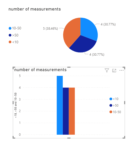
@AnonymousThank you, thats very good suggestion. But I would like to also:
1) show all values on one graph
2) show percenatage
Like here:
- Mark as New
- Bookmark
- Subscribe
- Mute
- Subscribe to RSS Feed
- Permalink
- Report Inappropriate Content
Hi @Anonymous ,
So is below what you need?
Here is the .pbix file.
Kelly
Helpful resources

Power BI Dataviz World Championships
The Power BI Data Visualization World Championships is back! Get ahead of the game and start preparing now!

| User | Count |
|---|---|
| 39 | |
| 39 | |
| 37 | |
| 29 | |
| 24 |
| User | Count |
|---|---|
| 120 | |
| 95 | |
| 70 | |
| 69 | |
| 65 |


